The rule of thirds is one of the fundamental composition principles in photography. It’s all about positioning the most important elements off-center to create a balanced and harmonious composition. While it sounds simple, it’s often overlooked or misunderstood. In this article you’ll learn how to apply the rule of thirds to create well-balanced iPhone photos that are naturally pleasing to the eye.

Stella Oliver – iPhone Photo Masters Student
What Is The Rule Of Thirds?
To compose your photos according to the rule of thirds, you must imagine your photo divided into nine equal parts using two vertical lines and two horizontal lines.
In fact, on the iPhone you can easily display these gridlines within the camera app. To switch the gridlines on go to Settings > Photos & Camera > Grid.
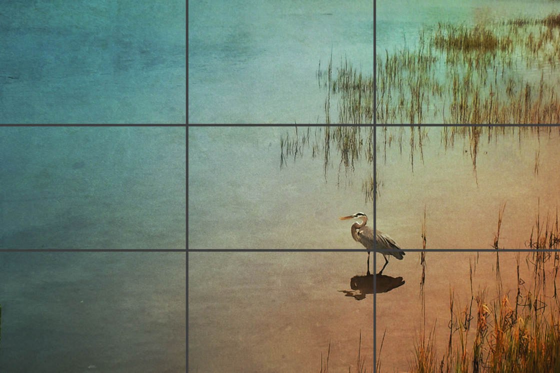
The rule of thirds states that the most important elements in the scene should be placed along the gridlines or at the intersections where the lines meet.
In the photo above, you can see that Stella has placed the bird at the junction point where the right vertical gridline and bottom gridline meet.
Positioning the important elements off-center like this, rather than directly in the center of the frame, tends to create a more harmonious and balanced composition that looks and feels right to the human eye.
Of course, this “rule” is really just a guideline, and when broken intentionally, central subject placement can have a powerful visual impact. But in general, the rule of thirds is a great starting point for any composition.
So let’s take a look at 10 great ways that you can use the rule of thirds to position the important elements and subjects in your iPhone photos.
1. Position The Horizon In Landscapes
If you’re shooting landscapes, the rule of thirds is one of the first things you should think about when composing your photo.
In general, landscapes don’t look good if the horizon is positioned directly across the center of the photo. Positioning the horizon centrally tends to chop the photo in half, and isn’t very pleasing to the eye.
For a more naturally balanced composition, it’s best to place the horizon on or near one of the horizontal thirds lines. Whether you position it on the top or bottom gridline will depend on what you want to emphasize in the scene.

Janice McEwan – iPhone Photo Masters Student
If the sky is more interesting than the foreground, like this beautiful sunset captured by Janice, it makes sense to position the horizon on the bottom thirds line.
This allows you to fill two thirds of the frame with sky, drawing the viewer’s attention to that part of the scene.
However, if your landscape has an interesting foreground, then you should consider aligning the horizon along the top thirds line.

Stella Oliver – iPhone Photo Masters Student
In this stunning beach photo taken by Stella, the lines, textures and reflections in the foreground add lots of visual interest to the scene.
So in this case, Stella made a great choice to position the horizon along the top thirds lines, so that the foreground takes up a larger portion of the photo.
While the horizon doesn’t have to align exactly with the horizontal gridlines, positioning it off-center nearer the top or bottom of the frame will normally produce a more pleasing composition than a central horizon.
2. Position The Main Subject Off-Center
With any scene that you choose to photograph, you should always ask yourself, “What’s the main subject in this scene?” Once you know what your main subject is, you then have to decide where to position it within the frame.
Will you position the subject centrally or off-center? If you’re positioning it off-center, where exactly should you place? The rule of thirds can help you with this.
While central subject placement can have a powerful impact, your photo will usually look more natural and balanced if you position the subject off-center… In particular on one of the junction points where the horizontal and vertical gridlines meet.

Janice McEwan – iPhone Photo Masters Student
In this lovely sunset photo, Janice has used the rule of thirds to position both the horizon and the main subject (the setting sun).
The sun is positioned approximately at the junction point where the top gridline and left gridline would meet. The photo looks well balanced with this off-center composition.
Fiona Grose – iPhone Photo Masters Student
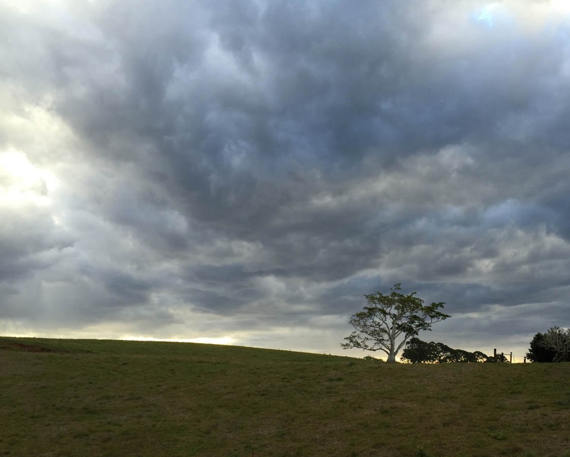
This photo by Fiona is another good example of using the rule of thirds to position both the horizon and the main subject.
This time, the horizon has been placed near the bottom of the frame to give priority to the dramatic sky. And the tree, which is the main subject, has been positioned approximately where the bottom gridline and right gridline would intersect.
3. Position The Eyes In Portraits

Janet Cashin – iPhone Photo Masters Student
If you’re shooting portraits of people or animals, use the rule of thirds to help you position their face and eyes within the scene.
The eyes are where the viewer’s gaze will be drawn to first, so positioning them off-center according to the rule of thirds will usually create the strongest composition.
If you can see both eyes, position them along the top gridline like Janet has done in the photo above. If the subject is posing side-on and you can only see one eye, position the eye on the junction point where two lines meet.
Positioning the cat’s face on the intersection where the top and right gridlines meet has created a really natural and well-balanced composition.
4. Break Symmetry

Jeremy Searle – iPhone Photo Masters Student
The main reason to position the horizon centrally is when you have water in the foreground as it allows you to create a symmetrical image using the reflection.
However, you can still incorporate the rule of thirds into a symmetrical image by including a main subject positioned off-center. This has the wonderful effect of breaking the symmetry and creating a more compelling image.
Jeremy did a great job with the composition of this photo, using an off-center leaf as his main subject in the foreground of this otherwise symmetrical image.
5. Align Vertical Subjects
Luis Fernandez – iPhone Photo Masters Student
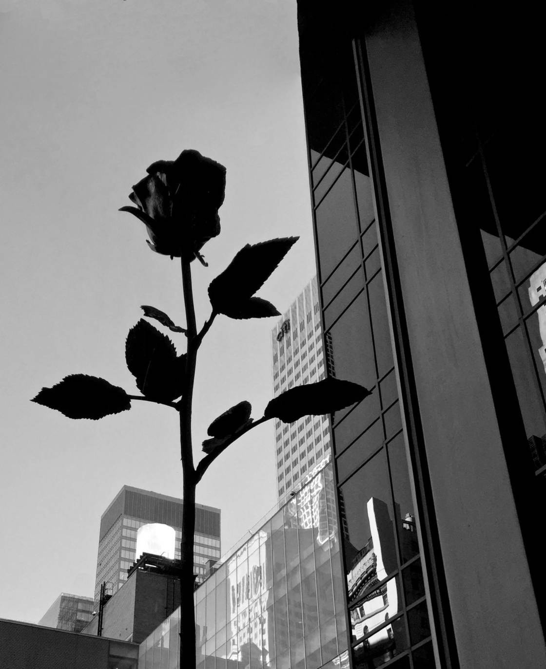
If you’re photographing a vertical subject, such as a person, tall building, or the single rose in this photo, always think carefully about where you position it within the frame.
Placing a tall subject in the middle of the frame can have the same impact as a centrally placed horizon – it cuts the image in half and can look as if you haven’t taken much care with composing your image.
It normally works best to position the subject on either the left or right side of the frame – on or near one of the vertical gridlines.
I like the way Luis has composed this photo with the rose stem positioned to the left as it balances the detail on the right of the frame.
6. Leave Negative Space
Jude Dundas – iPhone Photo Masters Student
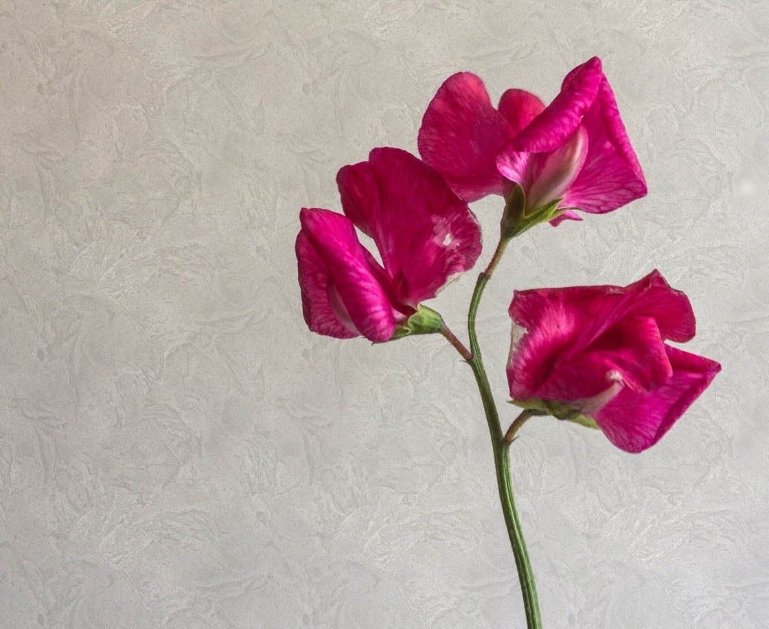
Negative space refers to empty space in a scene, and it can have a powerful impact on your photo. Empty space allows you to create a clean and simple composition, placing maximum emphasis on your subject because nothing else is competing for attention.
While a minimalist scene like this might be simple with very few elements, the position of your main subject is really important. It’s very easy to create an awkward and unbalanced composition when there’s lots of empty space.
Using the rule of thirds will allow you to quickly and easily create a good composition where the subject balances the empty space.
So whenever you’re photographing a scene with lots of negative space, consider aligning your main subject on one of the gridlines, or where two lines intersect.
7. Leave Active Space For Moving Subjects
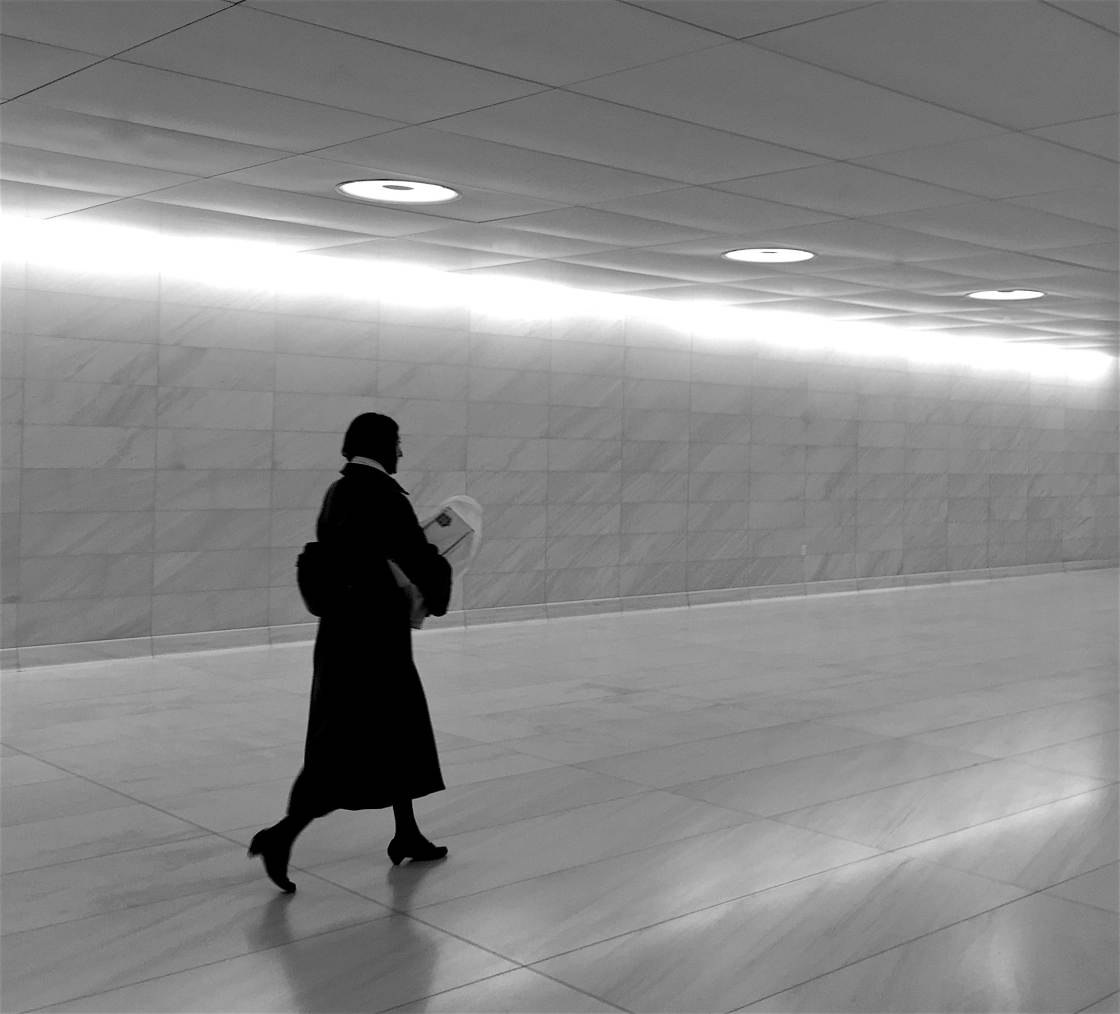
Luis Fernandez – iPhone Photo Masters Student
The rule of thirds is perfect for scenes where your subject is moving from one side of the frame to the other. Why? Because leaving more space in front of your subject gives them space to “move into.”
In the photo above, Luis has positioned his moving subject on the left third of the frame. This allows the viewer to easily imagine the woman moving through the frame and walking into the space in front of her.
If she was positioned on the right hand side of the frame, it would appear that she was about to walk out of the photo. In some cases this can work as it creates tension and drama, but in most cases you should leave more space in front of your subject than behind.
8. Leave Space For The Subject To Look Into
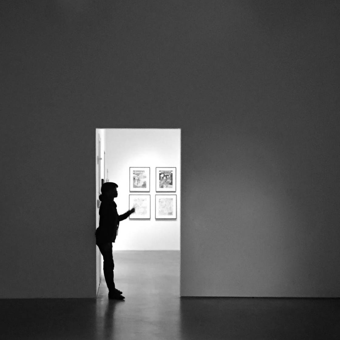
Luis Fernandez – iPhone Photo Masters Student
You can also use the rule of thirds to compose photos where your subject is looking to the left or the right of the frame.
It’s best to leave more space in the direction of their gaze as this gives them room to “look into.” Similar to moving subjects, it allows the viewer to follow the subject’s gaze and get an idea of what they were looking at.
If you leave more space behind them than in front, it would appear that they were looking out of the frame. Sometimes this can work as it creates a sense of mystery, but in general you should leave more space in front of their eyes than behind.
9. Emphasize Important Part Of A Close-Up Subject

Luis Fernandez – iPhone Photo Masters Student
You might not immediately think to use the rule of thirds when taking close up photos, but this wonderful flower photo demonstrates just how effective it can be.
The center of the flower is the focal point in this photo, so Luis made an excellent choice to compose the image with this element positioned on the junction point of two gridlines.
Whenever you’re shooting close-up photos, always ask yourself where you want the eye to be drawn to. Then try positioning that area of the subject off-center according to the rule of thirds.
10. Use Rule Of Thirds To Compose Abstracts
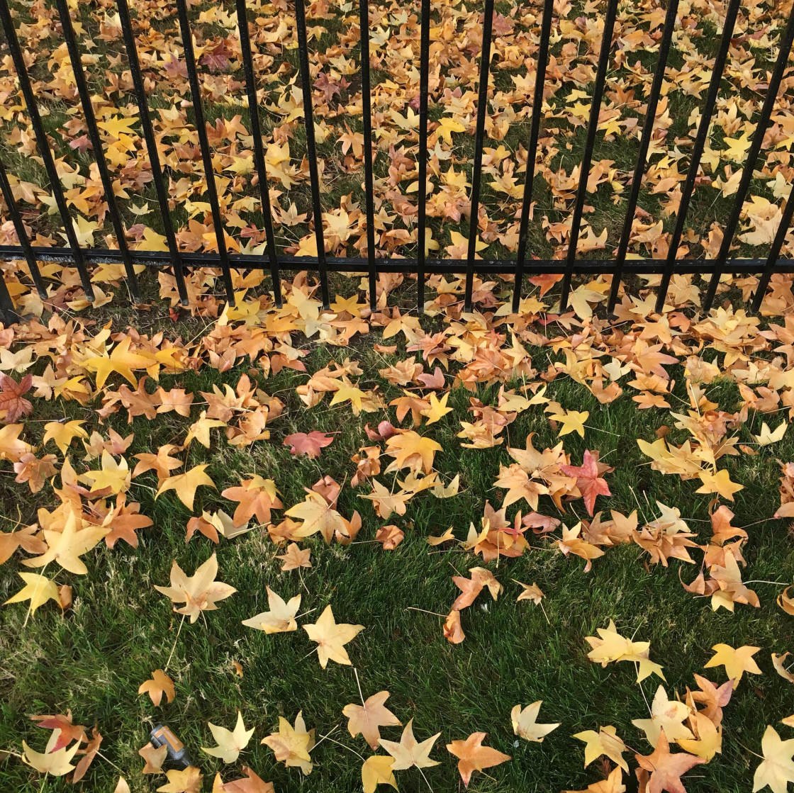
Ashwin Prasad – iPhone Photo Masters Student
Similar to shooting close-ups, if you have a scene that has an abstract quality with patterns, lines or textures, you can use the rule of thirds when experimenting with the placement of different elements.
Look for lines and other objects that you could position along one of the gridlines or at one of the junction points. Use these elements to split the composition into one third and two thirds.
This technique is a very easy way to create a harmonious composition from basic abstract elements. Ashwin’s decision to use the railings in one third of the photo is a great example of this.


Glad to hear you enjoyed this tutorial Malcolm. We’re soon to be launching the new version of our website, so we’ll be looking into some of these issues that you mention. Thank you for your ideas! 🙂
This post is not datet 🙁
How come?
Excellent. Well said and explained. Thank you for posting this.
Glad to hear you enjoyed this article Richard.
I’m trying to do some catching up on your wonderful articles. Very much appreciated the info presented along with the very nice photos for examples. Thank you
Arline
Thanks for your comment Arline. Really glad to hear you enjoyed this tutorial 🙂
extremely helpful. thank you!
Really happy to hear that Rebecca! 🙂
Came across this article on Facebook. Thanks for reposting older articles. The rule of thirds concept always confused me. Your clear outline, explanations and examples were a tremendous help. Now I just need to put it to use.
Good article, but the Rule of Thirds, popular as it has been for decades, actually seems a bit arbitrary to create a composition that feels natural. Why one third and not two fifths for example? Going into deeper research might reveal that good compositions are often based on the Golden Ratio, also known as Phi (1:1.618…), as the Fibonacci sequence is found in plant structures and many other natural phenomena. Artists have known this for centuries, Leonardo Da Vinci has researched and used it extensively in works of art. So the Rule of Thirds can probably just be meant as a rule of thumb to roughly approximate the Golden Ratio if no precise tools are at hand. Today, smartphone apps (but not the iPhone Camera) can easily display a Golden Ratio grid, sometimes also called Phi Grid or DaVinci Grid. Google reveals good articles why the Golden Ratio is better than the Rule of Thirds, as well as camera apps that can display the Phi Grid.