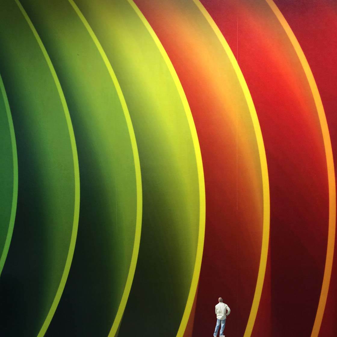
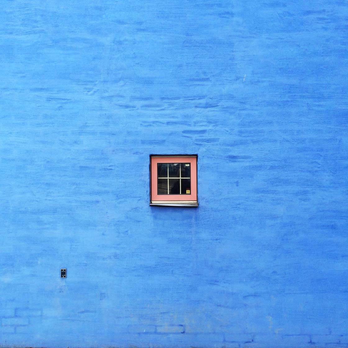
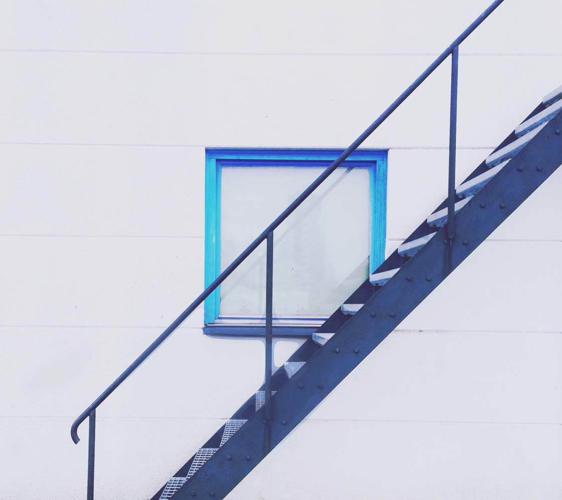
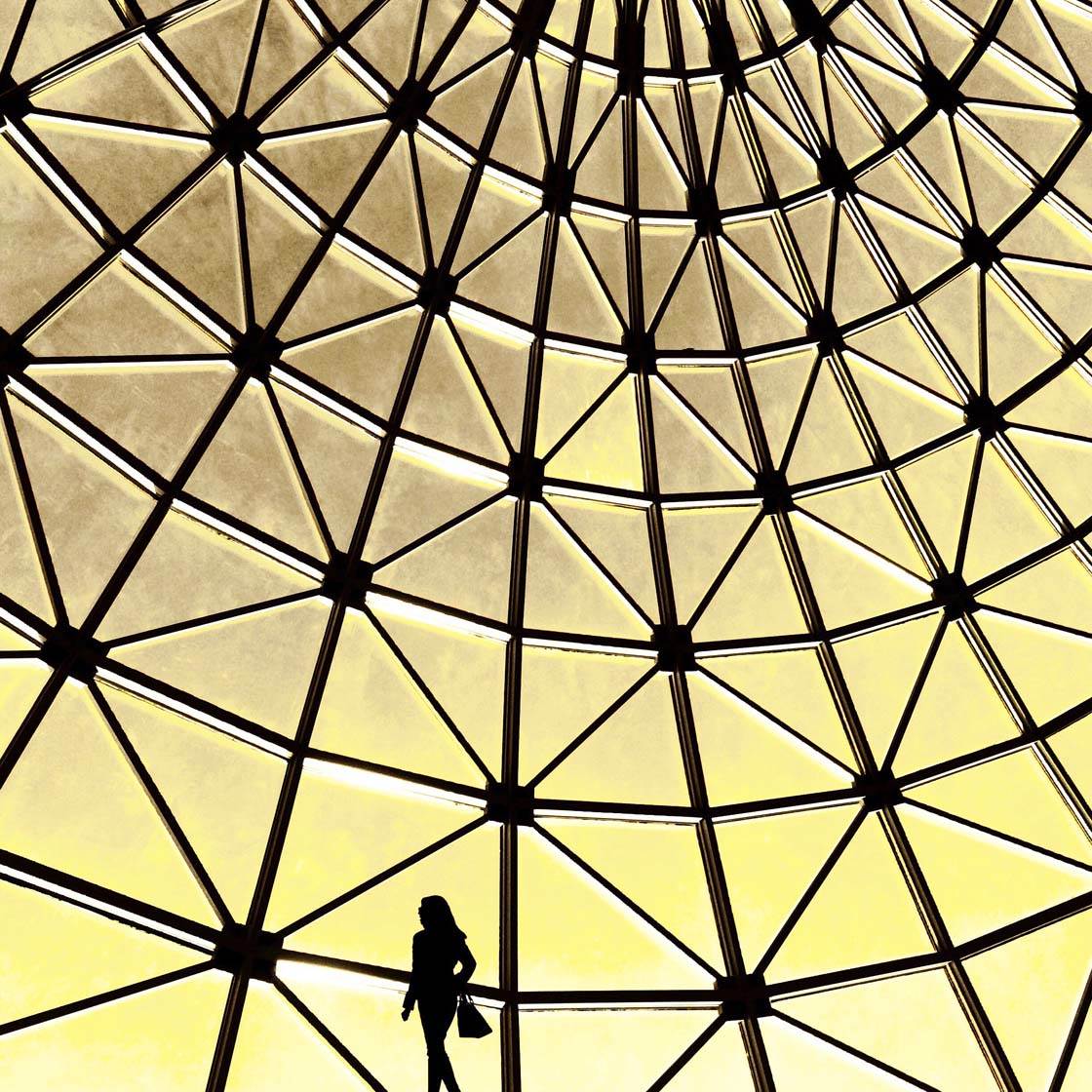
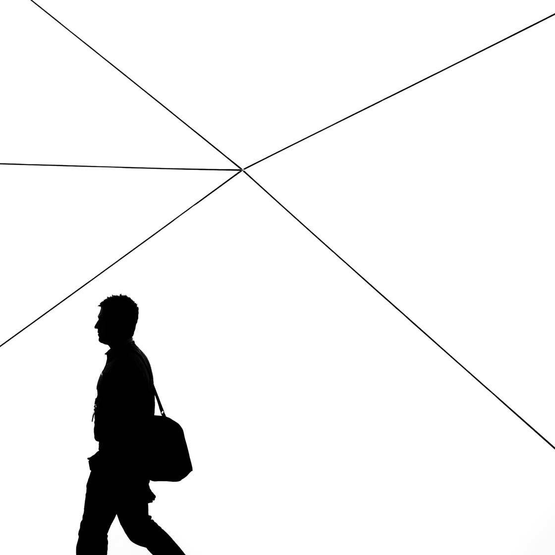
I’m really pleased to share this interview with Marcus Cederberg, a talented iPhone photographer who takes stunning minimalist and abstract photos. Often using buildings and architecture as his subjects, his Instagram feed is a stunning array of vibrant colors, repetitive patterns and lots of negative space. In this interview you’ll learn more about Marcus and how he takes such eye-catching photos with his iPhone.
Tell us a little bit about yourself.
I live in the middle of Sweden in a town called Örebro, where I work as an IT manager at Örebro Municipality. I’m 49 years old, married to Elisabeth and have two daughters aged 11 and 13.
My father was a photographer and journalist and I think I’ve inherited both of these interests, even though my passion for taking pictures was suppressed for many years.
How did your iPhone photography journey begin?
It began with the Instagram app. Prior to that I mainly took pictures of my family, but when I discovered Instagram and all of the talented photographers there, I was hooked.
First I was only exploring all of the talent, but when I got my first feature I became confident to start posting more and more photos.
What inspires you to take photos with the iPhone?
That’s easy – it’s the quick access to the camera. Prior to the iPhone I had to plan ahead if I was going to take some photos, but with the iPhone I’m carrying my camera with me wherever I go.
Having an iPhone back in 2008 was very interesting. Not only did it have a camera, but also a pretty good one. I’m an Apple guy and have been faithful to the brand, and I really appreciate the camera in my iPhone 6 today.
Your Instagram feed is a fabulous array of brightly colored images with minimalist composition. What draws you to this kind of photography?
Thank you so much! I’ve thought a lot about that and I think the answer is a combination of randomness and being a minimalist in real life. Randomness in the sense that it was a minimalistic picture that rendered my first feature on Instagram.
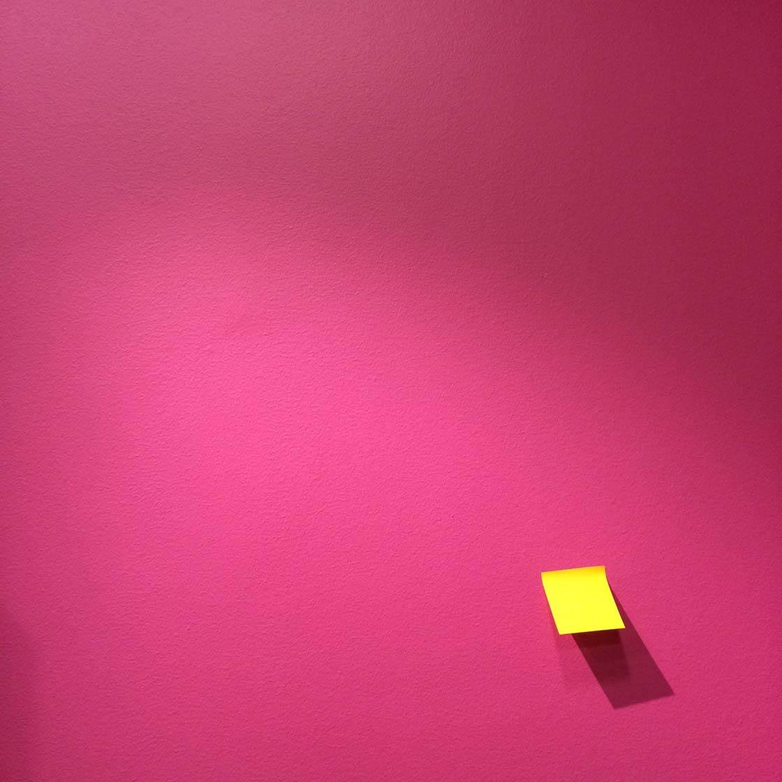
But I’ve always appreciated pictures based on simplicity where a few items, often but not always combined with negative space, tell a small story or have some sort of twist. And I just love color!
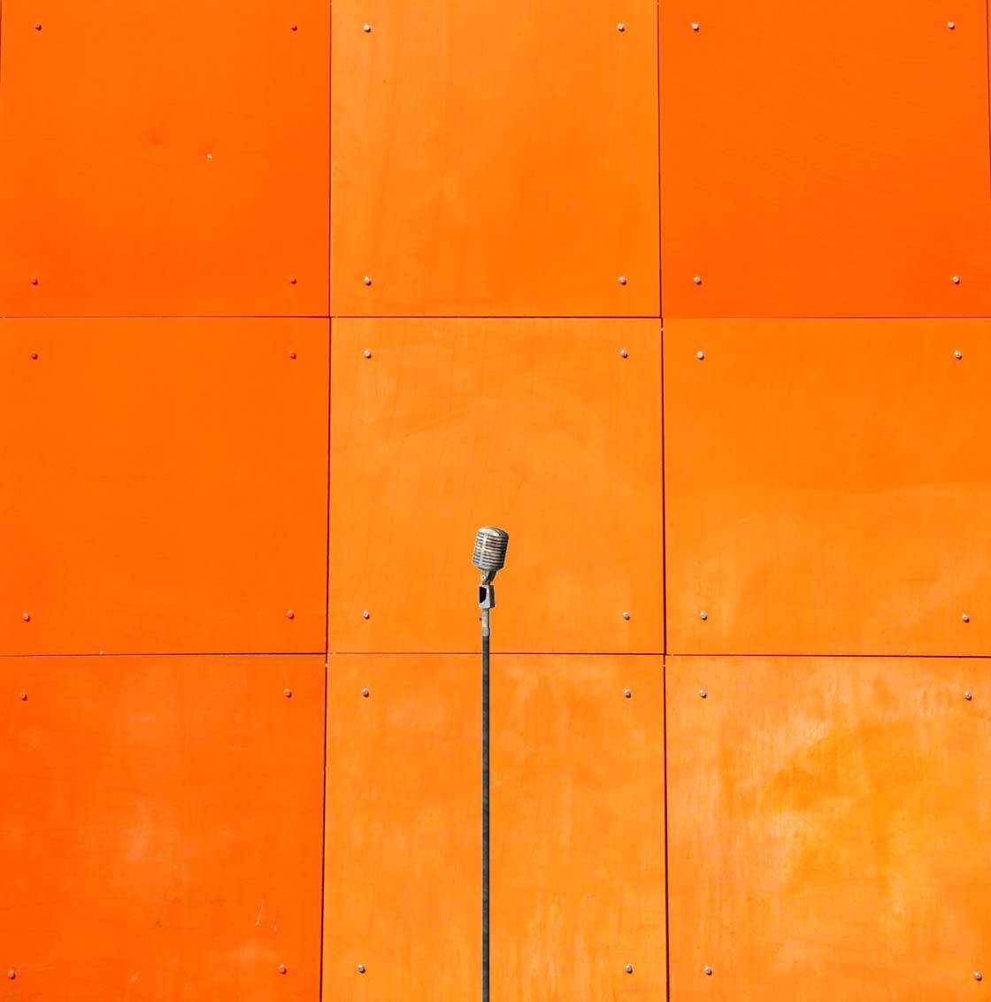
I’ve received feedback from several followers that they like both the colors and the placement of each picture creating a grid. I like that feedback and try to think about it when posting on Instagram.
A lot of your subjects are buildings. Why do you think architecture works so well for minimalist and abstract photography?
I should have been an architect! I admire that profession and there are so many gorgeous, magnificent and minimalistic buildings around the world.
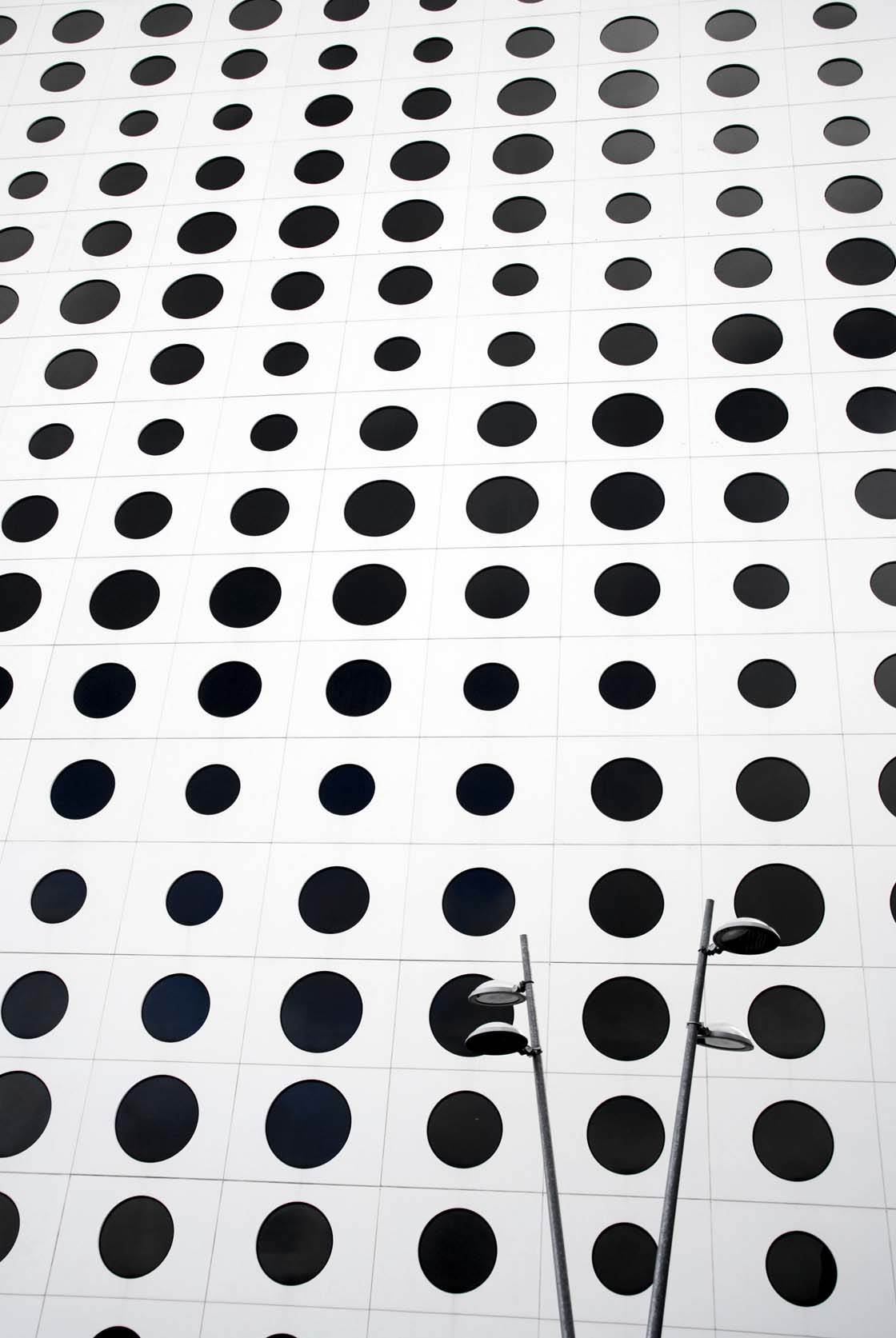
I prefer more urban kinds of building like skyscrapers, or industrial and rural buildings where there’s often an existing minimalist combination of material and colors.
What other subjects work well for this genre of photography?
I would say everything! But the background to the subject needs to be a lot of empty negative space.
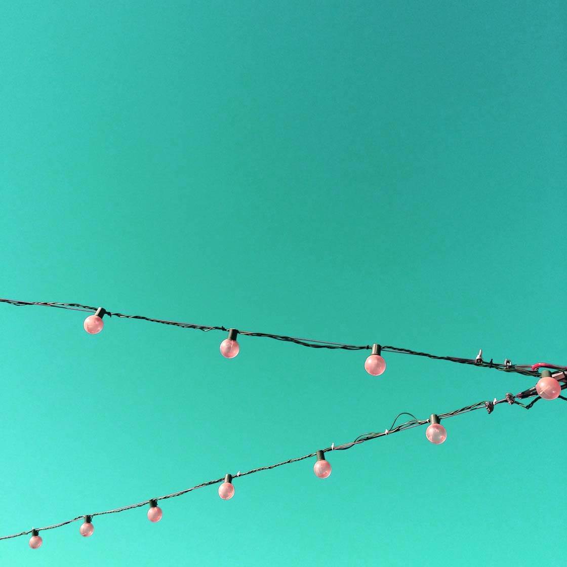
Therefore it’s hard to find minimalistic pictures in nature if there’s no sky or other plain background behind the subject to bring the necessary simplicity to the picture. A single tree is perfect for minimalistic photography, but not a whole bunch of them.
With so few elements in the scene, composition is very important. Do you have tried and tested composition techniques that work for this kind of photography?
This is an interesting question that I’ve been asked many times. A lot of people think that composition isn’t that difficult in minimalist photography. This is true in a way, but it’s maybe not as easy as you might think.
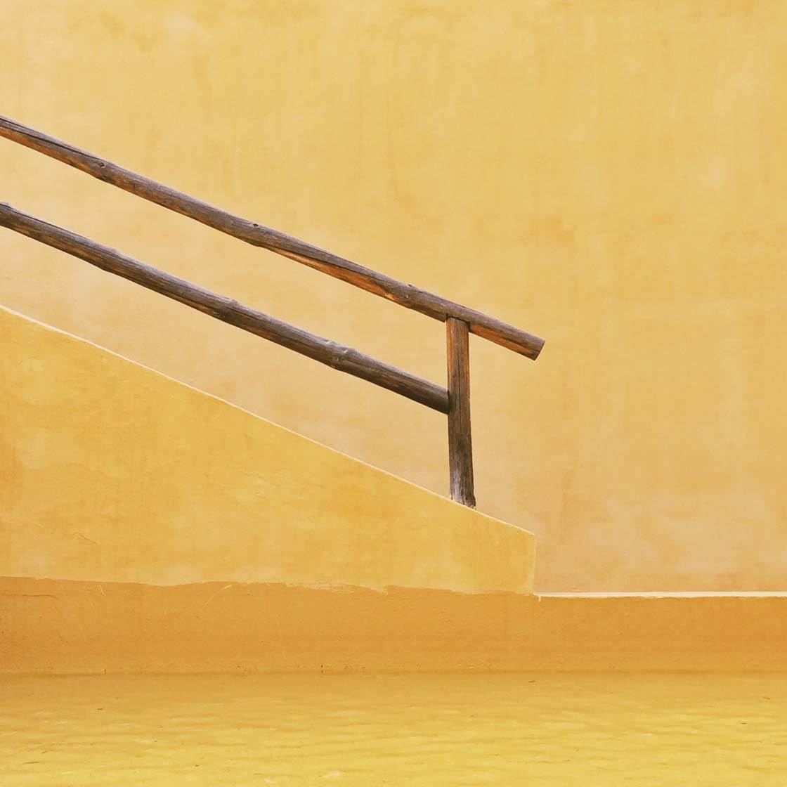
The trick is to eliminate as much as possible from the picture, and only keep the absolute necessary elements in the frame to maintain the viewer’s interest. Or as Douglas Horton put it, “The art of simplicity is a puzzle of complexity.”
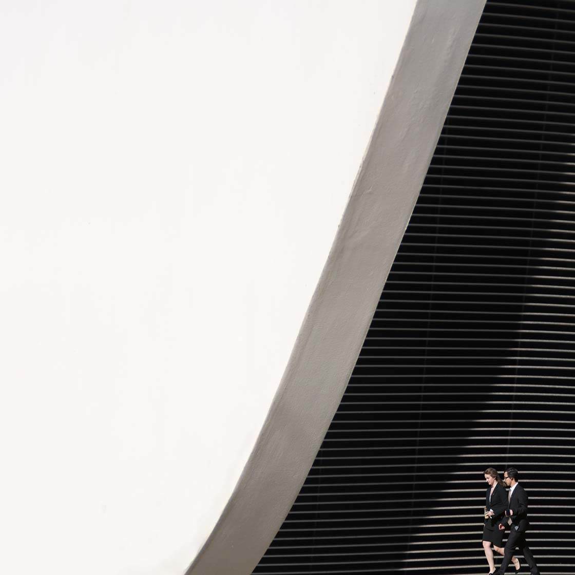
I often exclude even more objects or distracting elements in the editing process in order to get the ultimate feeling of simplicity, but lately I’ve also started to add things in during post-processing.
Many people worry about including a large amount of empty space in their photos. How important is this in your genre of photography?
In my opinion, negative space is one of the most under-rated aspects to consider when taking photos. This is true generally speaking, and especially when it comes to my genre of course.
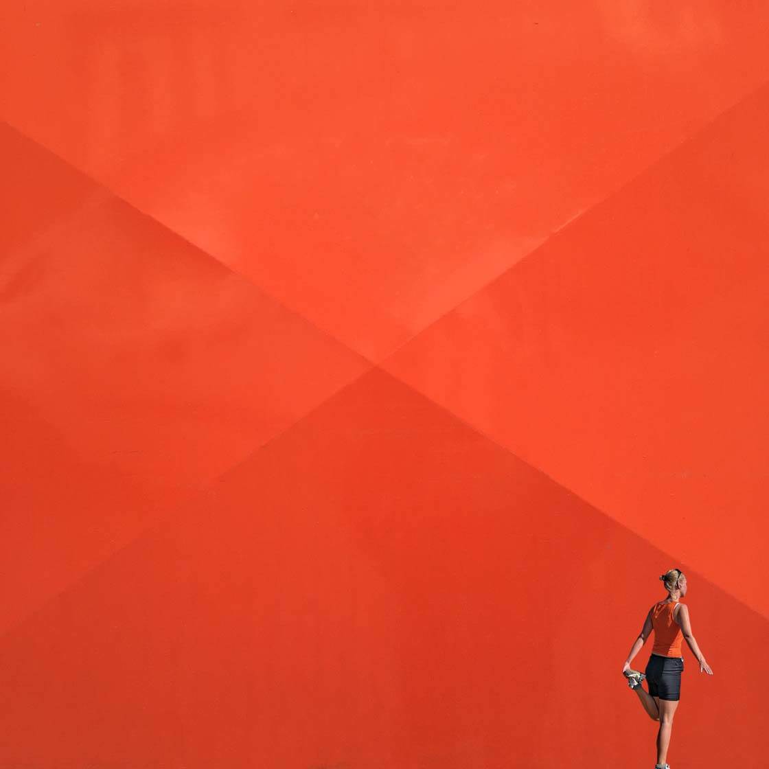
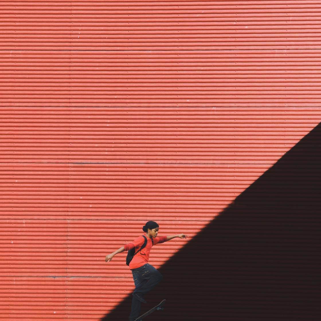
I love seeing negative space in a variety of different kinds of picture, for example, it’s extremely powerful in sport photography. A combination of negative space and a lot of action often creates great pictures!
What are your top tips for taking better minimalist and abstract photos with the iPhone?
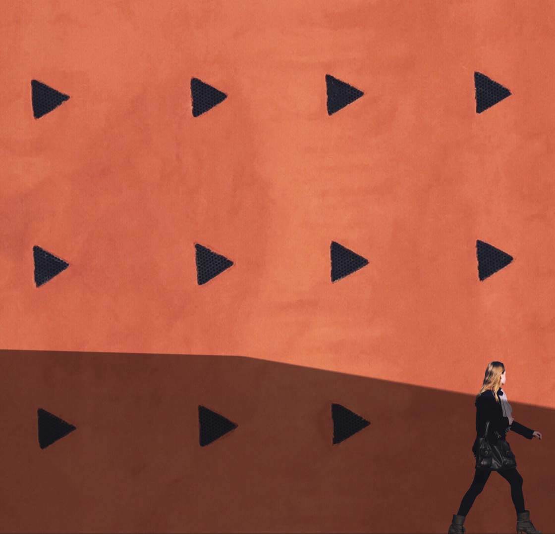
Dare to using negative space with a twist. A single lamppost might not be that interesting, but if it has a shadow it becomes more interesting for the viewer. And don’t be afraid of colors – the more the better!
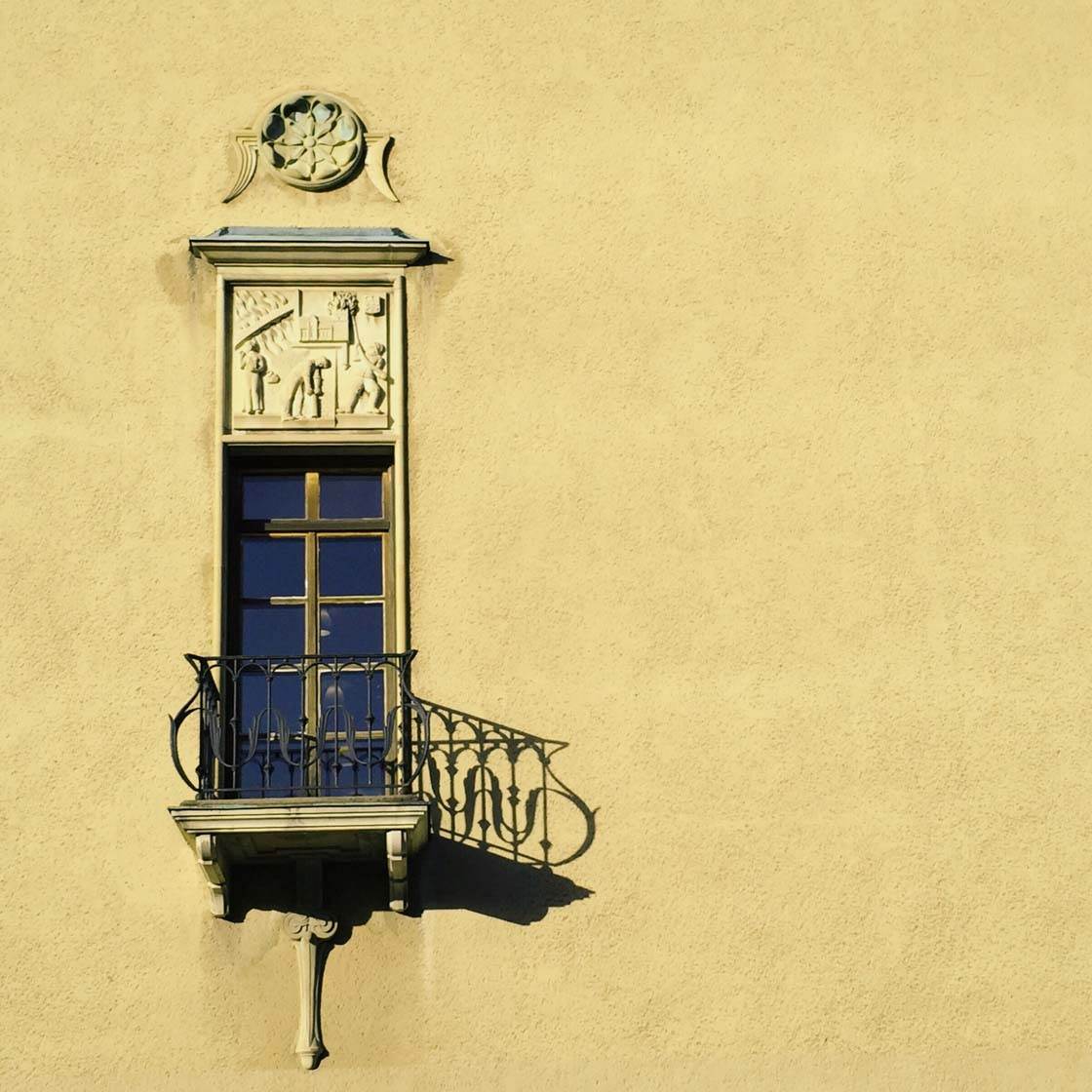
I try to set a limit of one to three items in my photos. More than that makes the picture less minimalistic in my opinion, but on the other hand a lot of repeated objects can also be quite abstract.
Let’s talk about photo apps. Are there any apps that you use for taking photos besides the native camera app?
I always use the native camera app for taking photos. I’ve tried some other apps for taking pictures but I come back to the native camera app every time.
What are your favorite apps for post-processing?
When I first started taking photos I rarely edited the image. I thought the editing apps back then overdid it. But the apps today are much more developed and now I edit almost all of my pictures.
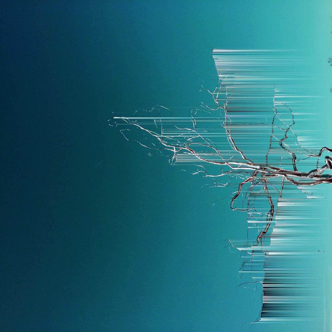
I mainly use apps like Pixelmator for iPad, Snapseed, VSCO Cam, Fotograf, Reflect Mirror Camera, Color Splash and Repix. Occasionally I use Decim8, Matter and Mextures.
Do you use any iPhone photography accessories?
No I don’t. I have a small stand for the iPhone somewhere but I’ve never used it.
Can you briefly explain the story and editing process behind your three favorite iPhone photos?
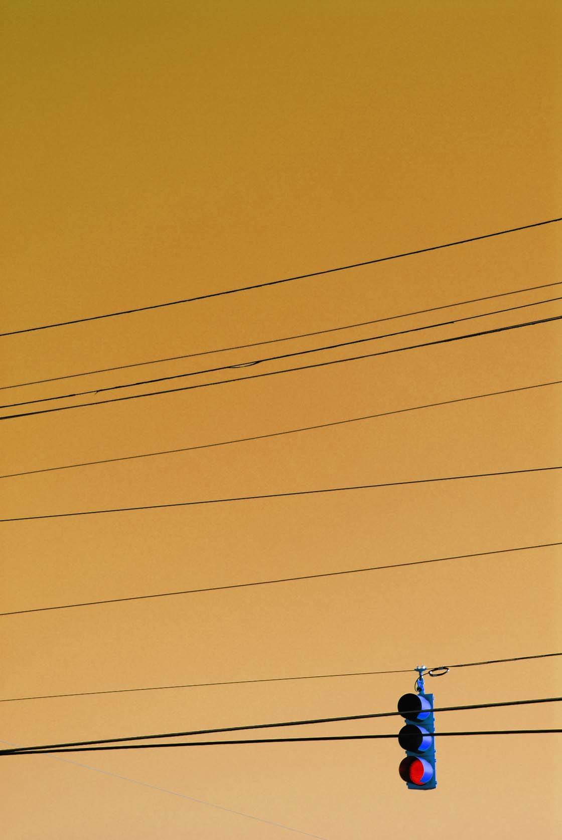
This photo was taken when I was on vacation in the USA. We were out driving when we stopped at a traffic light, and I suddenly saw this scene that I wanted to photograph.
I was able to take three or four photos before the light turned and we had to drive away. I edited it briefly using the Snapseed photo editing tools. And I used Color Splash to make the sky more yellow.
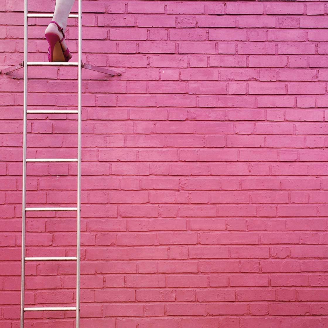
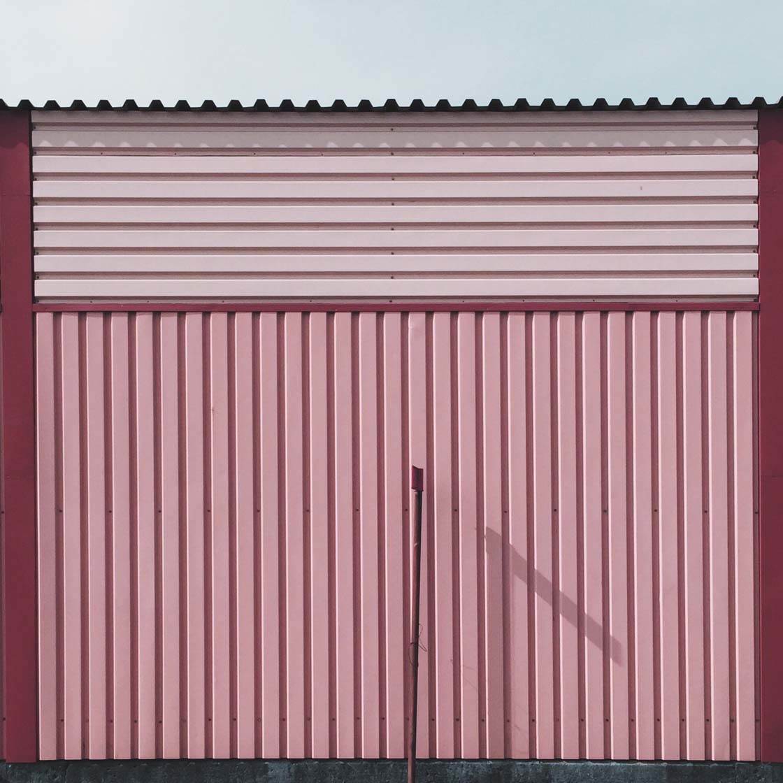
The original wall in this picture is a nice red, but I wanted it to be more ”girly” so adjusted the color using Pixelmator.
I’ve received many questions about the lady on the ladder, but there is no lady there… the foot was added into the photo afterwards in post-processing.
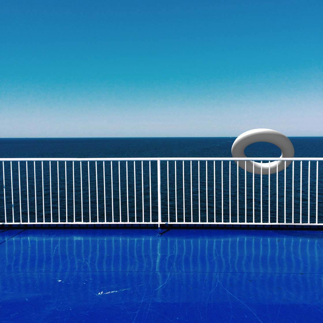
I took this photo one hot summer’s day on the ferry between Sweden and Denmark. I almost posted it on Instagram as it was, but someone had just recommended the Matter app and I started to play with it. I liked the app and added the lifebuoy, giving the picture a whole new dimension.
What tips do you have for beginner iPhone Photographers who want to start taking more creative photos with their iPhone?
Think outside the box and always try to get into the opposite perspective. When you’ve shot the dandelion in backlight, the single lamppost or the power line in sunset, try to think of new perspectives and ways of taking pictures.
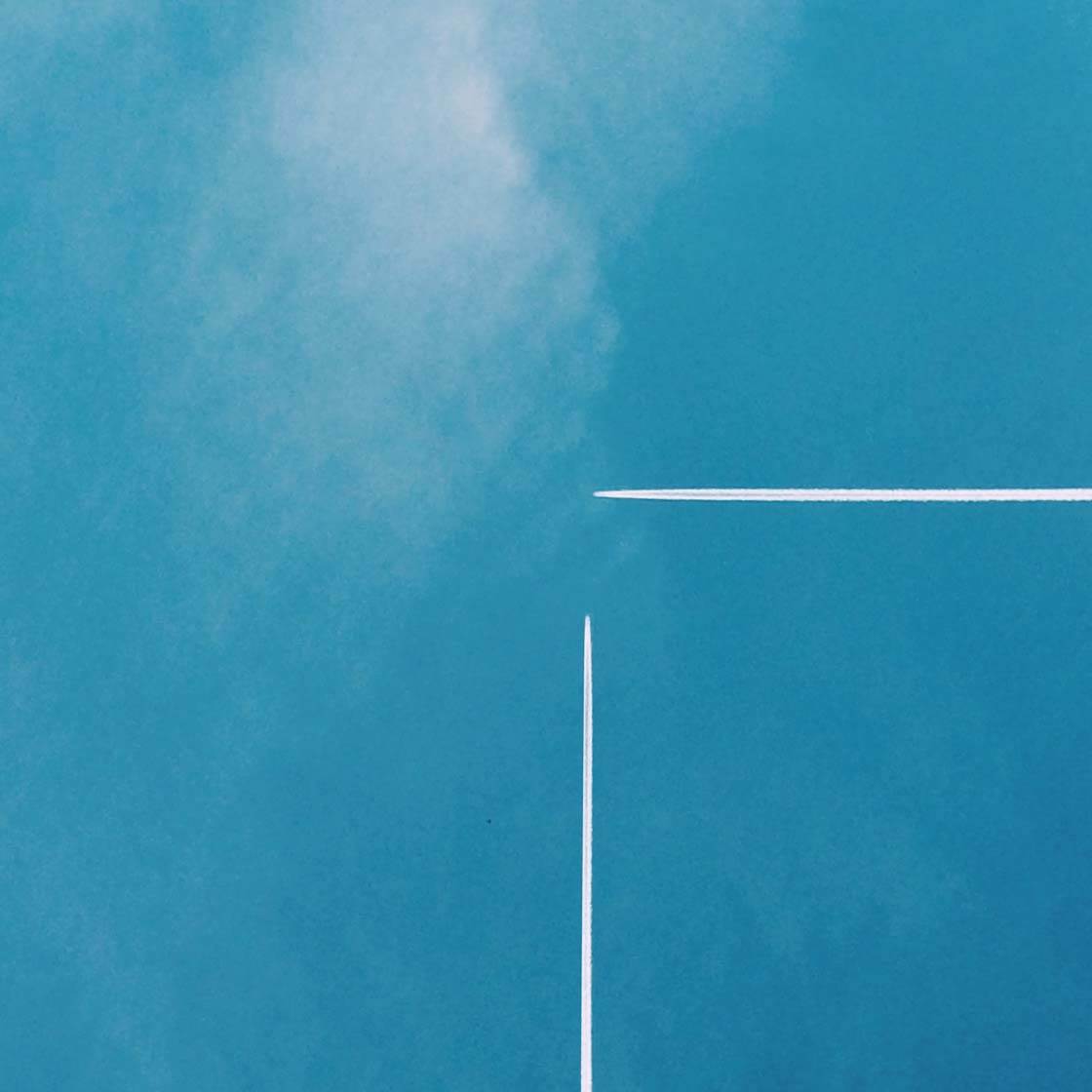
What happens if you get closer to the object? Are there any cool shadows around? What can be added into the picture to tell a small story?
Which iPhone photographers do you admire the most?
Some of my favorite photographers are Jeanette Hägglund (@etna_11) from Sweden (check out our interview with Jeanette), Diletta (@ladile) from Italy, Marina Tamsol (@marinatamsol) from Sweden, and Huxster (@huxsterized) from Malaysia.
Where can we see your iPhone photography?
You can find my pictures on Instagram @marcuscederberg or at Twenty20: www.twenty20.com/marcuscederberg

Awesome interview! So great to read about you and your process, Marcus!
Many thanks Eric
Great gallery and tips.
Thank you so much !
Loved this interview – what stunning work! Thanks for sharing.
Glad you enjoyed it Geri! I really love minimalist and abstract photography.