I’ve recently had the pleasure of chatting to Charlie Read, an incredibly talented photographer who takes wonderful iPhone street photos. With a background in visual arts, he captures stunning light and powerful compositions that tell compelling stories of a particular moment in time. In this interview, you’ll learn more about Charlie, and how he shoots such creative iPhone street photography.
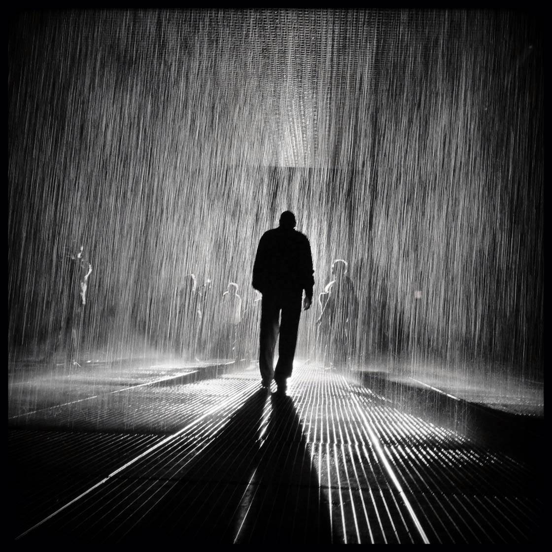
Tell us a little bit about yourself.
I’m a Creative Director at an agency specializing in Strategic Communications and Creative Services (marketing communications, training and development, meetings and events, and experiential design).
I live in New Jersey and commute to work in Manhattan’s west side. I majored in the visual arts in college while studying architecture, design, painting, photography and art history.
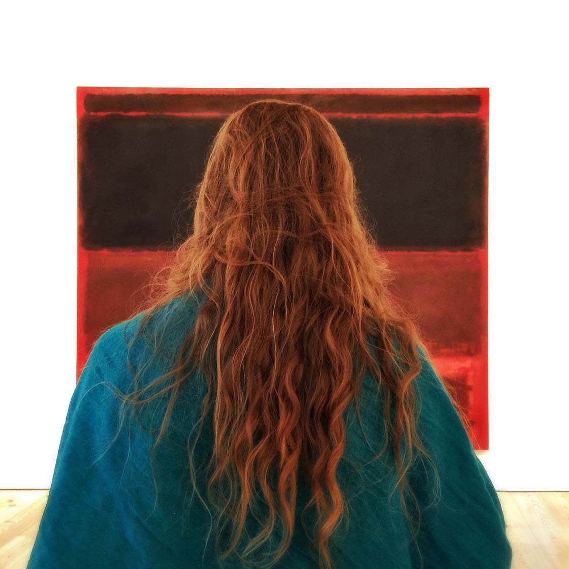
How did your iPhone photography journey begin?
It began with the launch of the iPhone 4S in late 2011. Before that, I enjoyed doing a little mobile photography with my Blackberry device, which took some surprisingly decent photos.
I’ve been keenly interested in photography ever since my 6th-grade science teacher set me loose in a darkroom. So having all of the tools available – right there in my pocket – felt very empowering.
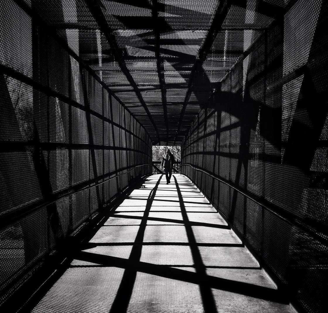
What inspires you to take photos with the iPhone?
I can be inspired anytime and anywhere by what I see around me. Light always inspires me. Great art and architecture inspire me.
I always have my phone with me, but rarely my “real” camera, which seems to validate that cliché we’ve all heard: What’s the best camera? …It’s always the one you have with you!
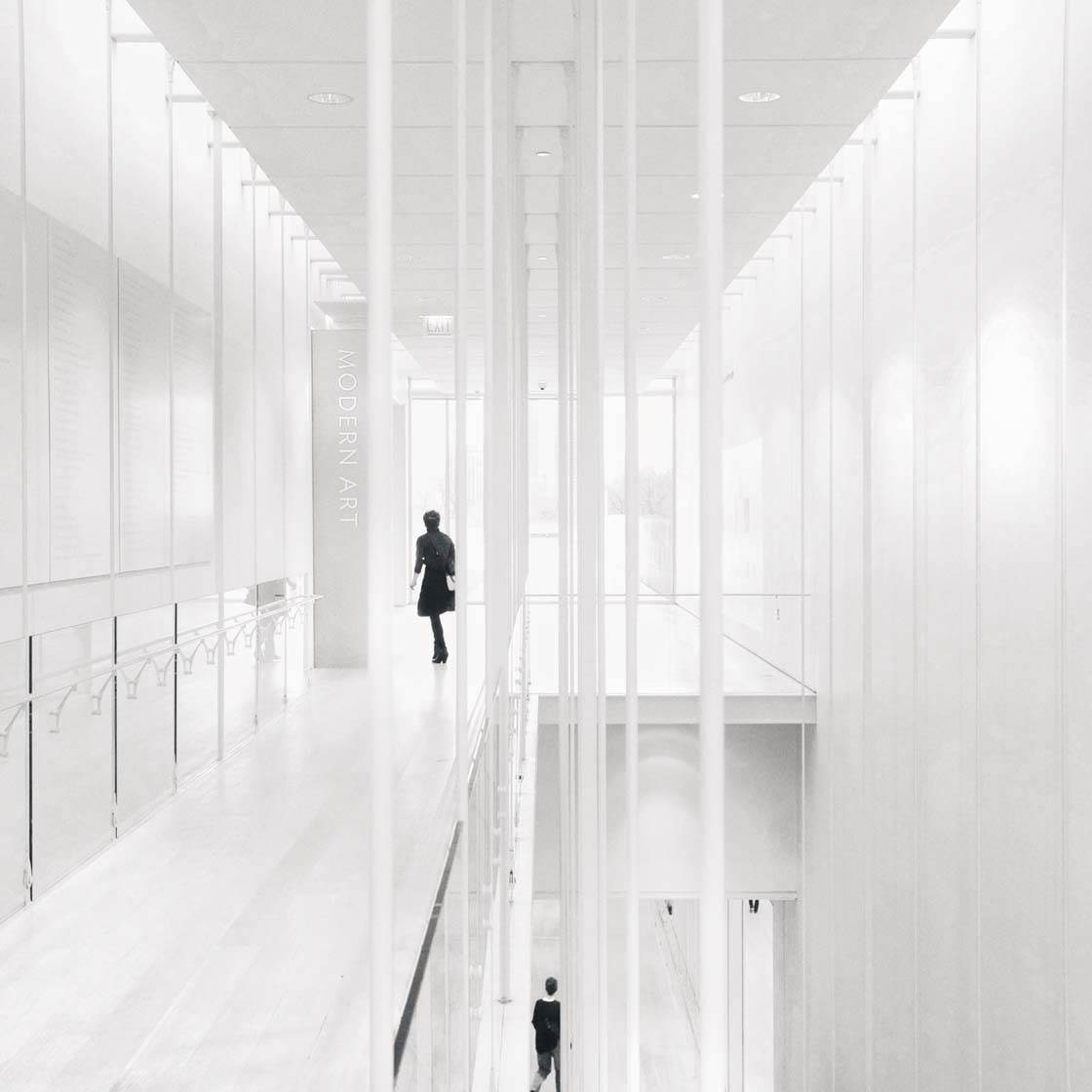
Do you have a favorite photography genre or do you like to experiment with different styles and scenes?
My personal bias is for un-staged shots of moments that actually occurred (no added elements or compositing of images in post-production).
For me, that’s a good, working definition for “street photography” – even when a shot isn’t taken in an urban setting or on a street, per se.
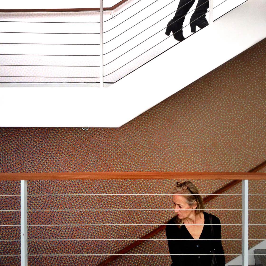
That said, I’ve enjoyed experimenting in different genres since I got started on Instagram early in 2013 and was exposed to such a rich variety of styles, approaches and apps.
It’s fun to play around, and the tools are so powerful!
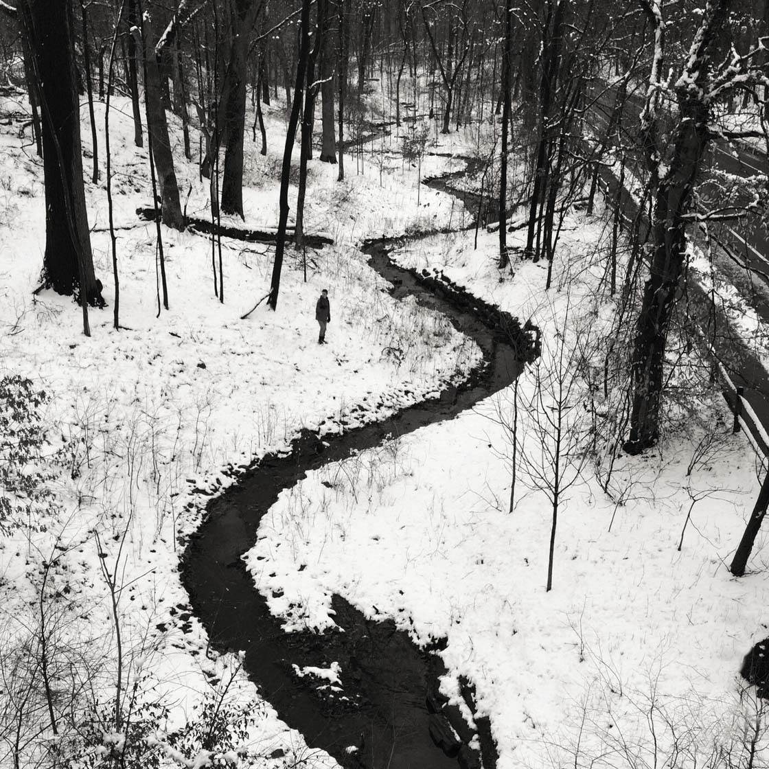
You mostly shoot in urban locations, capturing wonderful photos of buildings, architecture and street scenes. What draws you to this kind of photography?
There are a couple of reasons I gravitate to this type of subject matter – the simplest being that I spend more time in built environments than I do in natural environments because of where I live and work.
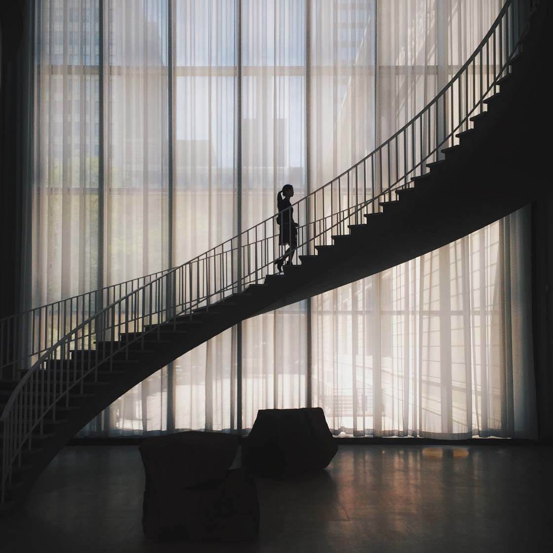
Another reason I’m drawn to architectural subjects and space is that I studied architecture, graphic design, and the visual arts in school.
So I’ll always seek out great architecture and public spaces (especially art museums) whenever I travel, whether for work or for play.
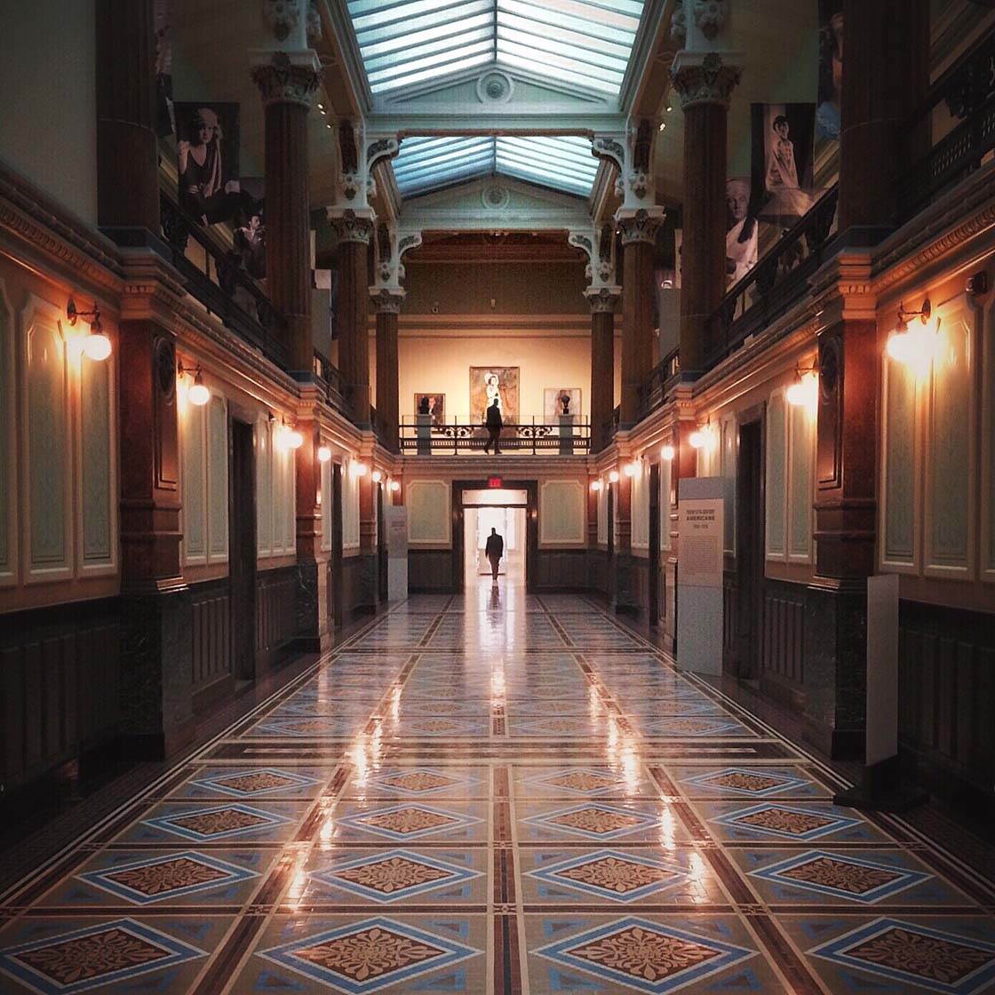
You have an amazing eye for composition. What are your top composition tips for anyone who wants to create more powerful and eye-catching images?
I studied graphic design and worked professionally as a designer and art director for many years.
So I believe pretty strongly that the best way to “learn” composition is by studying images that are well balanced and whose elements hold together well.
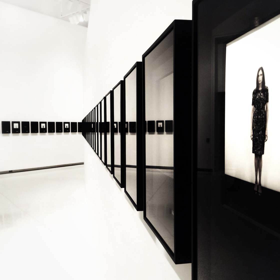
I look for picture elements that achieve an asymmetrical balance and create a kind of visual tension – near vs. far, large vs. small, center vs. edge, straight vs. curve.
Design principles like the rule of thirds can be very useful. Of course you have to know the rules to break the rules… And by all means, break the rules!
But it boils down to looking critically to train yourself, and learning to trust your gut.
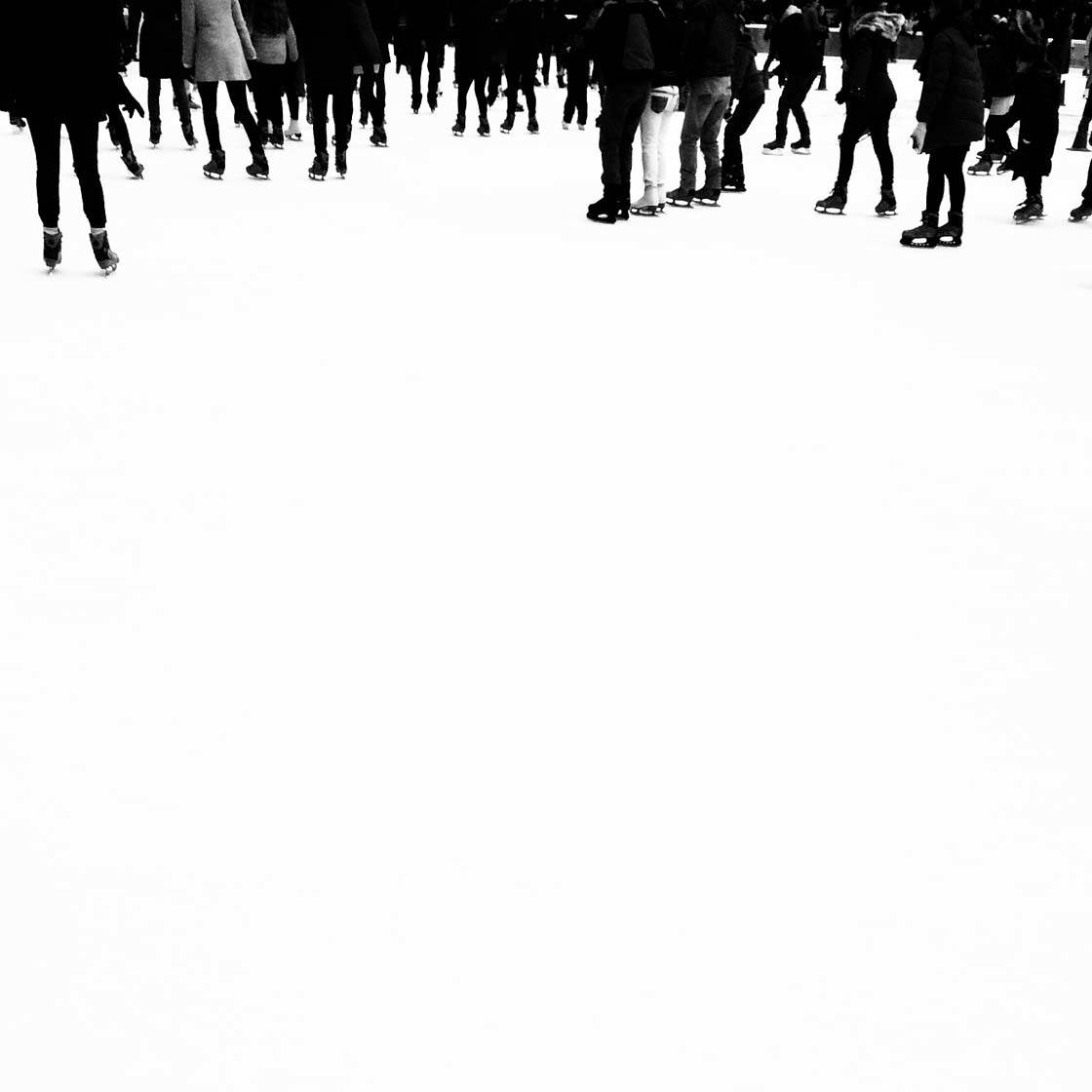
Another bit of advice I’d offer is to really explore the square. While I appreciate Instagram’s recent accommodation for cropping images in portrait or landscape mode, in some ways I preferred being limited to the square-cropped image format.
There’s a lot to learn from really exploring the limitations and possibilities in the simple square – or for that matter, within any given set of limited parameters, whether technical or logistical!
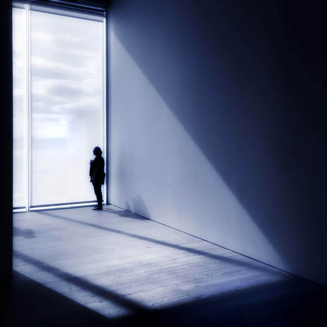
Shooting in urban locations can be challenging because of the busy environment. How do you go about capturing clean and simple photos in busy cities?
You have to give in to the chaos and let it play out in the frame, but here are a few suggestions…
Get up off the ground and shooting from an elevated perspective. Get out early in the day, ahead of the crowds, when the light is often at its best anyway.
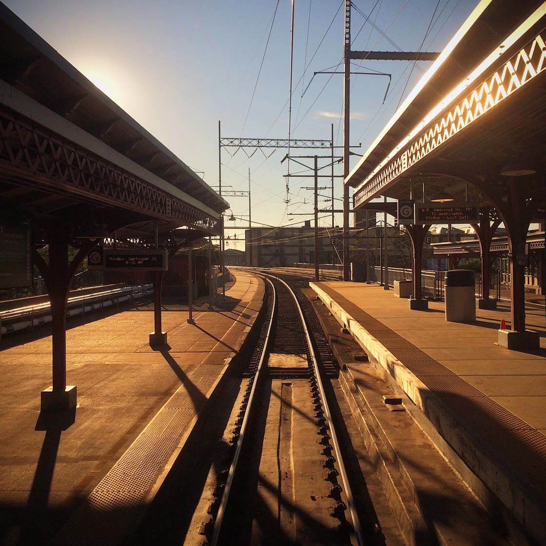
Scout for and seek out spots that are more out-of-the-way. And critically, be willing to spend a lot of time in one spot waiting for something magic to happen in the frame.
Shoot a lot, knowing that just one shot in a hundred might be “the one.”
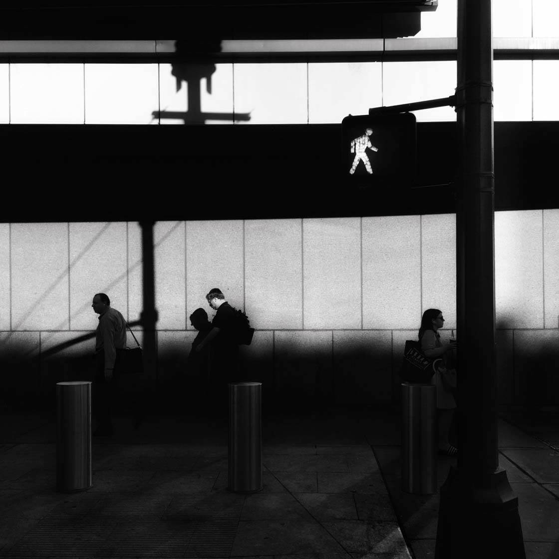
You often include people in your photos. How important is it to include a human element in photography?
It’s pretty important to me personally because of the storytelling aspect of what I’m trying to do. But it’s certainly an individual, stylistic choice.
And it’s very important to point out that there can also be a powerful human element in shots that might not include people in the frame – but in which their presence or actions can be powerfully felt or seen. And it’s often been said that buildings can have souls!
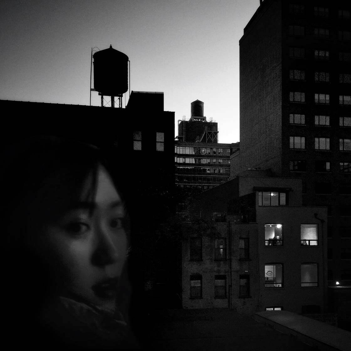
As a moderator for various hubs on Instagram, I’m always on the lookout for the deeper stories told in images – human relationships, motivation, desire, opposition, and so on.
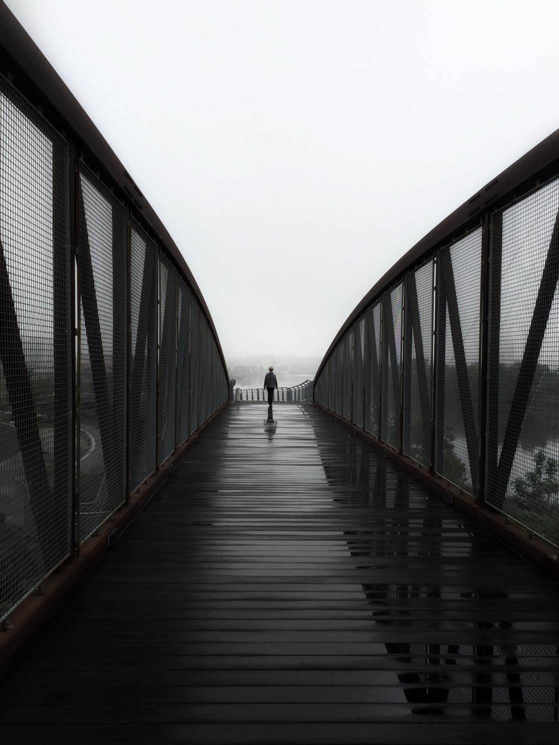
I was recently struck to discover that of my nine “most liked” images on Instagram in 2015, seven featured a lone, small, single human form.
The other two depicted a palpable human presence, even in the absence of the human form. But I suppose I shouldn’t have been surprised.
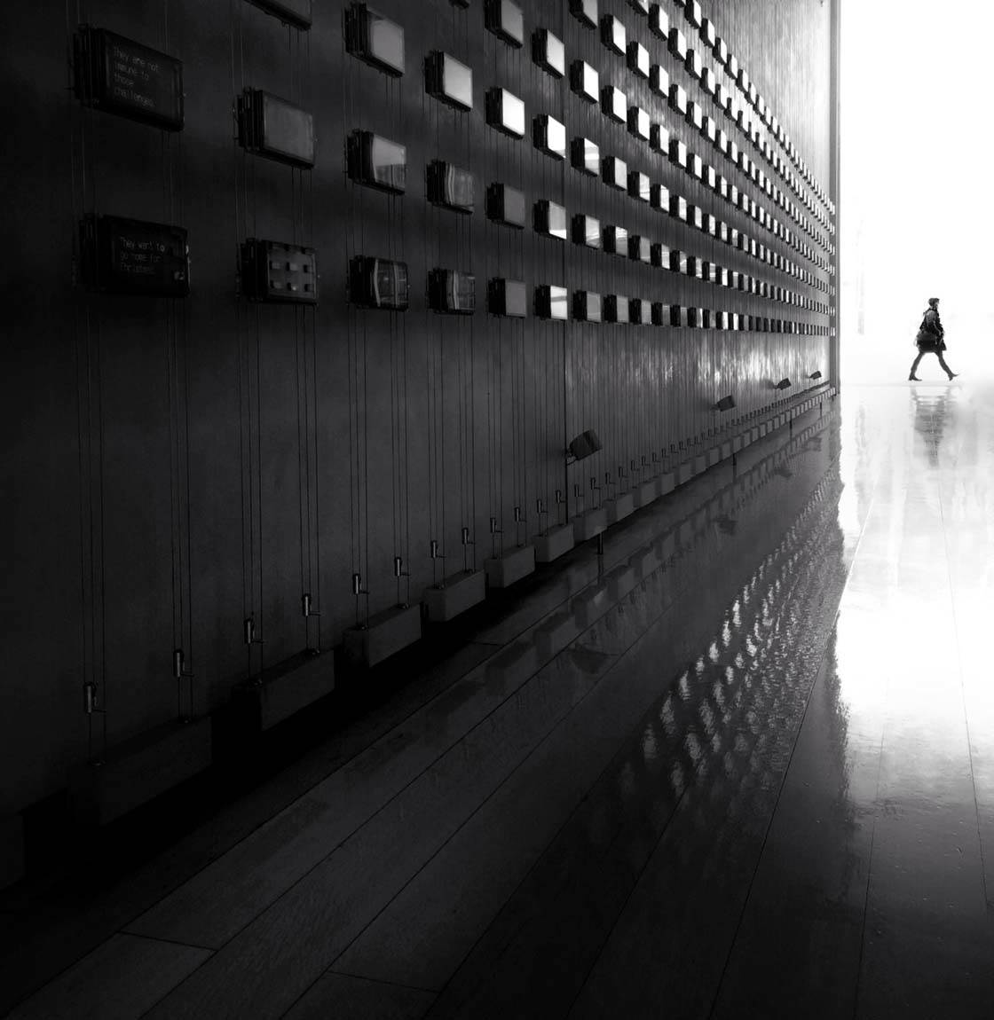
Your Instagram feed is a mix of color and black and white photography. What elements do you consider important for a black and white edit to be effective?
So interesting that you should ask that! Many people separate B&W and color into different accounts on Instagram, but I’ve always felt a strong urge to try to integrate the two.
When I studied photography in school and had daily access to a darkroom, it was “all B&W all the time” because of cost.
Also, there was an existing bias at the time that B&W equates to fine art photography, and color is for commercial photography. But with the digital tools available today, you have access to any and all options.
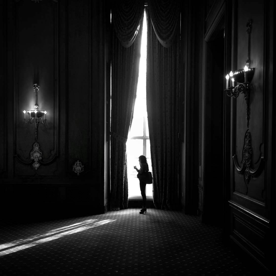
For a long time, I challenged myself to post B&W and color alternately in my feed. I liked the pattern that it created in the grid.
But more importantly, I found that it slowed me down and got me thinking a little more deliberately about which shots lent themselves to color vs. B&W treatments.
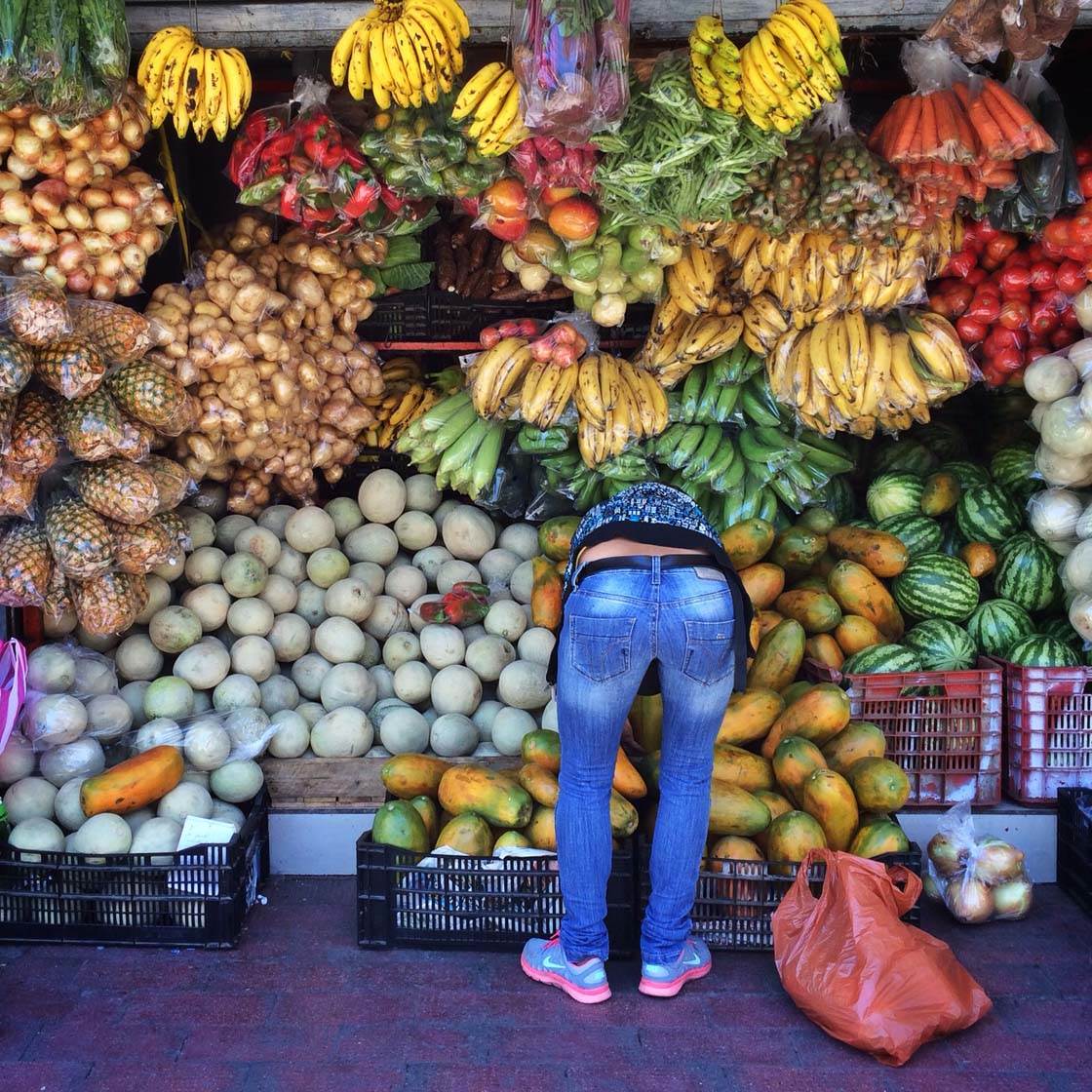
There are several factors that go into deciding whether I desaturate an image entirely to create a B&W image.
Sometimes it’s simply that the color temperature of the shot is off, or is a mix of natural and artificial colors that’s distracting. Sometimes strong colors aren’t working well together in the same shot.
Sometimes the subject of the photo is more the light itself, or the way it creates strong textures or patterns, and these qualities can be isolated or accentuated better in B&W.
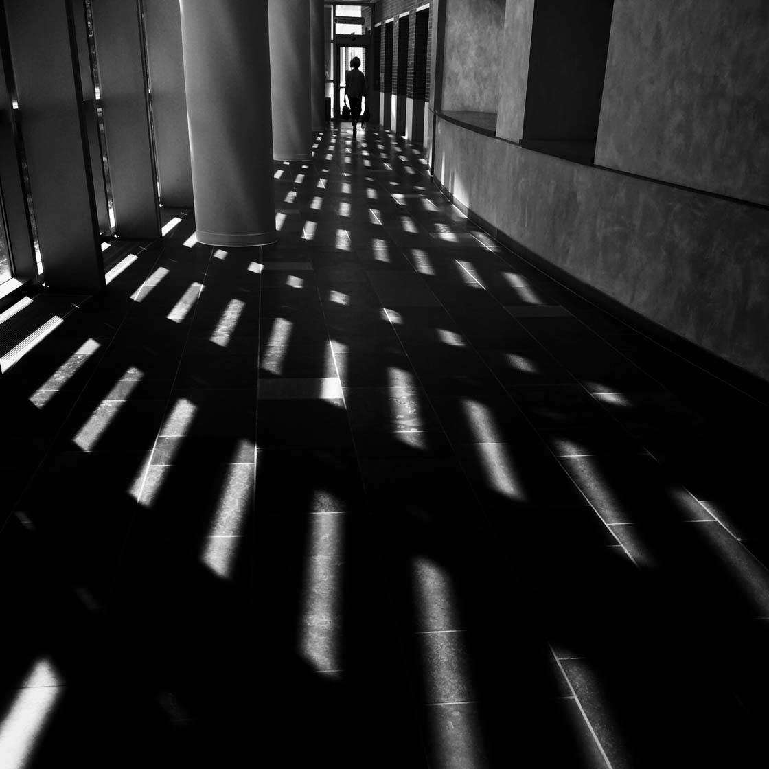
And then again, honestly, it’s often just a gut feeling. When I do desaturate an image to B&W, I almost always leave about 10% of the color in the mix as it seems to make for richer greyscale tones.
Let’s talk about photo apps. Are there any apps that you use for taking photos besides the native camera app?
I used the original Hipstamatic app for quite a while early on and loved it. I alternated its use with other apps and tools, although I eventually became frustrated with its limitations.
The app has been significantly upgraded over time, and now offers great flexibility and a really excellent in-app camera, so I’ve started experimenting with it again.
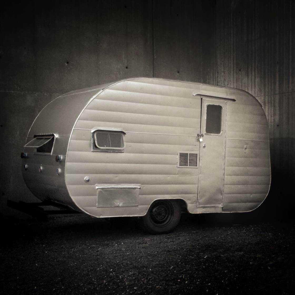
The “Hipsta” model, offering different lens and film choices, takes me back to my darkroom days as a student – without the chemicals!
I’ve also used Top Camera, Camera+ and ProCam. I appreciate the range of controls available in all of these apps, but I’ve always gravitated back to the simplicity of the native iPhone camera as my “go-to” camera app.
What are your favorite apps for post-processing?
I use Snapseed on virtually every shot, but not exclusively. I also use the VSCO app. I like the VSCO filters, especially the ability to dial down the intensity of the effect. I also like the VSCO editing tools for fine-tuning the edit.
Over time, Instagram’s in-app tools and filters have been enhanced and upgraded to approximate many of these same capabilities.
So I find myself using the Instagram tools frequently as well. I’ll often add a tiny touch of “this or that” as a final enhancement just before posting an image in Instagram.
I occasionally use a few specialized editing apps, such as Tadaa to isolate figures in the foreground and create a shallow depth-of-field effect.
Superimpose X can be used to layer elements or add a touch of “texture” to an image. And Luminance is great for adjusting color curves selectively.
I use SKRWT for the occasional bit of straightening and perspective control (although Snapseed and Instagram now offer similar tools), and TouchRetouch to clear up any distracting “blemishes.”
Do you use any iPhone photography accessories?
I occasionally use a mini iPhone tripod and iPhone tripod mount. And I use the iPhone camera’s built-in timer. But I haven’t tried any other accessories, such as lenses.
I like the limitation imposed by using a single, fixed focal length lens (even with a regular camera as well). It requires you to move to adjust your spatial relationship to your subject – to get more physically engaged.
Can you briefly explain the story and editing process behind your three favorite iPhone photos?
Wow, it’s difficult to narrow it down because there’s so much that I associate with each image.
For example, where and when it was taken (and sometimes with whom), plus other factors like the editing process, the caption I’ve written, or even the response that a shot has generated.
All of this is part of the “story” of the image for me. But here goes…
Promises, Promises
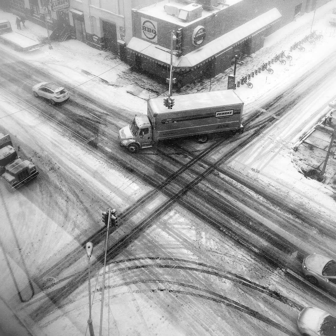
This image was shot as the supposed super-storm “Juno” was bearing down on the northeastern US, threatening several feet of snow early last winter.
It was getting late in the day and everyone had long since left the office ahead of the anticipated blizzard. Light was fading fast as the snow began to fall.
With my hat and coat on, ready to leave myself, I watched patterns form in the intersection of 11th Avenue and 46th Street from the corner of our 5th-floor offices.
I took a few quick shots, doing the best I could to get the photo “straight” and to minimize reflections on the windows, and then made my way home.
The storm ended up veering out to sea and depositing just a few inches of snow, but I think this shot captured the feeling of watching and waiting pretty well.
The image actually required very little editing – all with Snapseed. First, I cropped the photo and rotated it slightly with the Crop and Transform tools, then I used the Tune Image tool to tweak contrast slightly and selectively.
I followed with the Vignette tool to brighten around the edges and give a little more of a feel of a “whiteout.” And finally I sharpened things up just a touch using the Details tools.
Made To Fit
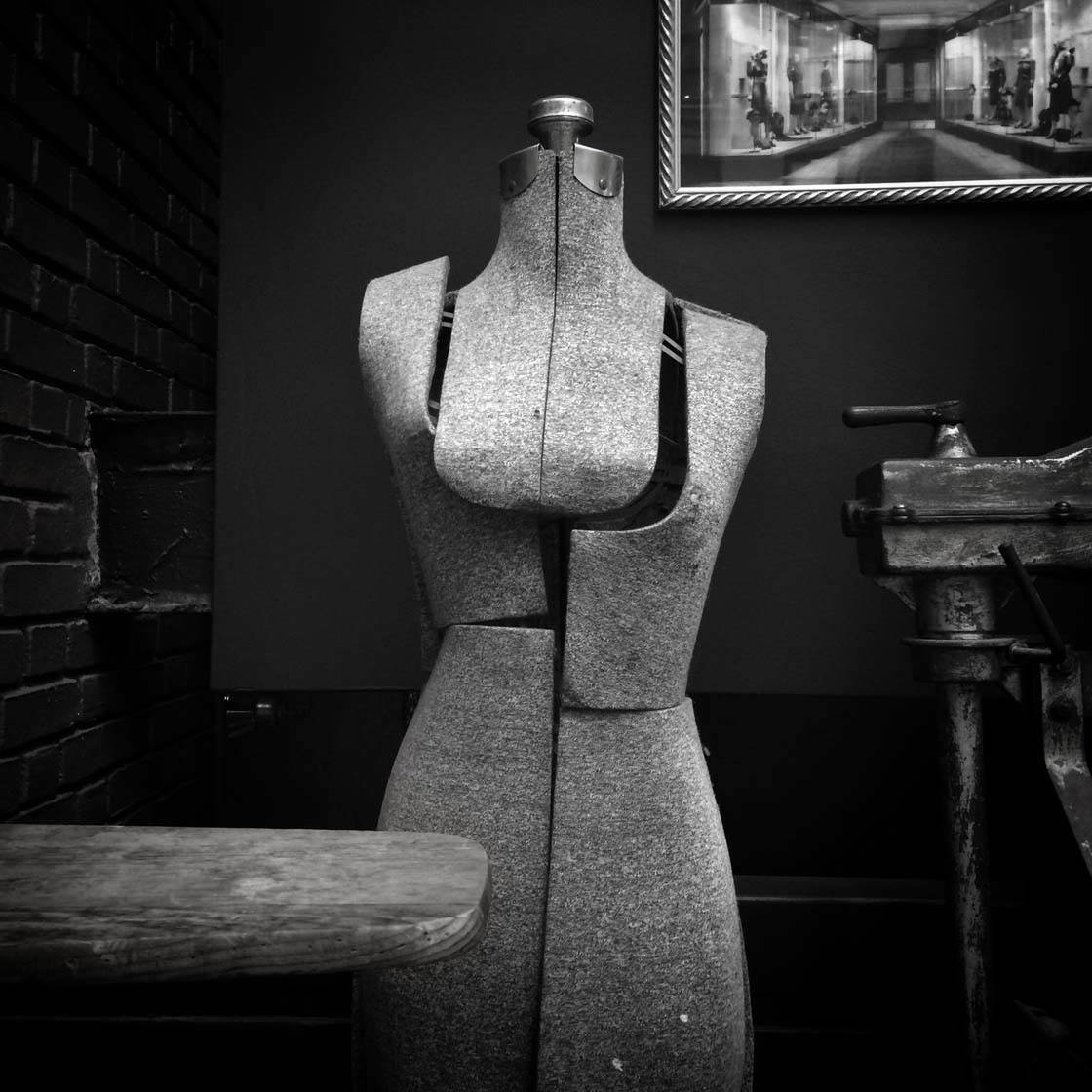
This shot was chosen as a winning image for Instagram’s weekly “Weekend Hashtag Project” (WHP) with the theme of #WHPsmallshops.
My original caption for the posting read: “There used to be hundreds of small shops lining the streets of the Garment District, but this window display (including a photo from the ’30s of a dressmaker’s storefront at this very site) was all I could find left of this lost world at street level today.”
In post-processing, I started by cropping and desaturating the image by about 50% in Snapseed.
Then I tried a series of different iterations in an app I was experimenting with at the time called Vintique, giving the window display a “vintage” look, finally landing on one that added some richness in the cooler tones.
I then opened the image again in Snapseed to work selectively to bring up brightness and accentuate the way the natural light fell on this dressmaker’s dummy.
Due to the exposure this image received on the Instagram front page, it became my most-liked image, and one of the most commented on images in my feed.
Come Closer
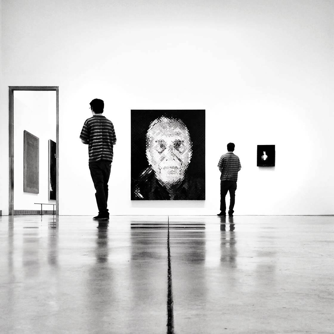
There’s something about this image that only one person seemed to notice and comment on when I posted it. And since it’s also an example of a favorite genre of mine – “the artwatcher” – I’ll choose it for my third “favorite” here.
I came upon this portrait by Chuck Close in a large gallery at the Philadelphia Museum of Art on a quiet day, and noticed it had been hung to align perfectly with the seam in the concrete floor.
So I got down on my hands and knees (museum guards have seen it all by now!) to check the reflections and try to get everything lined up from a low angle – and to wait for an artwatcher to appear.
Finally, this guy showed up and spent quite a bit of time considering the painting from multiple perspectives. I shot about 15 images as he moved forward and back again.
It was only later, as I edited the image I’d selected, that I tried combining two different shots of this artwatcher – one further back, and one closer to the painting.
This actually created a more interesting and faithful rendering of my own experience in this space, over time.
It gave me a chance to learn how to use Superimpose app to create the “double exposure” using parts of two different shots made a few minutes apart.
This editing process was followed by my usual sequence in Snapseed: Crop, Transform, Tune Image (Desaturate, Contrast, Selective).
And finally, I used the TouchRetouch app to clean up a few distracting blemishes, although you can now use the Healing tool in Snapseed to do this.
Do you shoot with any other cameras, and if so, when do you prefer to use the iPhone?
I own a Fuji X100S and enjoy shooting with it whenever I can. But I usually don’t have it with me, so I’m still 85-90% iPhone in my Instagram feed.
The iPhone is generally faster to use and more “forgiving,” so when the light is good or things are happening quickly, I usually still pull out my iPhone even when I have a choice.
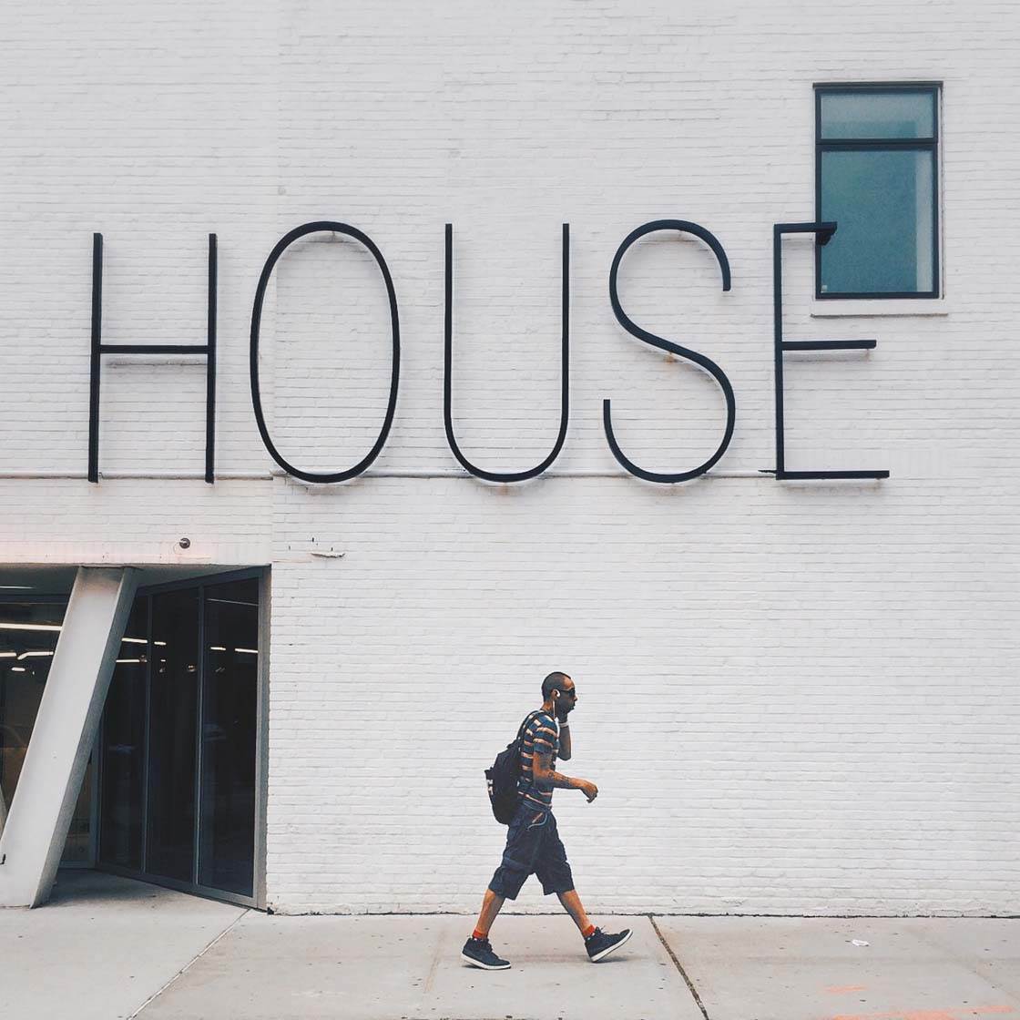
It also has a wider effective lens than the Fuji, which I tend to prefer. And I find that I’ve gravitated to shooting almost everything in a vertical or “portrait” orientation, which the iPhone is particularly well suited for.
Doing so helps me more readily “see” a potential square crop, and it’s the best orientation to use in order to take advantage of Instagram’s ability to post larger shots in portrait format.
You’re a keen Instagramer and member of several great Instagram hubs. What does this online community mean to you, and what effect has it had on your iPhone photography?
Instagram has been a fantastic creative outlet for me personally. Plus, I’m not involved with any other social media or photo-sharing platforms.
I love how “democratic” the platform is. In combination with all of the amazing apps and tools that exist out there, it means that anyone – whether professional, amateur, or rank beginner – can share such amazingly creative output.
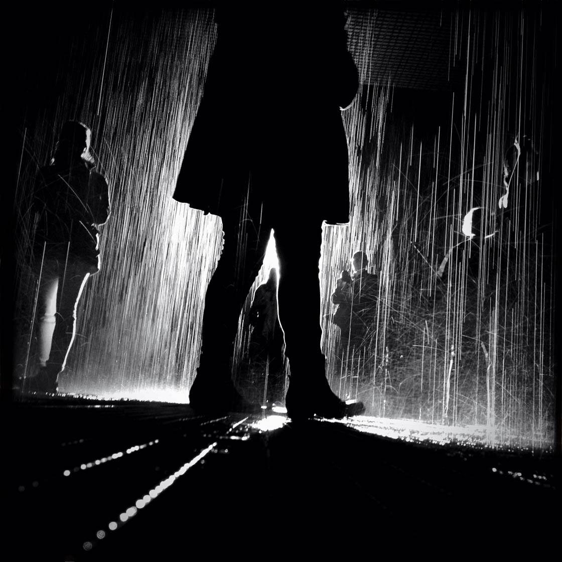
The Instagram hubs I’ve become affiliated with – whether as curator, moderator, or follower – tend to reflect my own interests, and thus offer a sort of targeted slice of inspiration and examples in different genres on a daily basis.
Being actively involved in this way pushes me to up my own game as a photographer, but it goes further than that.
Through my involvement in communities like @artwatchers_united I’m engaged on a global scale with the gallery and museum exhibition scene worldwide on an almost daily basis.
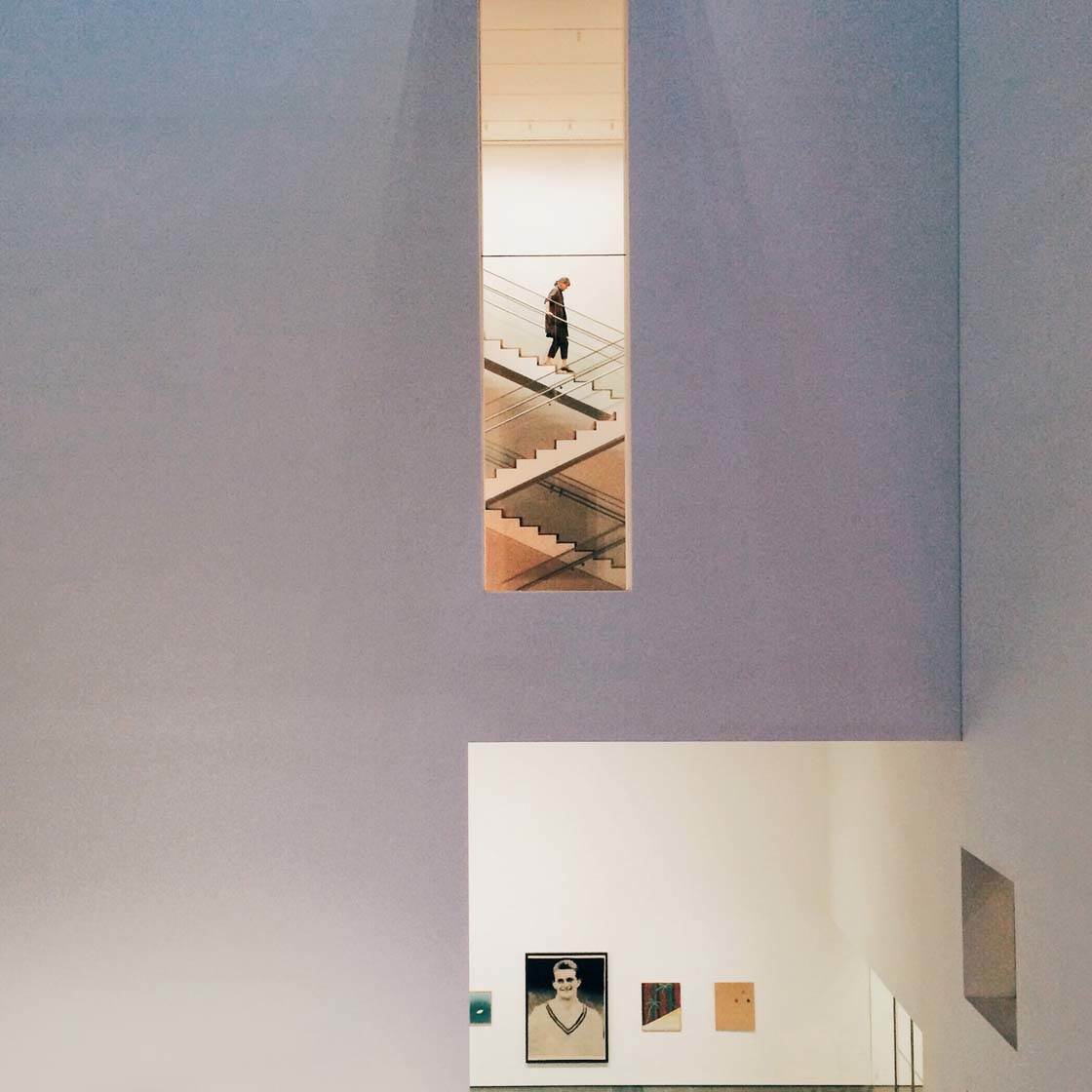
@JustGoShoot offers exposure to up-and-coming artists. In moderating for @Stairwalkers I get to review hundreds of shots from architectural and urban environments each week.
And then there are the black and white hubs that I’m also a part of, which expose me to the best work by artists who focus on B&W photography.
It’s also been incredibly fun connecting with other Instagramers in real life.
What tips do you have for beginner iPhone photographers who want to start taking more creative photos with their iPhone?
I would say, make sure you familiarize yourself with the full capabilities of the iPhone’s camera – especially how to set focus and exposure.
Experiment with as many of the available apps and tools as you have the time (and budget) for, and don’t be afraid to experiment with different techniques.
Seek out great work to study and learn from. Find a few great communities or hubs to become a part of on Instagram.
Many of the communities offer daily or weekly contests and themes that anyone can enter. This can be a good way to get exposure or feedback, as well as see great winning images on a daily basis.
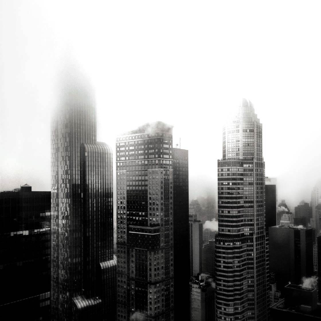
I’ve been a life-long student of the history of photography, and I still jump at the chance to see the work of photographers in galleries and museums whenever I can.
Finally, get out with other photographers to shoot as often as possible.
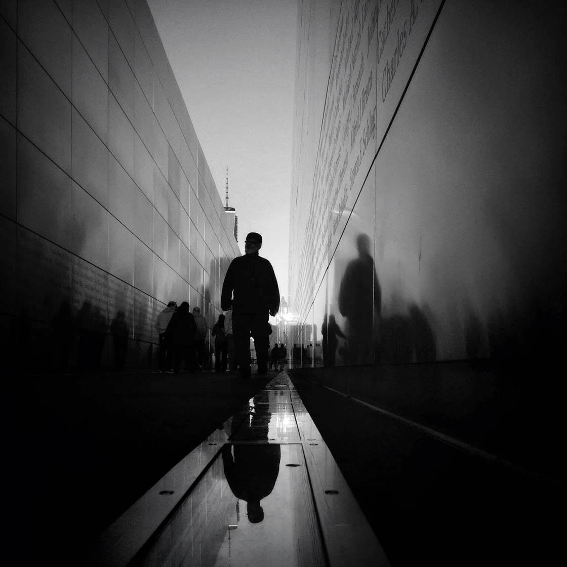
Which iPhone photographers do you admire the most?
Wow, there are so many artists doing such creative work in so many styles.
And there’s so much to admire even beyond the images themselves, including the supportive presence and personas that people bring to Instagram.
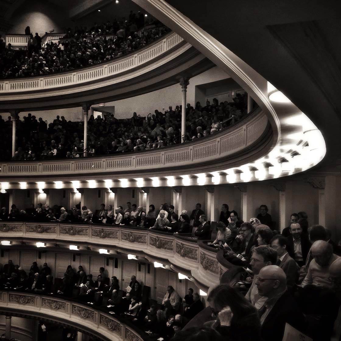
There are far too many to mention them all, but a few who focus more or less exclusively on mobile photography, and who also bring energy, engagement, ideas (and sometimes, even great captions) to the platform and its various communities are:
@emencher, @_soulkitchen_, @janove, @this.kitty, @nyroamer, @tejlgaard, @sunflowerof21 and @elinlia.
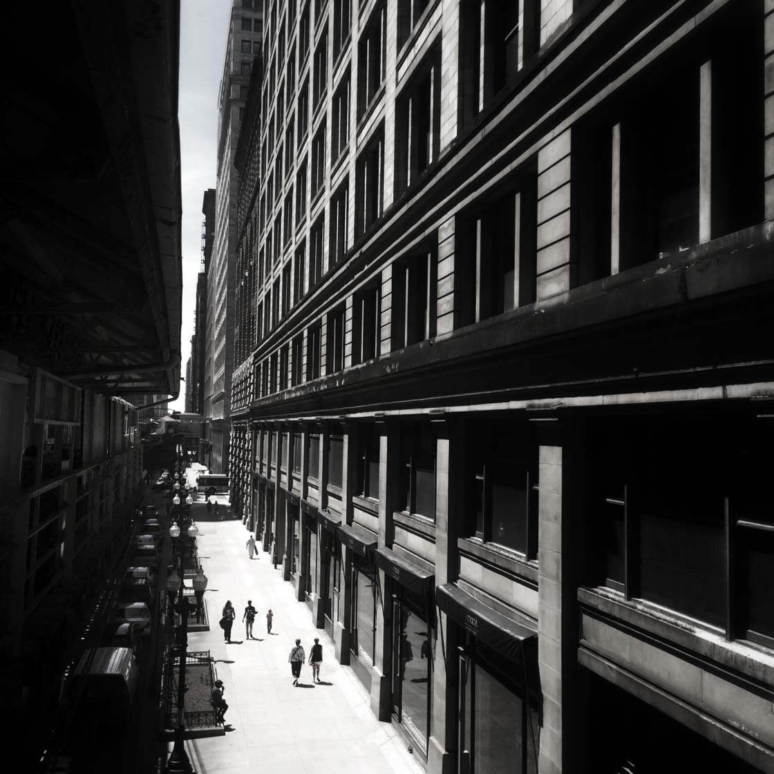
Where can we see your iPhone photography?
On Instagram @chasread – see you there!
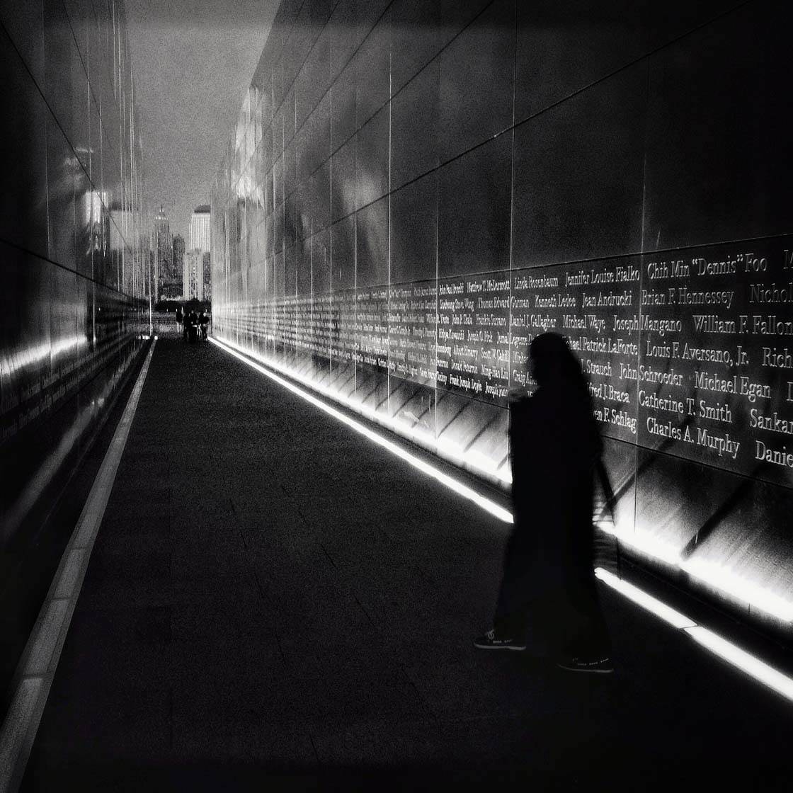

Thank you Charlie for sharing your wonderful photography with us 🙂
I saw this mentioned on FB and had to come here immediately.
I think you and your work are fantastic Charlie, and I really enjoyed reading this. You are one of the most engaged, supportive and encouraging people I have come into contact with through mobile photography.
What a huge happy surprise to see my name mentioned. Blown away!
Elaine
I’m happy to hear that you enjoy Charlie’s work, Elaine. And congrats on the mention! 🙂
iPhone Photography school- Really?