Are you often disappointed with your iPhone architecture photography? Taking stunning photos of buildings may seem challenging. But it doesn’t have to be! You just need to know a few creative shooting and editing tricks. In this tutorial, you’ll discover 10 tips for jaw-dropping architecture photography with your iPhone.
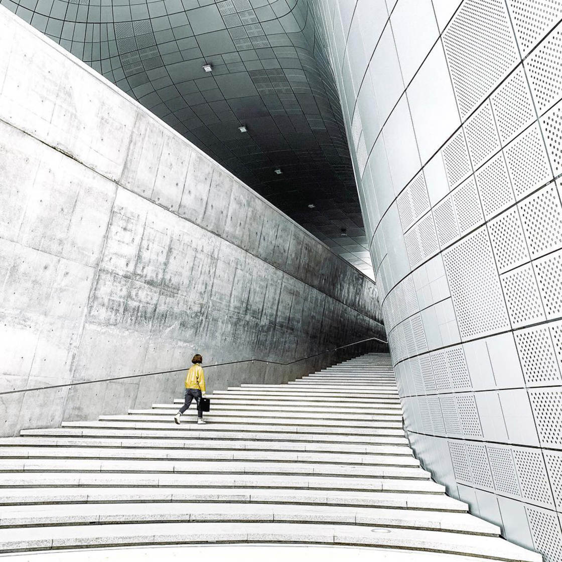
1. Focus On Strong Elements Of Design In Architecture
How do you approach architecture photography more creatively?
How do you capture awe-inspiring photos of buildings that really stand out?
You make use of architecture design elements when composing your shot.
Classic elements of design in architecture include lines, symmetry, geometric shapes, patterns, and colors.
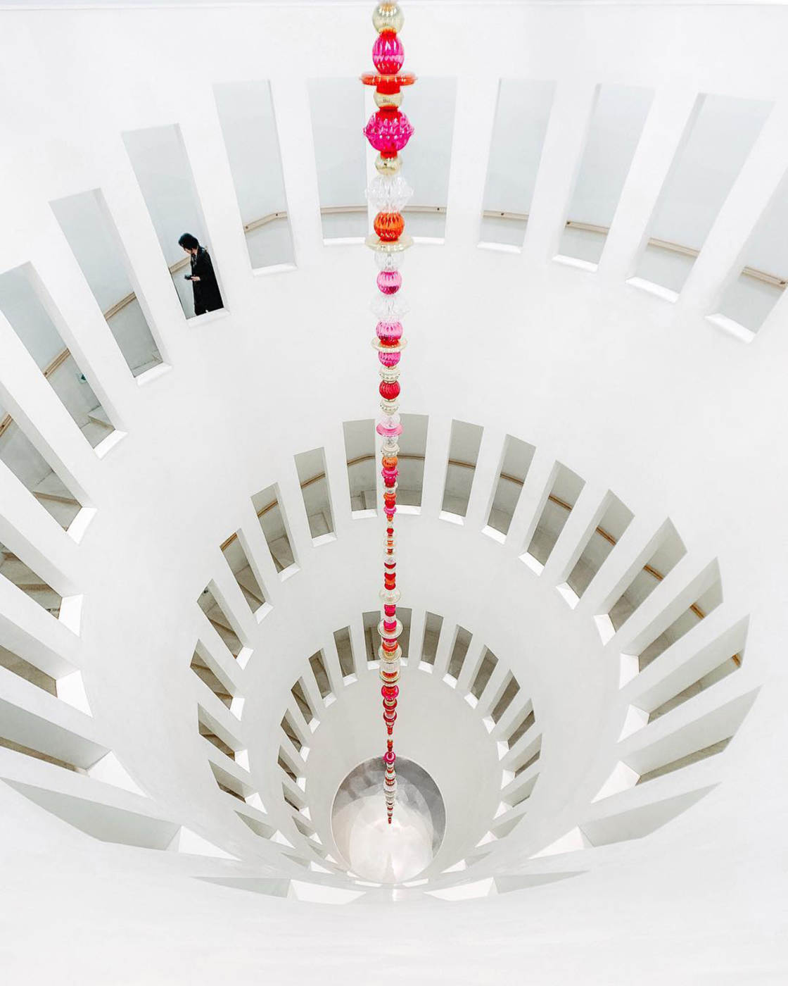
All of these elements are perfect for creating striking compositions.
So the first step to incredible iPhone architecture photography is to look carefully at the building.
Which architecture design elements can you see?
Do you see lines running horizontally, vertically, or diagonally?
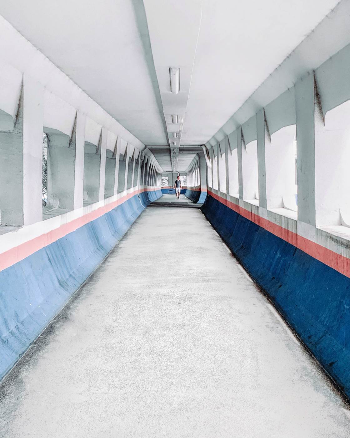
Does the building have perfect symmetry? Or is there a particular feature that’s symmetrical?
What shapes can you see? What colors stand out?
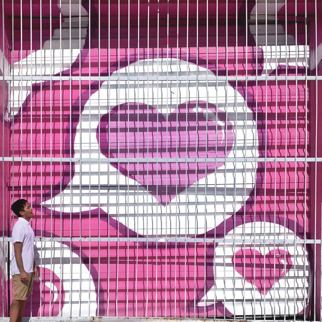
Can you see any repeating patterns in the design of the building?
Modern buildings tend to work well for architecture photography. But once you start looking, you’ll see design elements in every building, whether it’s old and new.
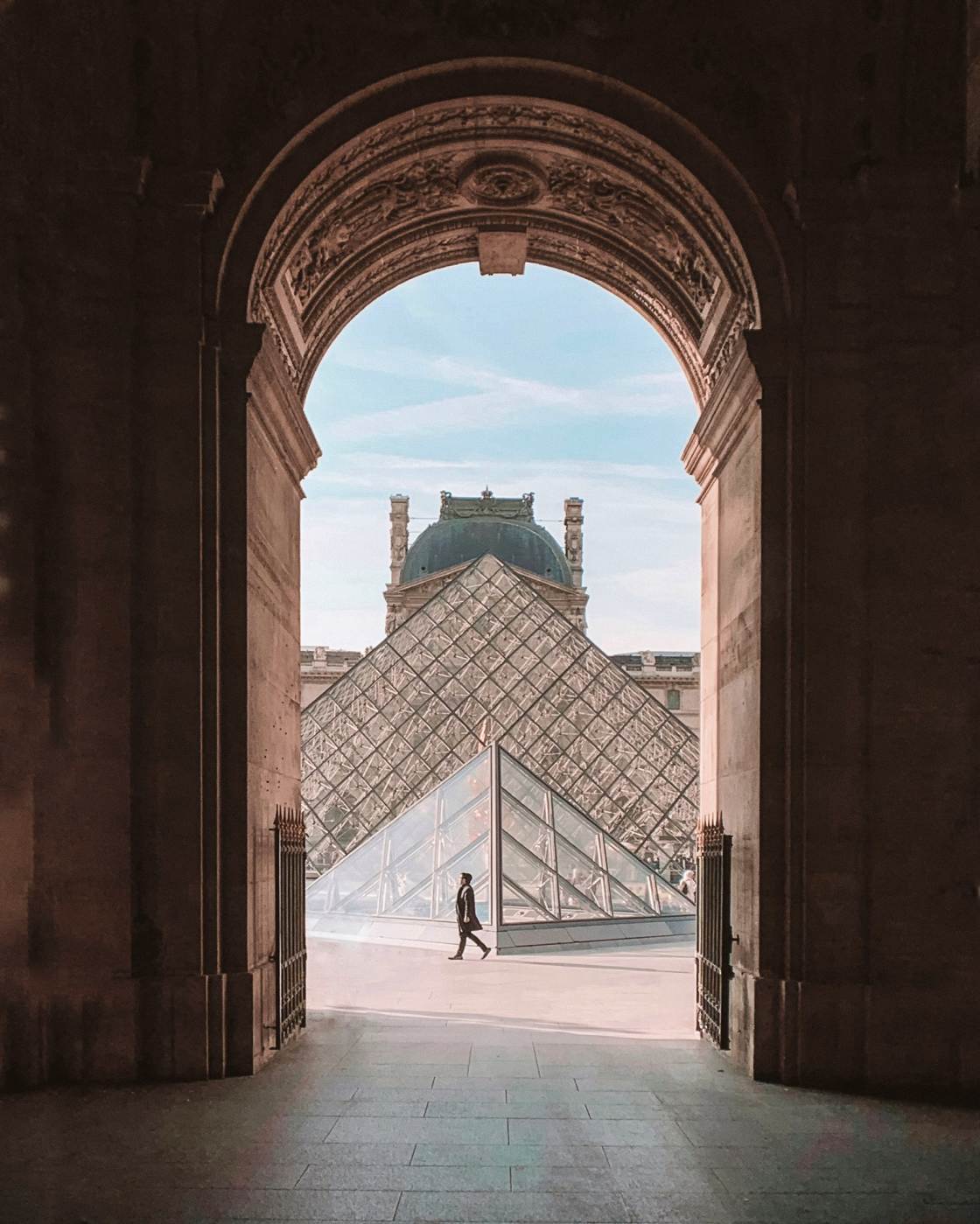
Once you’ve identified an interesting element, it’s time to compose your shot.
And this is the most important part of the process.
If you don’t compose carefully, your image won’t have any impact.
Even the most impressive building will make a boring photo if you don’t use good composition.
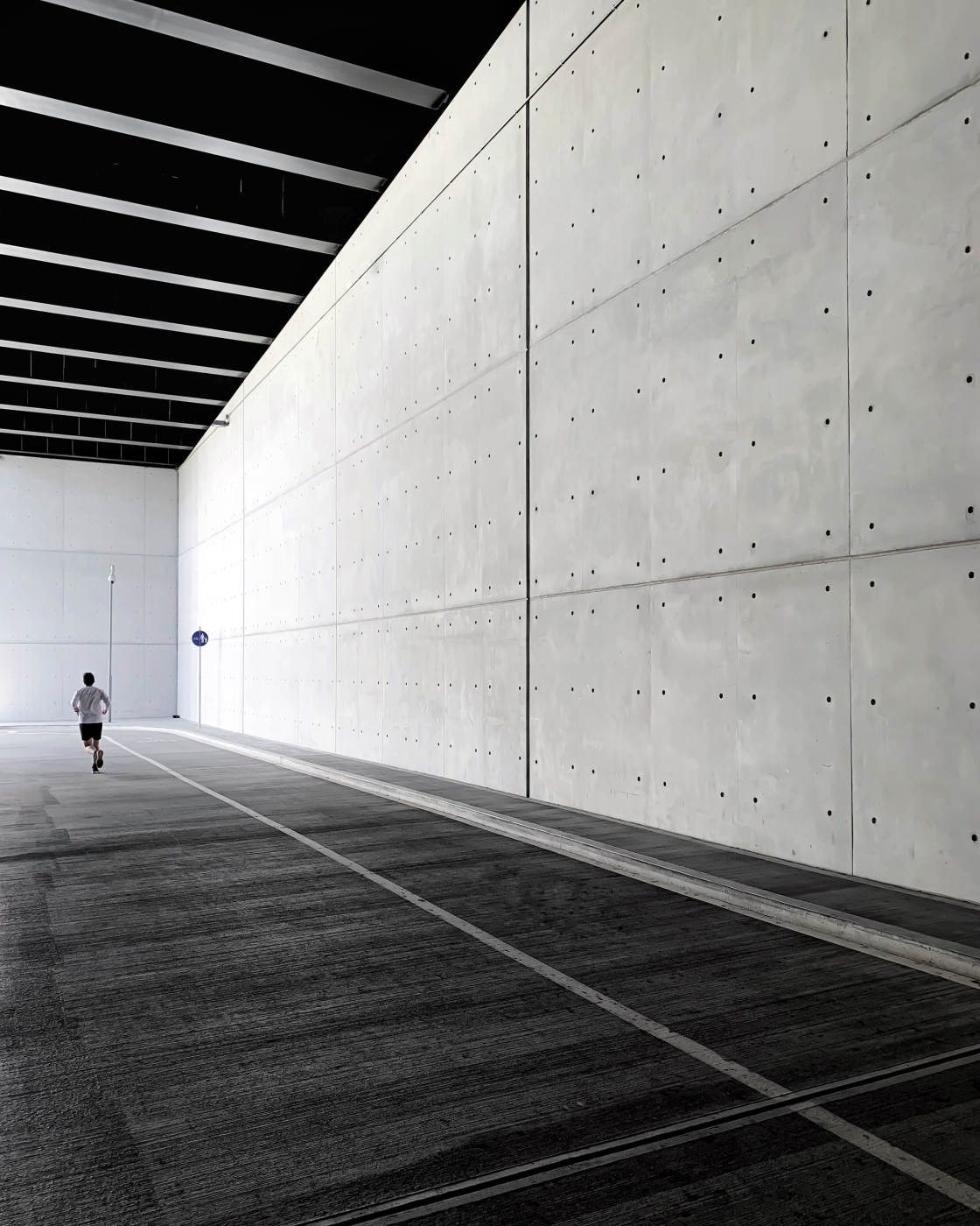
Read on to learn how to take photos of buildings using different architecture design elements.
2. Capture Symmetry For Jaw-Dropping Architecture Photography
Do you want to create dramatic architecture photos that jump off the screen?
Here’s how to do it:
Look for symmetry.
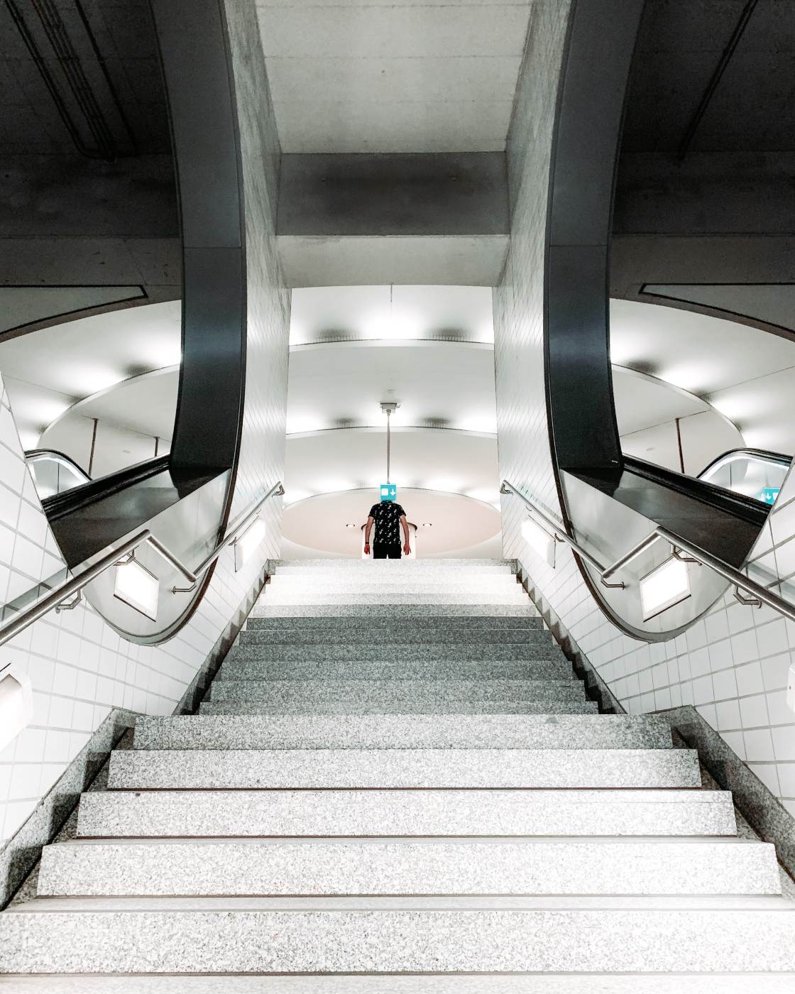
And then use it to create spectacular symmetrical compositions.
Symmetry is one of the first things I check for in a building.
Why? Because symmetrical compositions are incredibly eye-catching. They grab the viewer’s attention.
So where can you find symmetry in architecture?
First, take a look at the building as a whole.
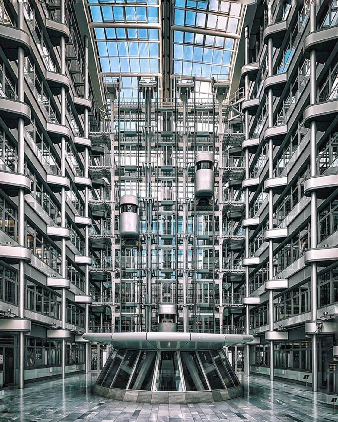
Many buildings are designed to be symmetrical. For example, they might have a central entranceway with identical features on either side.
Or the interior of the building might be laid out in a symmetrical format.
You’ll also find symmetry in certain architectural features.
For example, long corridors, tunnels, and archways are symmetrical by design.
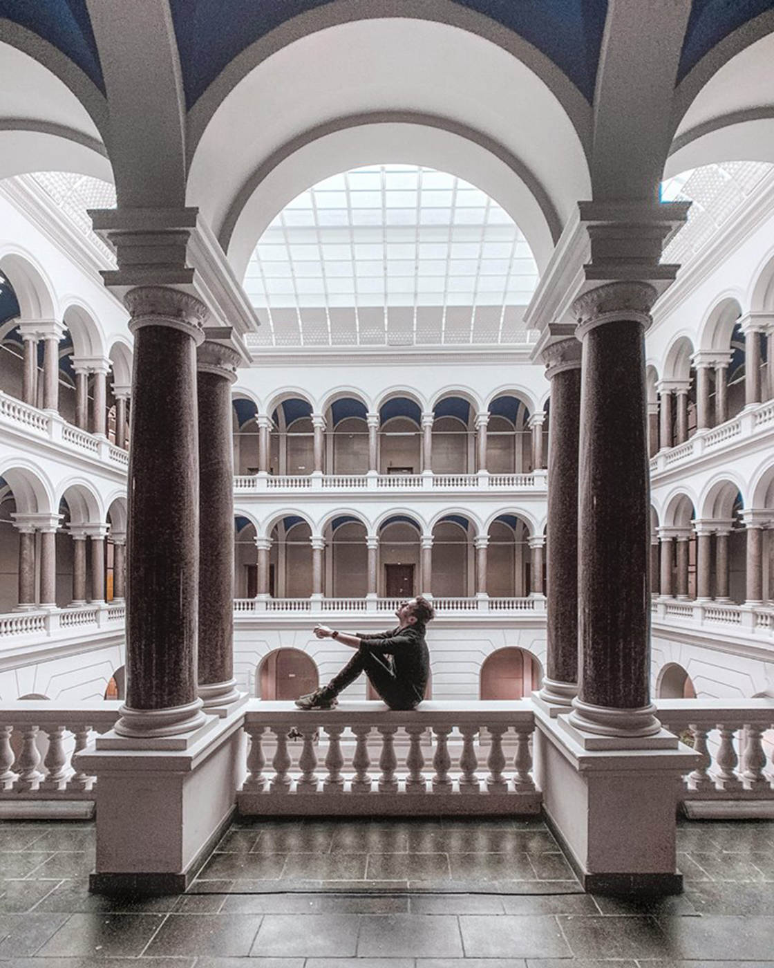
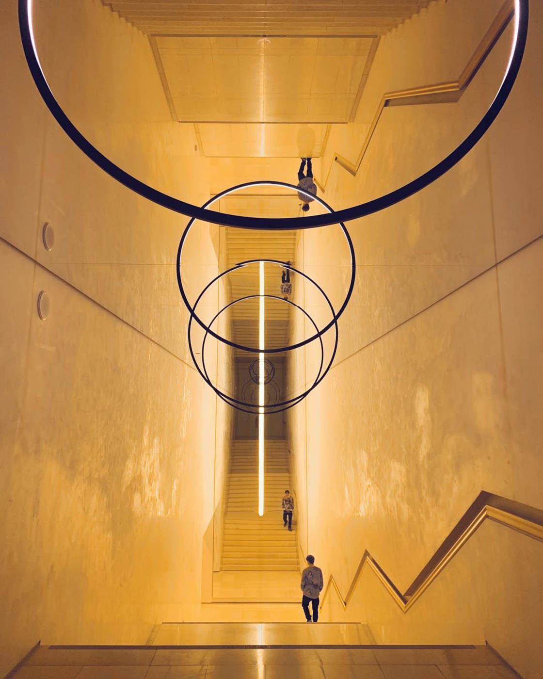
Staircases and escalators are also great places to capture symmetry.
You might even be able to use a reflection to create symmetry in your architecture photography.
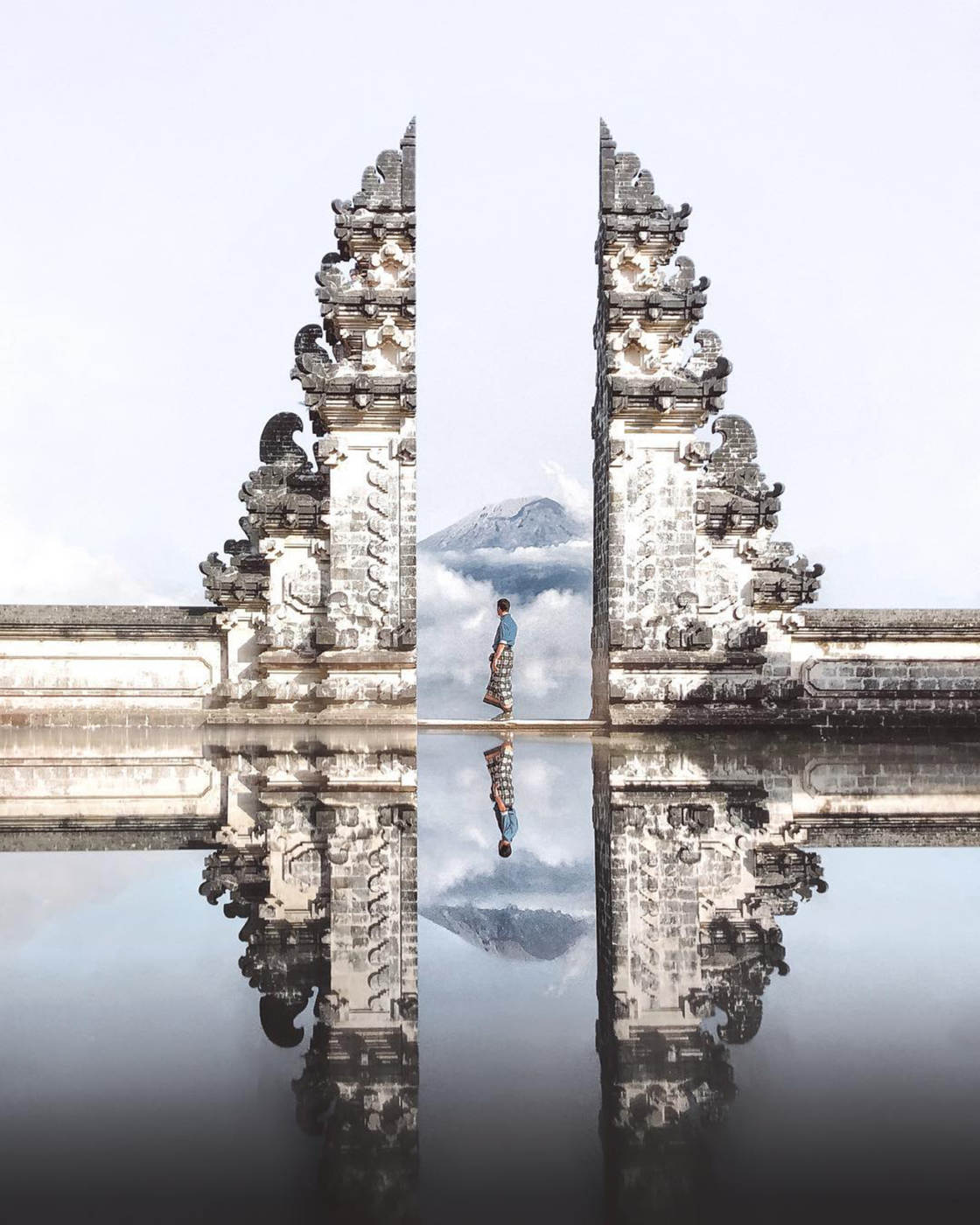
You can also look out for “near-symmetry.” This is where both sides of the image are very similar, but not an exact mirror image.
The example below has a symmetrical composition. But the two sides have slightly different architectural features.
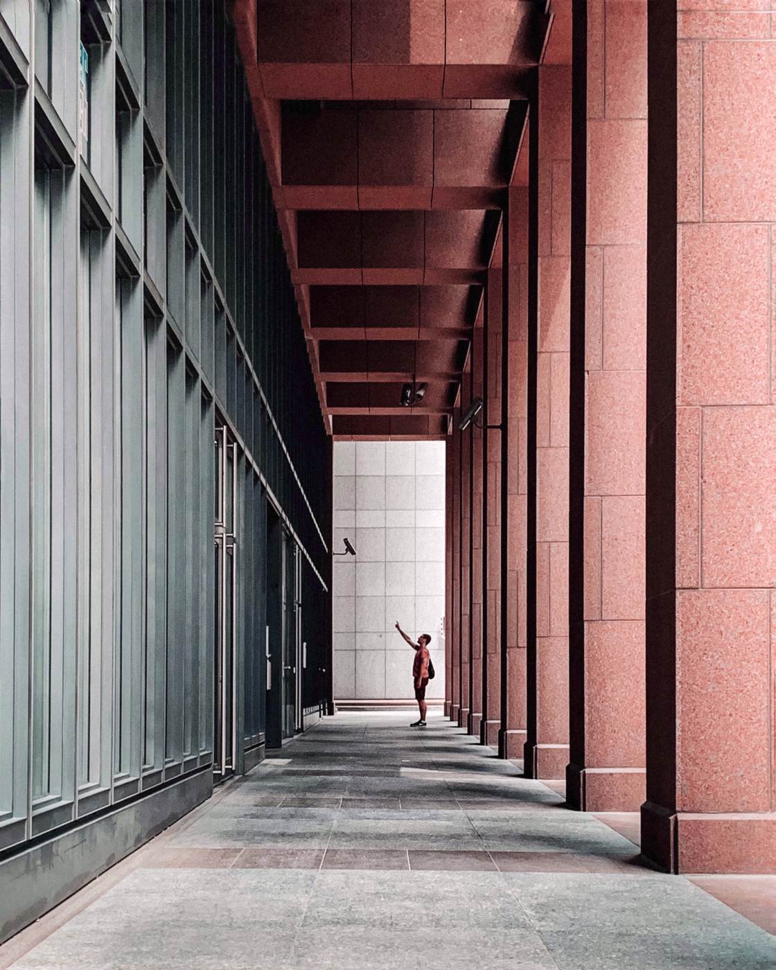
When composing your photo, stand centrally in front of the building. Then frame your shot with the line of symmetry down the middle of the frame.
If you do this, you can create striking compositions in your iPhone architecture photography.
3. Seek Out Geometric Shapes For Eye-Catching Compositions
Buildings are full of geometric shapes.
And shapes are perfect for creating eye-catching compositions in your architecture photography.
When you look at a building, challenge yourself to find as many shapes as possible.
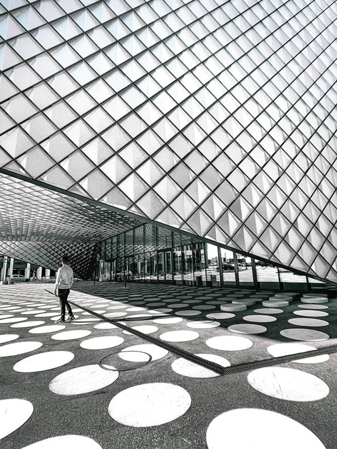
How many squares, rectangles, triangles, or circles can you spot?
The easiest place to find shapes is in the form of windows, doors, and archways.
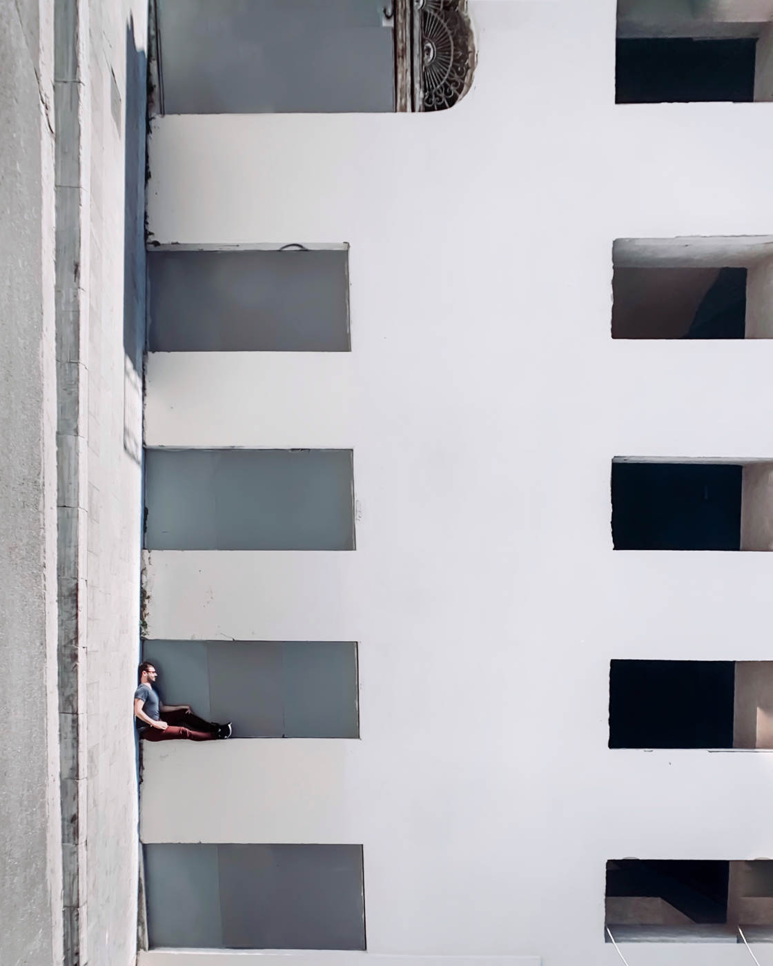
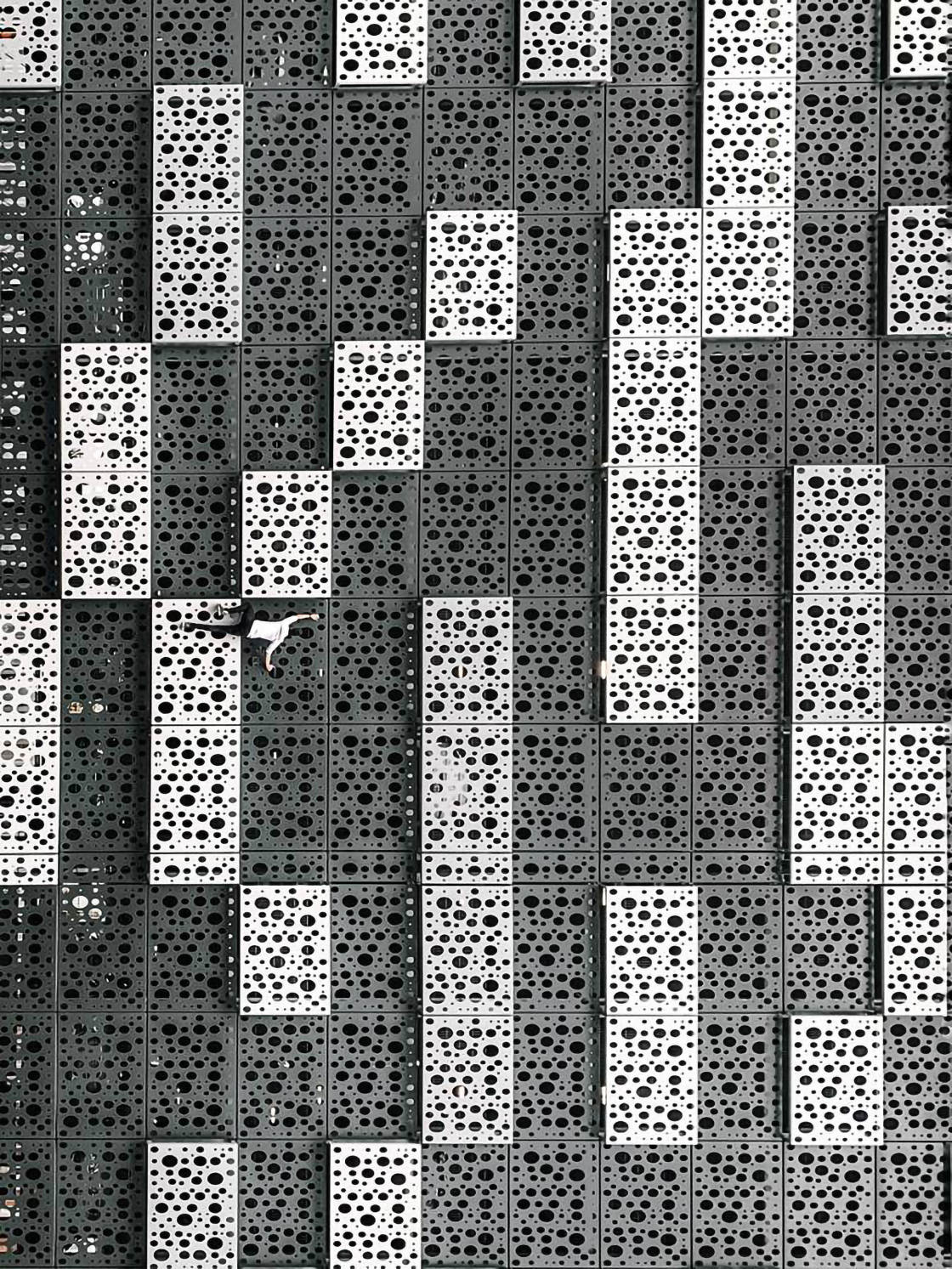
If you’re photographing the exterior of a building, look for different shapes on its facade.
For architecture interior photography, search for shapes in the building’s decor and design features.
Once you’ve found a shape that interests you, you need to compose your shot.
Try to make the shape the focal point of your image.
Eliminate anything distracting from the frame. Move closer to crop out unwanted surroundings.
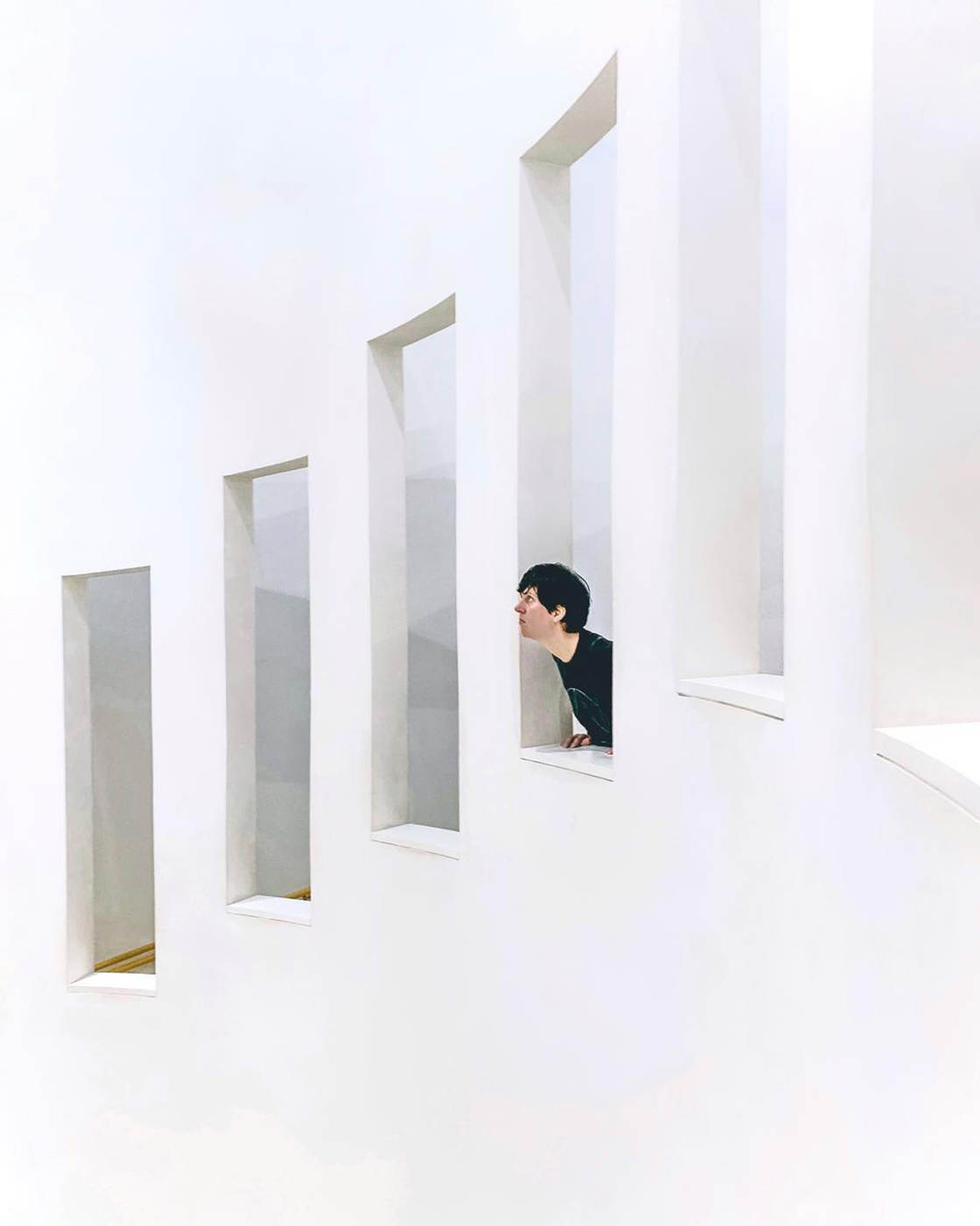
Try shooting from directly in front of the shape to create a symmetrical composition.
Then move to one side to see whether that creates a more interesting image.
You could also experiment with shooting from high and low angles. Changing your perspective will change the way the shape appears in your image.
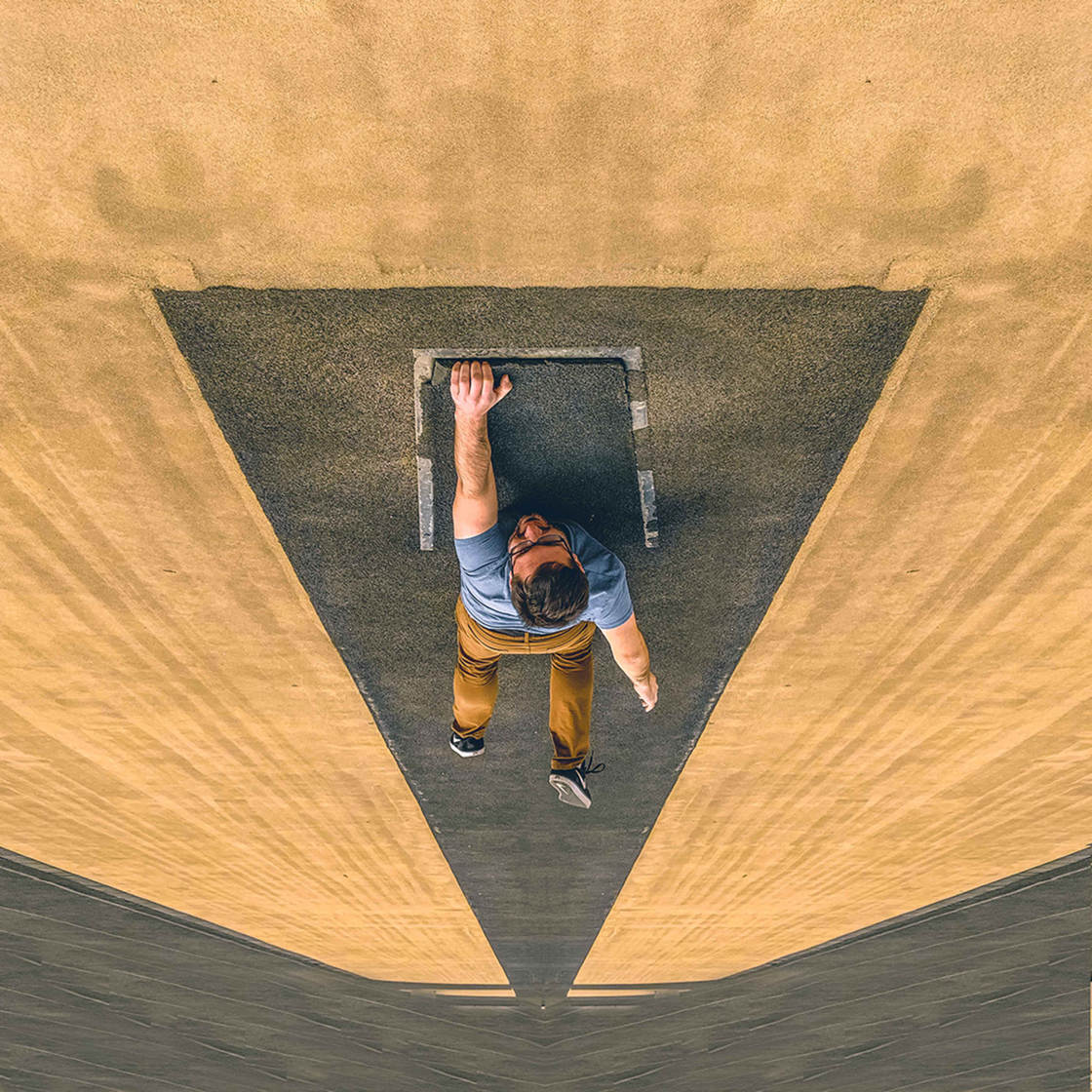
Remember, you want the shape to be the main attraction.
So take a few moments to find a shooting angle that makes the shape stand out.
The results will definitely be worth it!
4. Use Leading Lines To Add Incredible Depth To Your Architecture Photos
Do you want to create images with amazing depth?
It’s easy with this one composition trick:
Use leading lines!
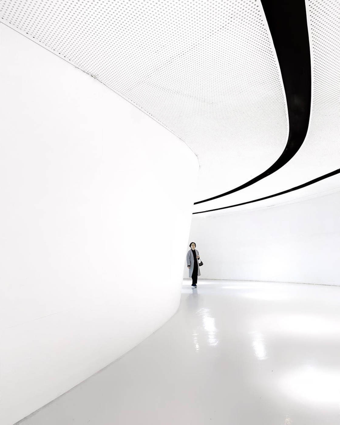
Leading lines are lines that lead from the foreground into the background.
The lines take the viewer on a journey through your image. They lead the eye deep into the scene.
And this is what creates such an incredible sense of depth in your photos.
So how do you create powerful compositions using leading lines?
First, look around for any architectural lines that you could use.
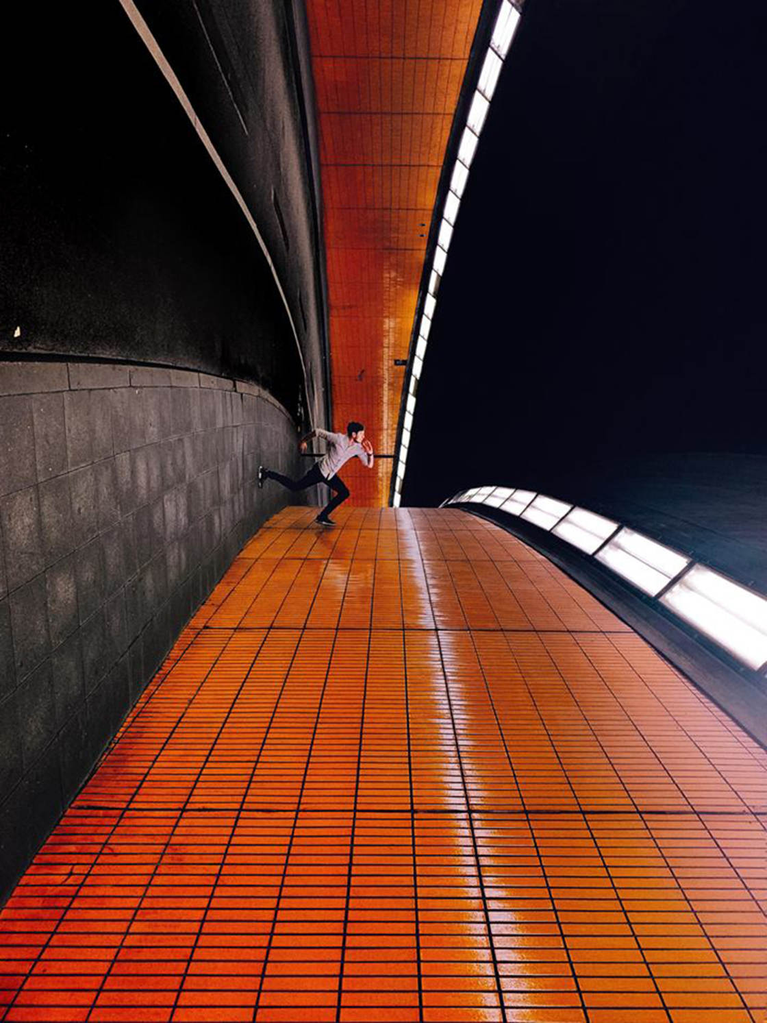
Are there lines on the ground? What about the walls? You’ll even find lines on the ceiling in many buildings.
If you’re shooting in a long corridor, use the lines where the walls meet the floor or ceiling.
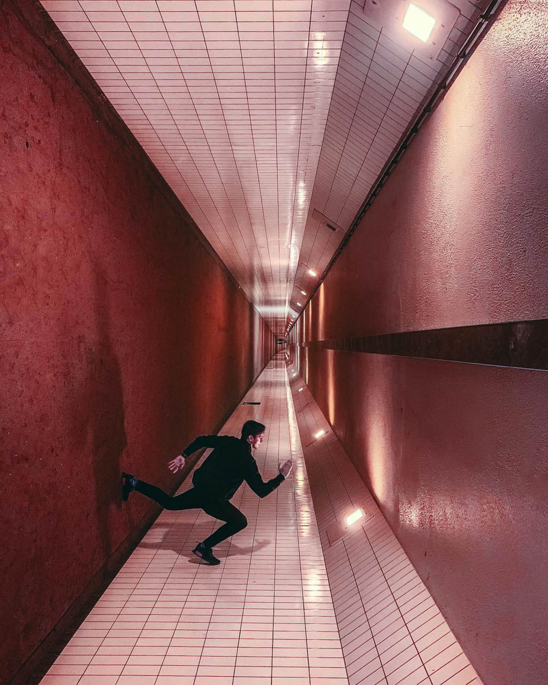
Next, frame your shot so the lines lead from the front of the image into the distance.
This is essential for creating a strong sense of depth.
You might need to adjust your shooting angle to achieve this. For example, you might need to get lower or higher.
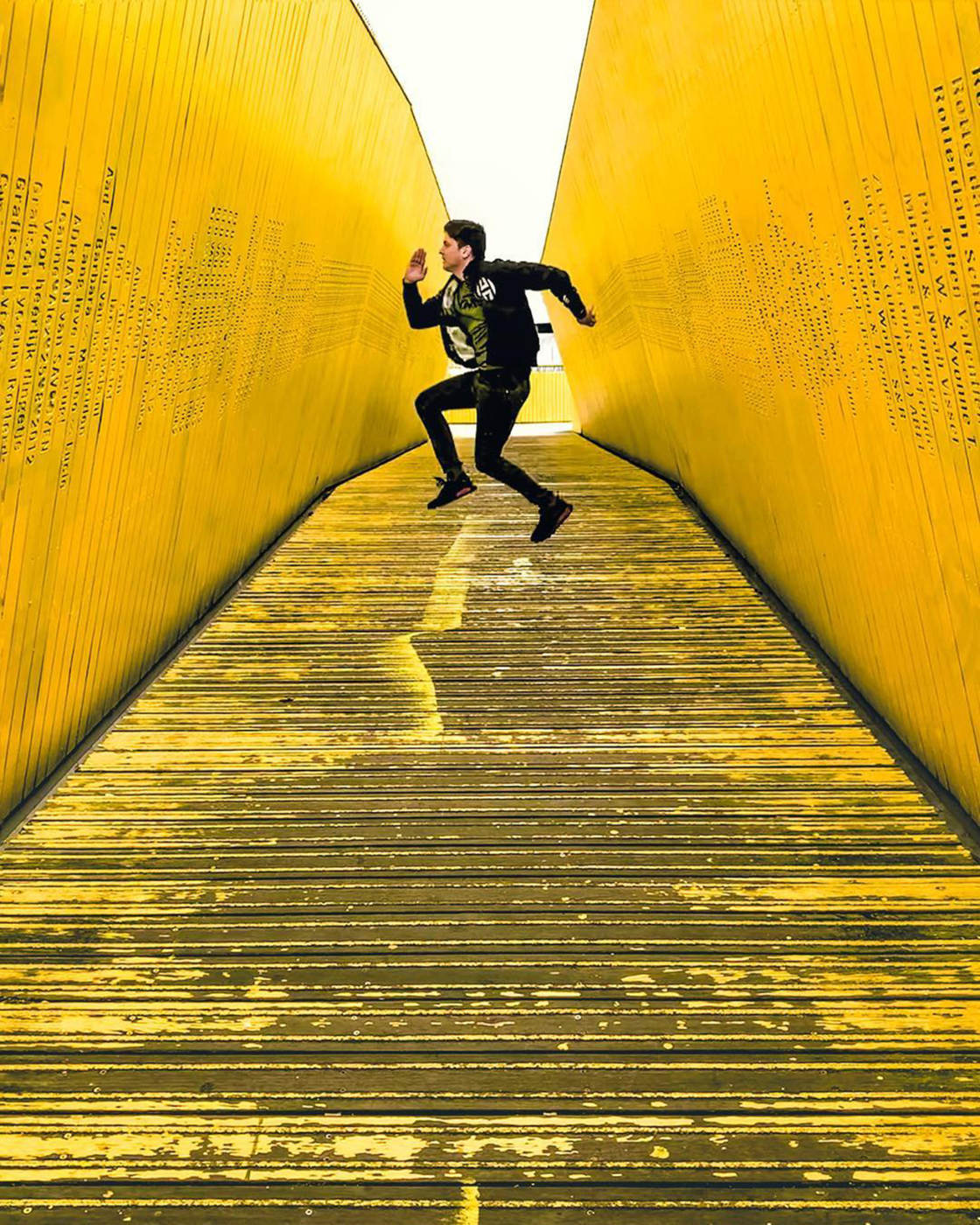
Straight lines that converge into the distance are great for creating symmetrical compositions.
For perfect symmetry, have the lines converge in the center of the frame.
You can also look out for curved lines.
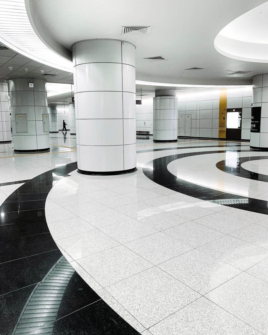
Sweeping curves lead the eye gently around the image, creating wonderful visual flow.
If possible, have the lines lead towards a person or object. The lines will draw the viewer’s eye through the image toward your focal point.
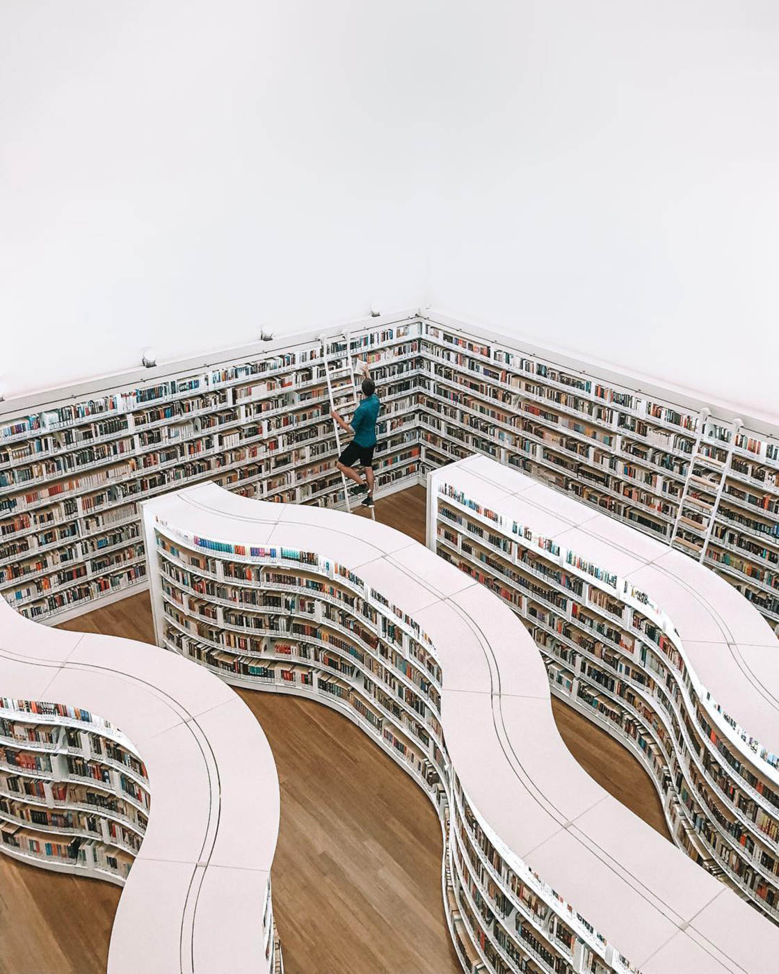
Leading lines are one of the most powerful composition elements you can use.
So don’t forget to incorporate them into your iPhone architecture photography!
5. Capture Repeating Patterns For Mesmerizing Photos Of Buildings
Patterns are the perfect design elements for creative architecture photography.
They allow you to create mesmerizing images with an amazing abstract quality.
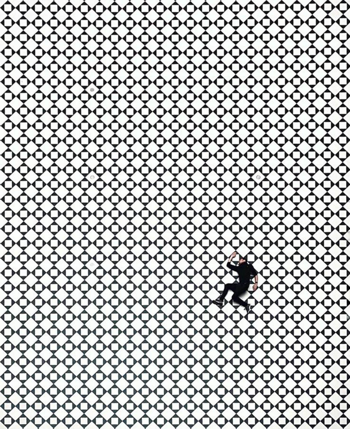
Buildings are full of repetitive patterns that are pleasing to the eye.
Look out for interesting floor tiles which look incredible when shot from above.
Exterior facades with rows of identical windows or balconies are great for creating pattern photos.
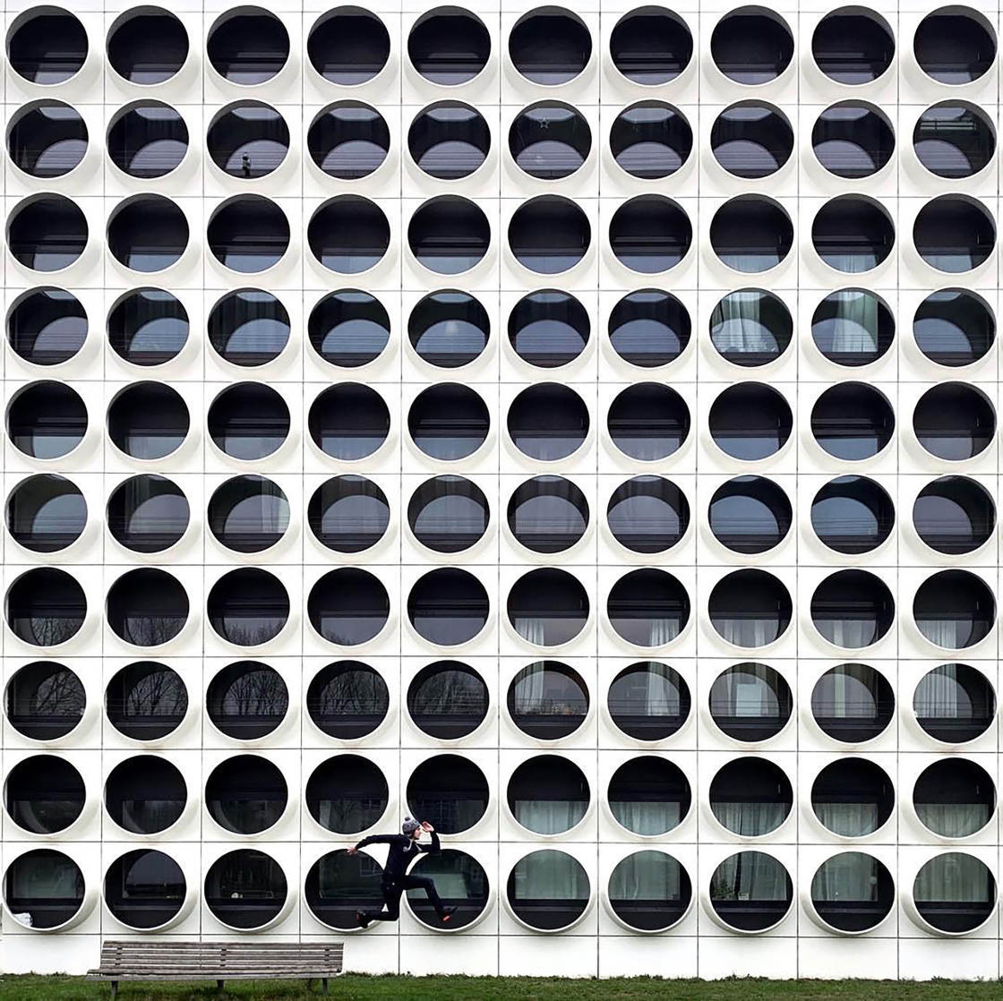
Search for any part of the building that has repeating shapes or lines.
And then compose your photo to emphasize the repetition of architectural design elements.
The best way to do this is to fill the entire frame with the pattern.
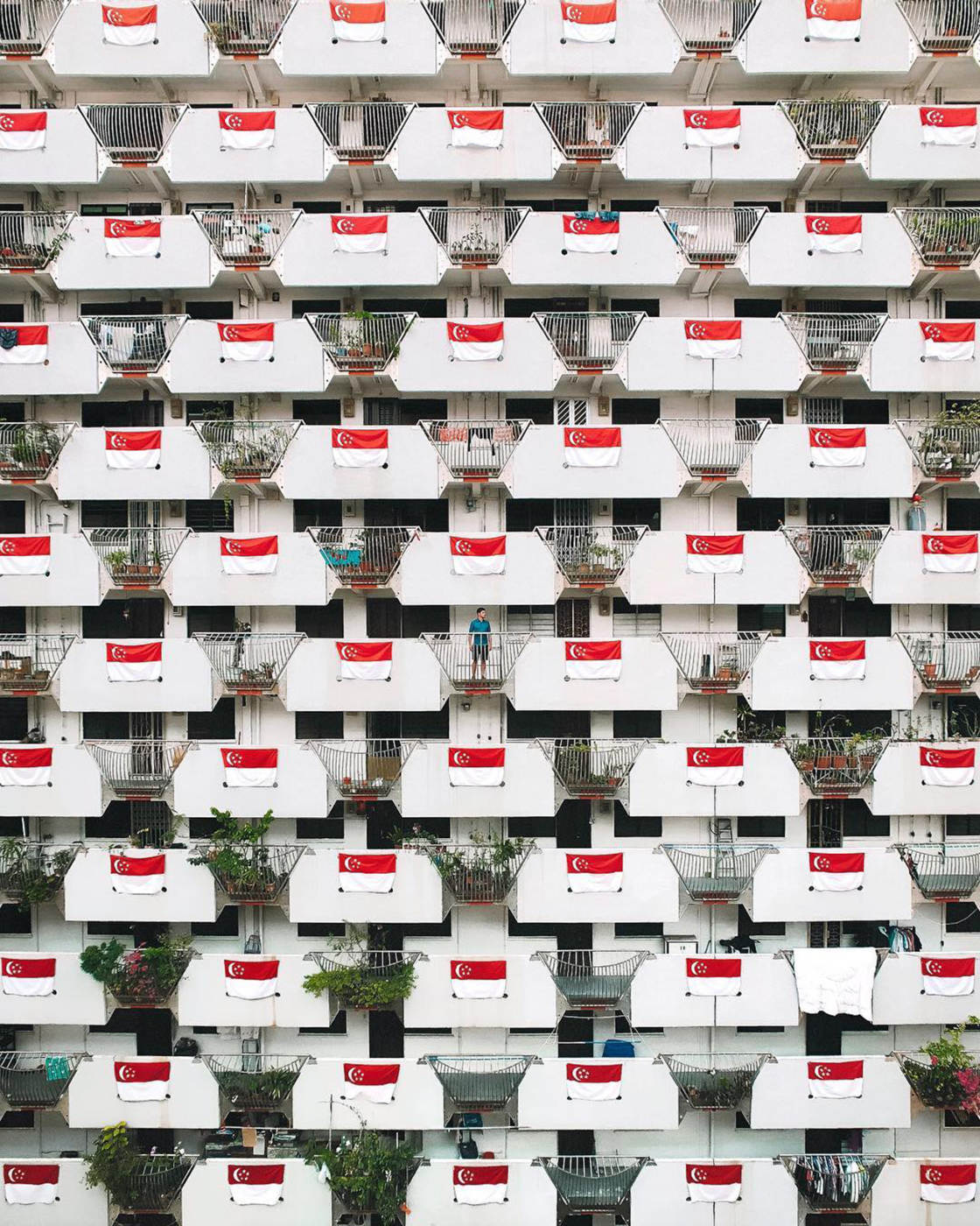
Move closer to eliminate the surroundings. You want the whole image to be filled with the pattern.
If you have an iPhone with a telephoto lens, you could zoom in to get a closer view.
Simply tap the 1x icon to zoom in. The icon will change to 2x which indicates you’re using the telephoto lens.
(To switch back to the wide-angle lens, tap the 2x icon to return to the 1x zoomed out view.)
6. Use Color To Grab The Viewer’s Attention
Another way to create attention-grabbing images is to use color.
When you’re looking at a piece of architecture, study its color.
Is the building made up of a single color or lots of colors?
Are the colors vibrant? Or is the building a simple white, grey or black?
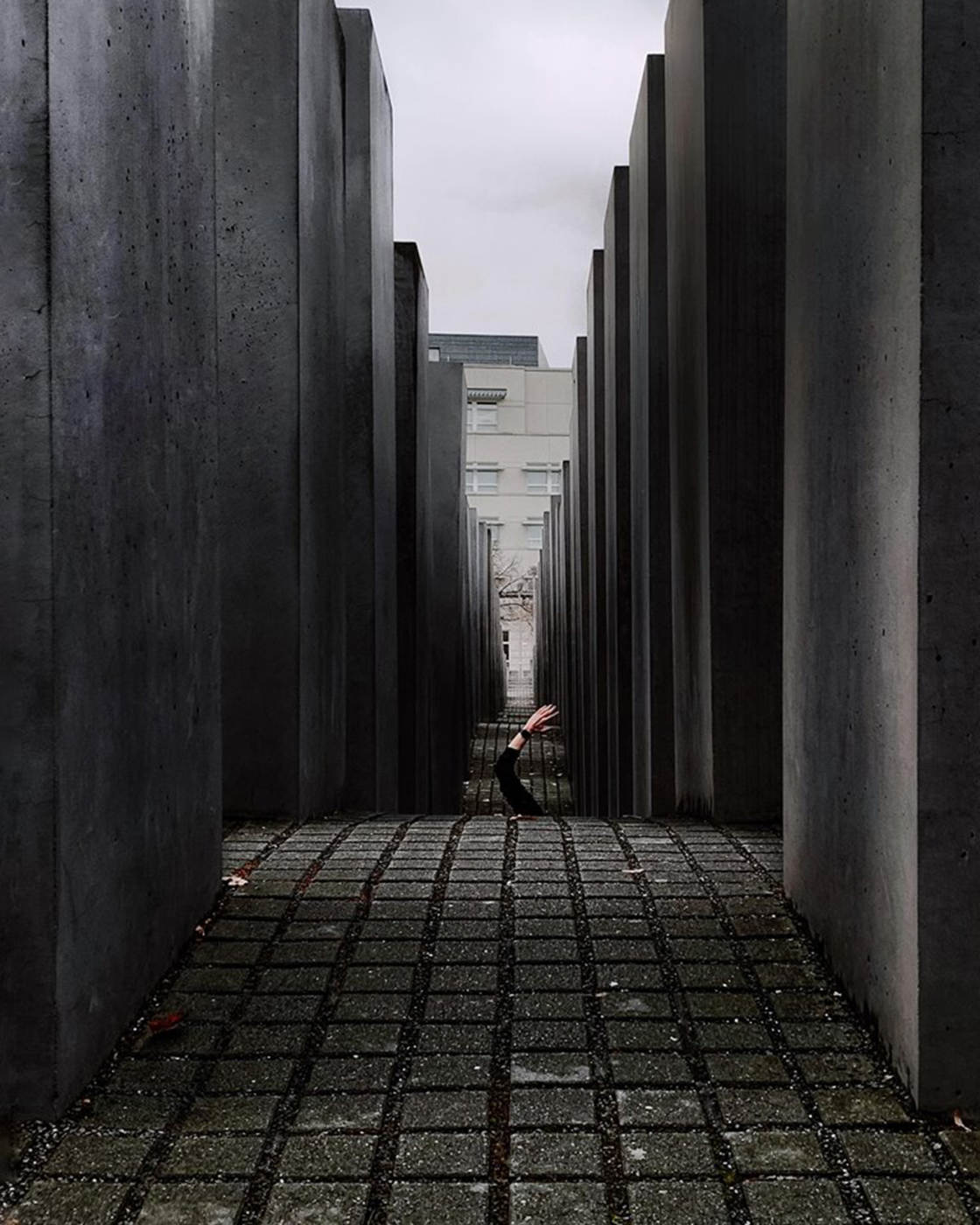
Next, think about how you could use the building’s color to create a beautiful composition.
It’s usually best to fill the frame with one main color – even if that color is grey or white.
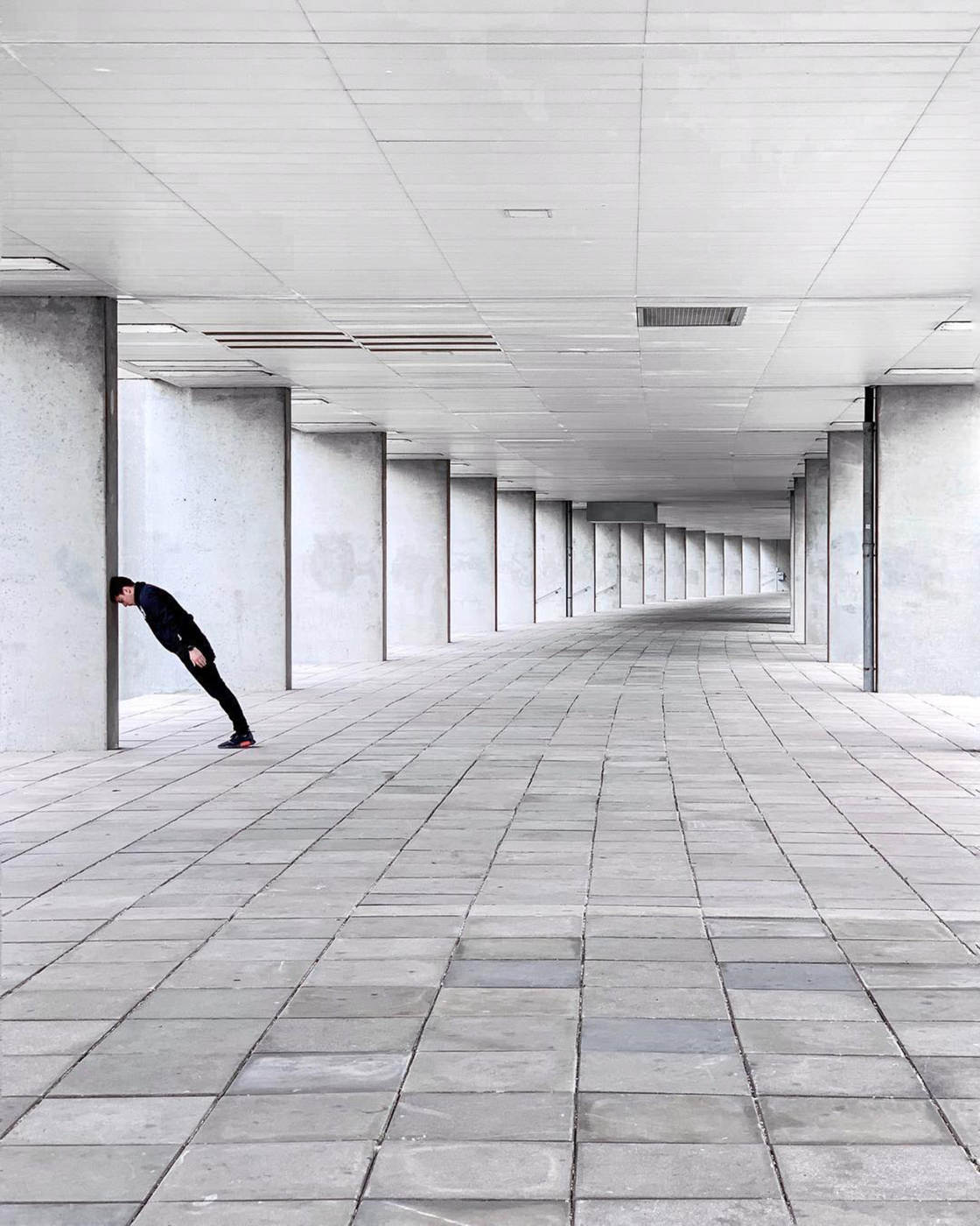
If you have lots of colors competing with each other, the image can look messy and confusing.
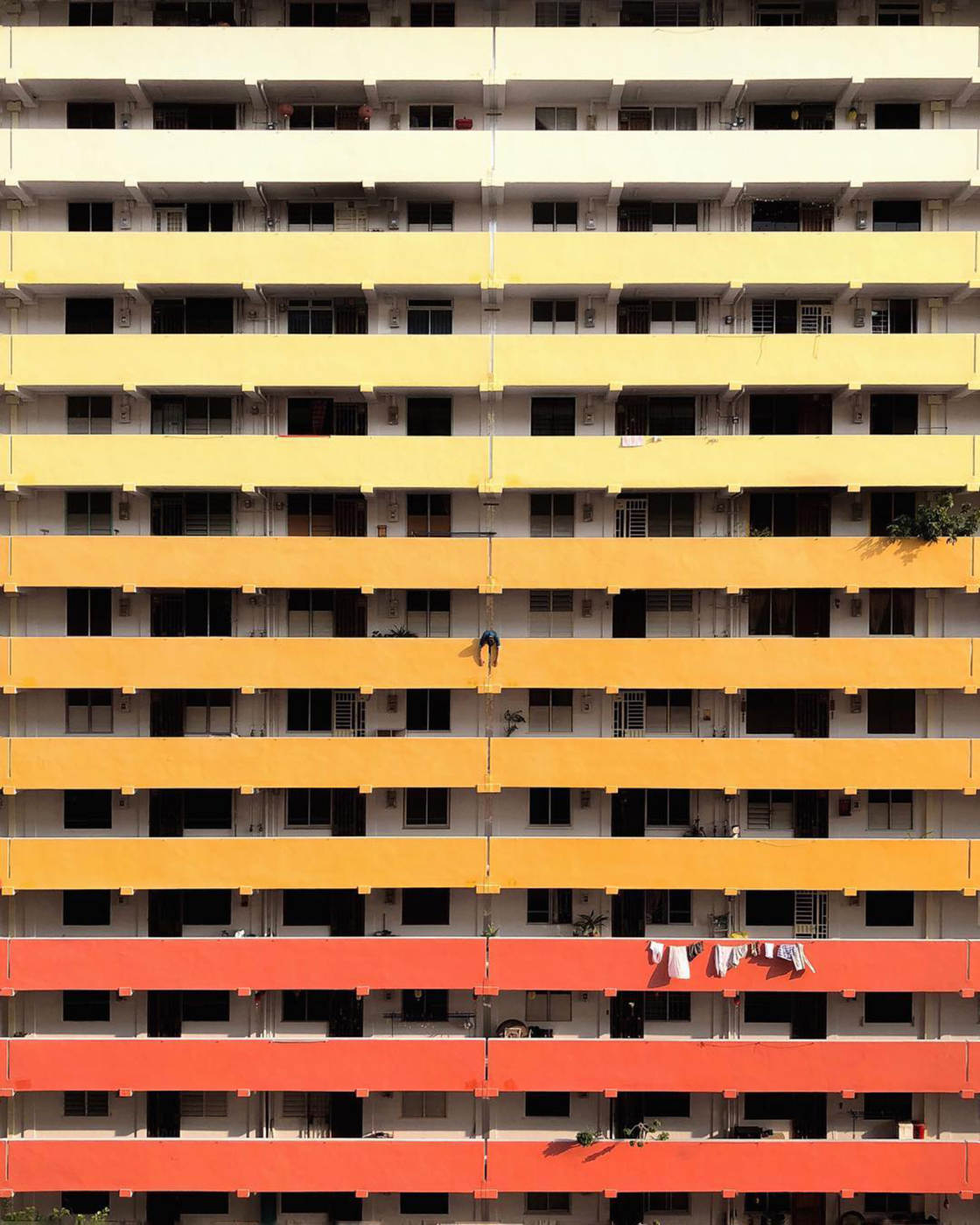
Sometimes an image with several colors can work well. But including lots of colors should always be intentional.
In the photo below, it was the different colors of the balconies that caught my eye. So that’s what I wanted to capture in my photo.
Using one main color with a splash of another color can work well too.
In the photo below, I chose to include a bit of blue sky at the top of the frame.
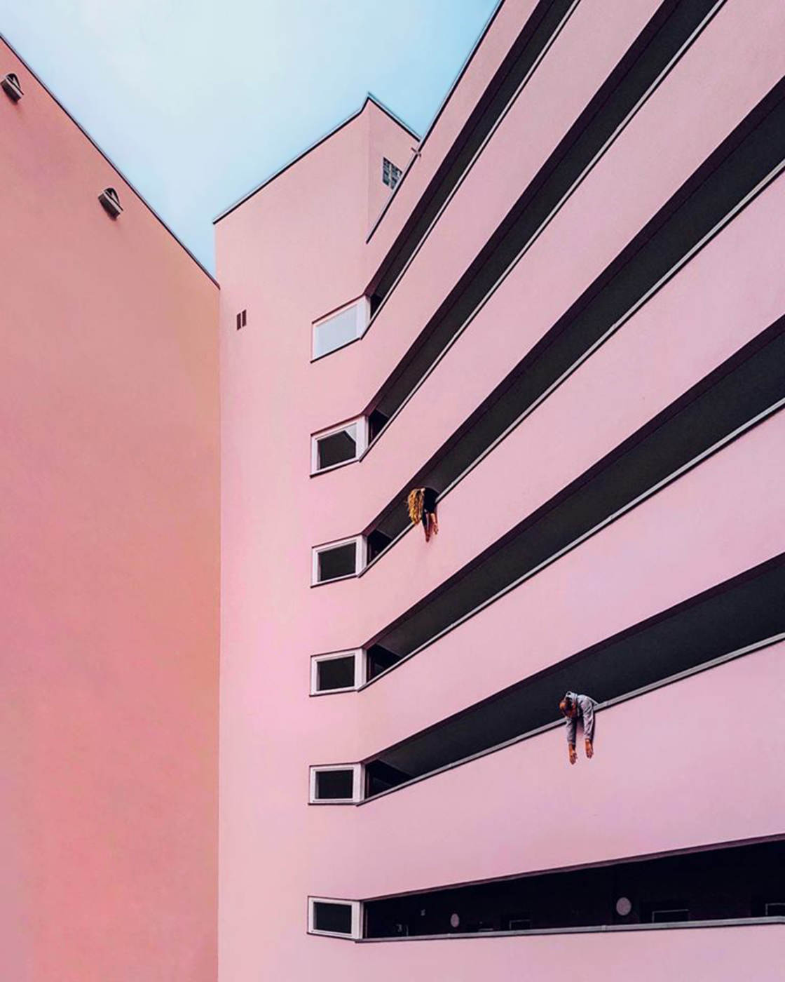
The blue looks great with the pink. And it adds some extra visual interest to the image.
In the photo below, most of the image is white or pale grey. But the black furniture adds contrast. And this creates a strong focal point in the image.
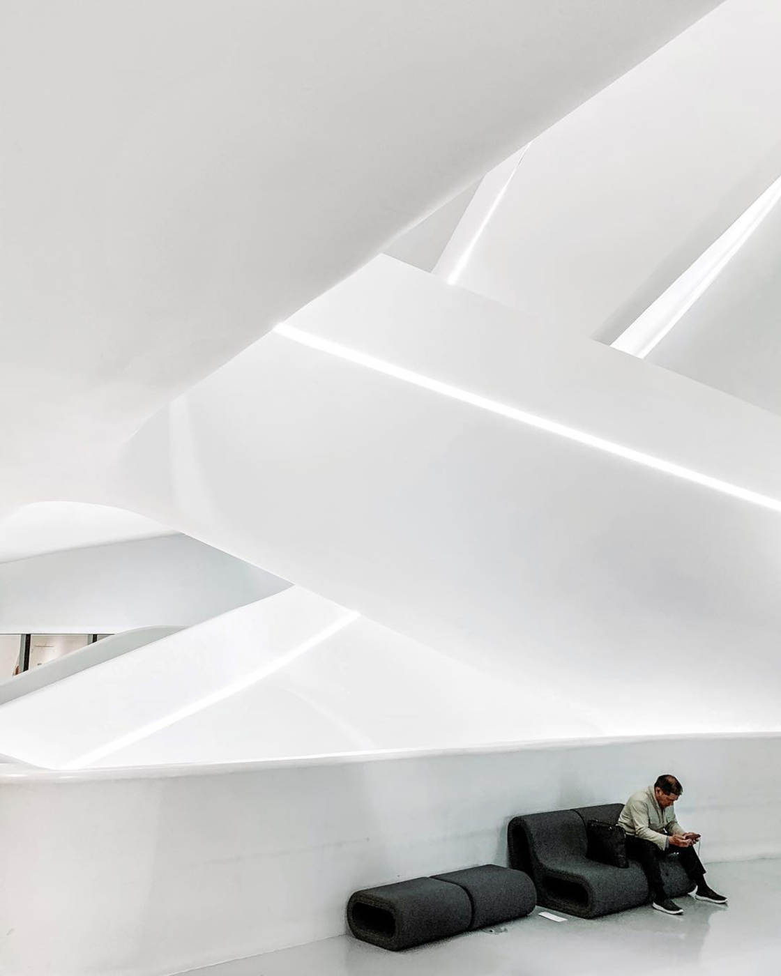
Color has a big impact on the mood of your photos. So always take a moment to consider how the colors will affect your image.
Then try out different compositions to include or exclude certain colors.
Remember, you can always edit the colors in post-processing.
For example, you can use a photo editing app to make colors more vibrant or muted. You can even pick out certain colors and change the hue or saturation selectively.
7. Capture Light & Shadow For Spellbinding Architecture Photos
Good light is important for all genres of photography. And architecture photography is no exception.
So how can you use light for more creative architecture photos?
Use the contrast of light and shadow to add interesting visual elements to your pictures.
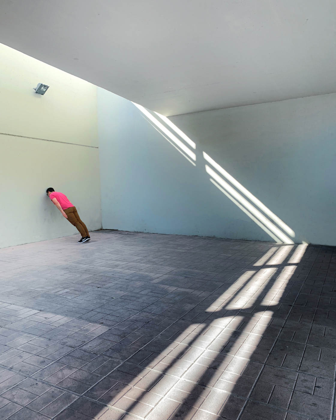
You’ll find the strongest shadows when the light is bright. So shoot when the sun is out, rather than on an overcast day.
When you’re exploring a building, look for areas where you have both light and shade in the scene.
Once you’ve found a shadow, work out how to incorporate it into your composition.
Could you use the shadow as a leading line?
Do the shadows create an interesting repetitive pattern?
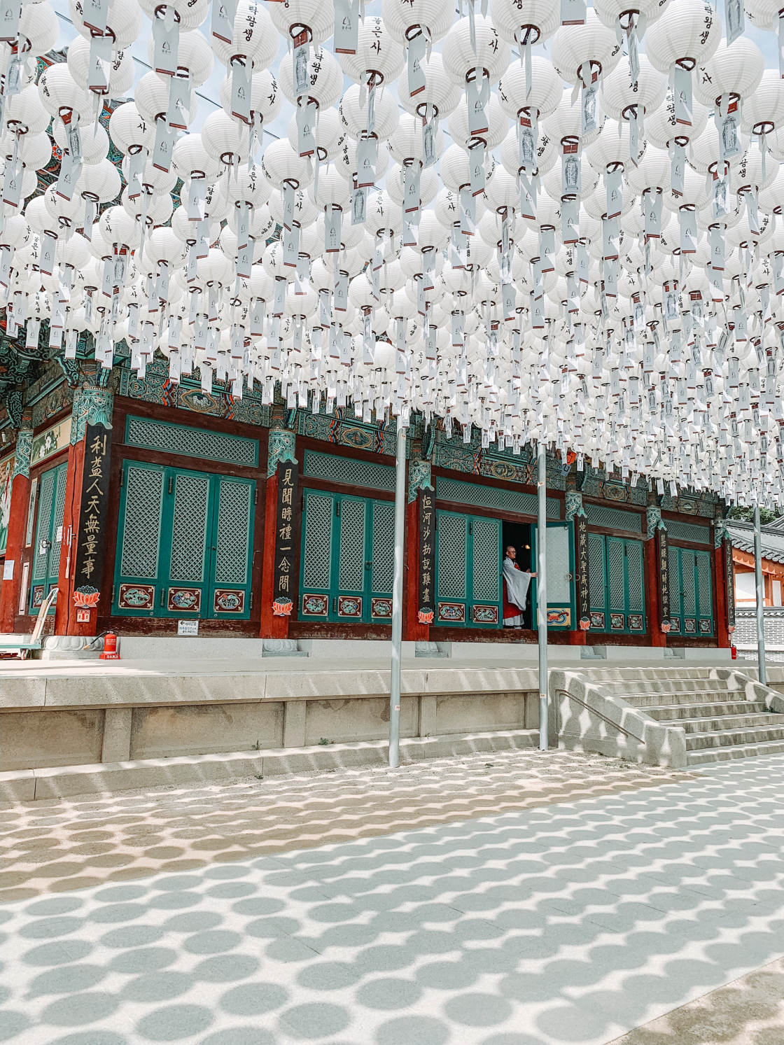
Would it be better to include both the shadows and the objects creating them?
Or would it be more intriguing to capture just the shadows on their own?
When taking photos of shadows, the contrast between light and dark can make it tricky to get the exposure right.
Exposure refers to the brightness of your photo. And the key to great shadow photography is to slightly under-expose.
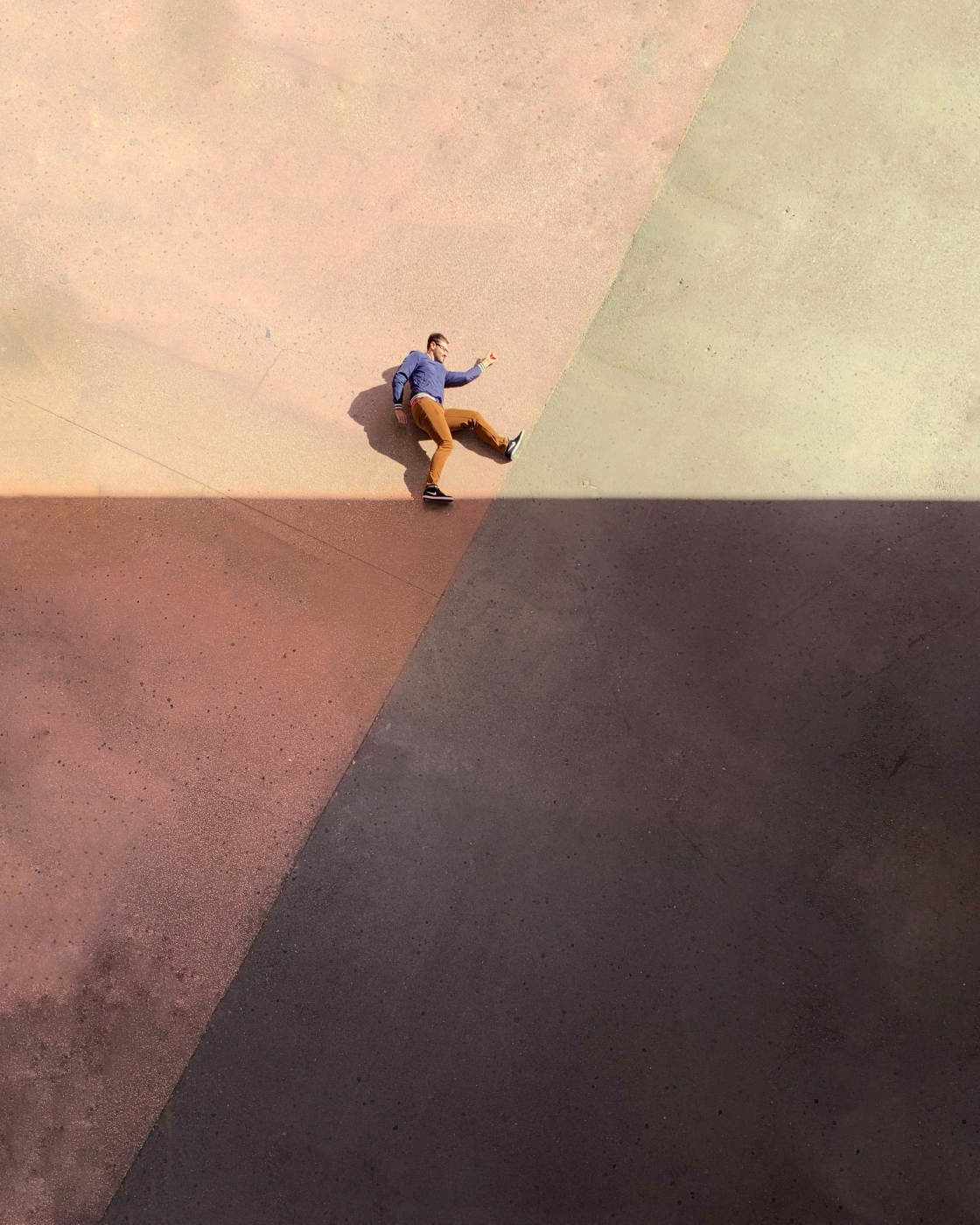
This ensures that the lighter areas retain color and detail, rather than appearing too bright.
How do you adjust exposure in the iPhone Camera app?
First, tap the screen to set the focus point. Then swipe down to make the image darker (or up to make it brighter).
Remember, you want to see detail in the brighter areas. If the shadows appear too dark, you can always brighten them slightly in post-processing.
8. Include A Person In Your iPhone Architecture Photography
Have you noticed that most of my architecture photos include a person?
If you haven’t tried adding people into your building shots, I’d definitely recommend it!
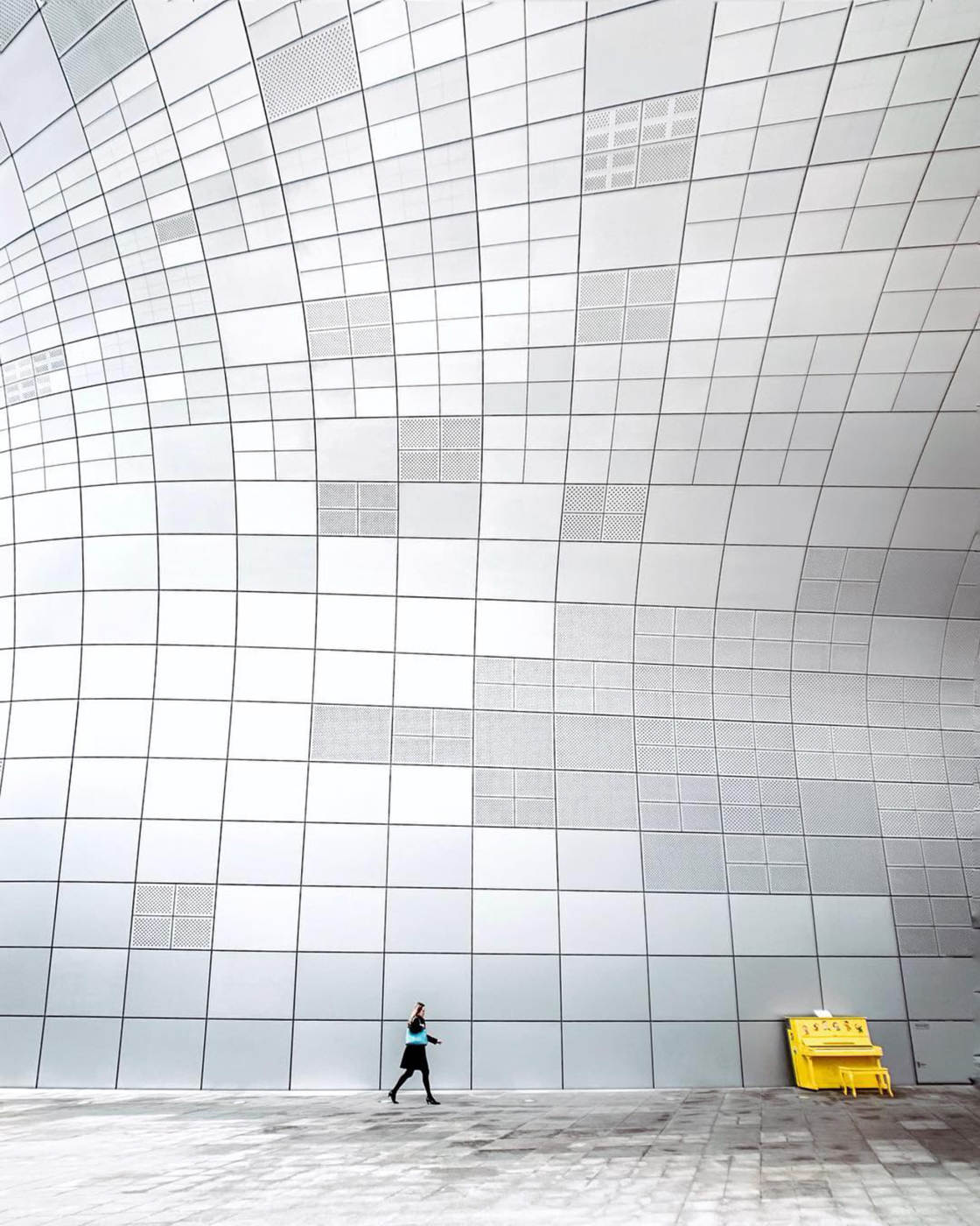
Including a human element creates more engaging architecture photos.
A person adds a strong focal point to the image.
People are also great for creating a sense of scale in your architecture photography.
It makes it easier to convey the enormity of a building when you have a person standing next to it.
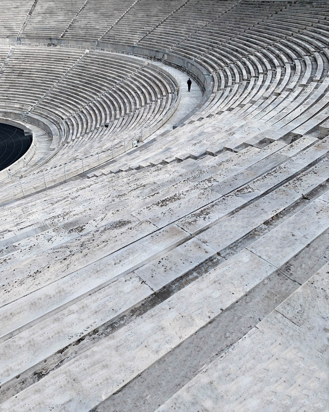
To make the building seem even larger, have the person stand far away in the distance. The further away they are, the smaller they’ll appear.
Having a person in your architecture photos can also add an interesting storytelling element. And this creates more compelling photos that the viewer can engage with.

Look for strangers walking through the scene. Or take a friend along and ask them to pose for you.
You could even use an iPhone tripod and appear in the photo yourself.
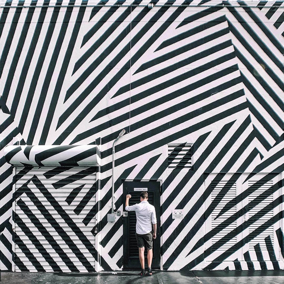
Think about how the person could make the picture more intriguing. For instance, have them knocking on a door or pointing at a particular architectural feature.
You also need to decide where to position the subject within the frame.
If you’re photographing a friend, you can direct them to stand in a certain place.
A good starting point is the rule of thirds. This composition technique is all about positioning the subject a third of the way into the frame.
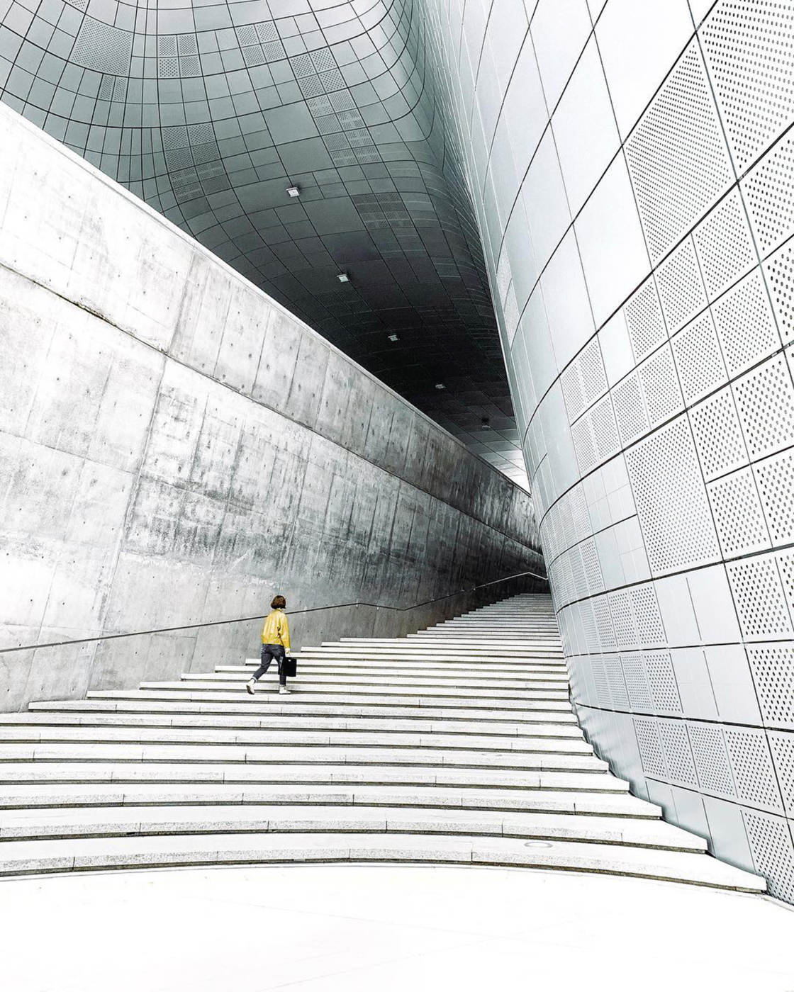
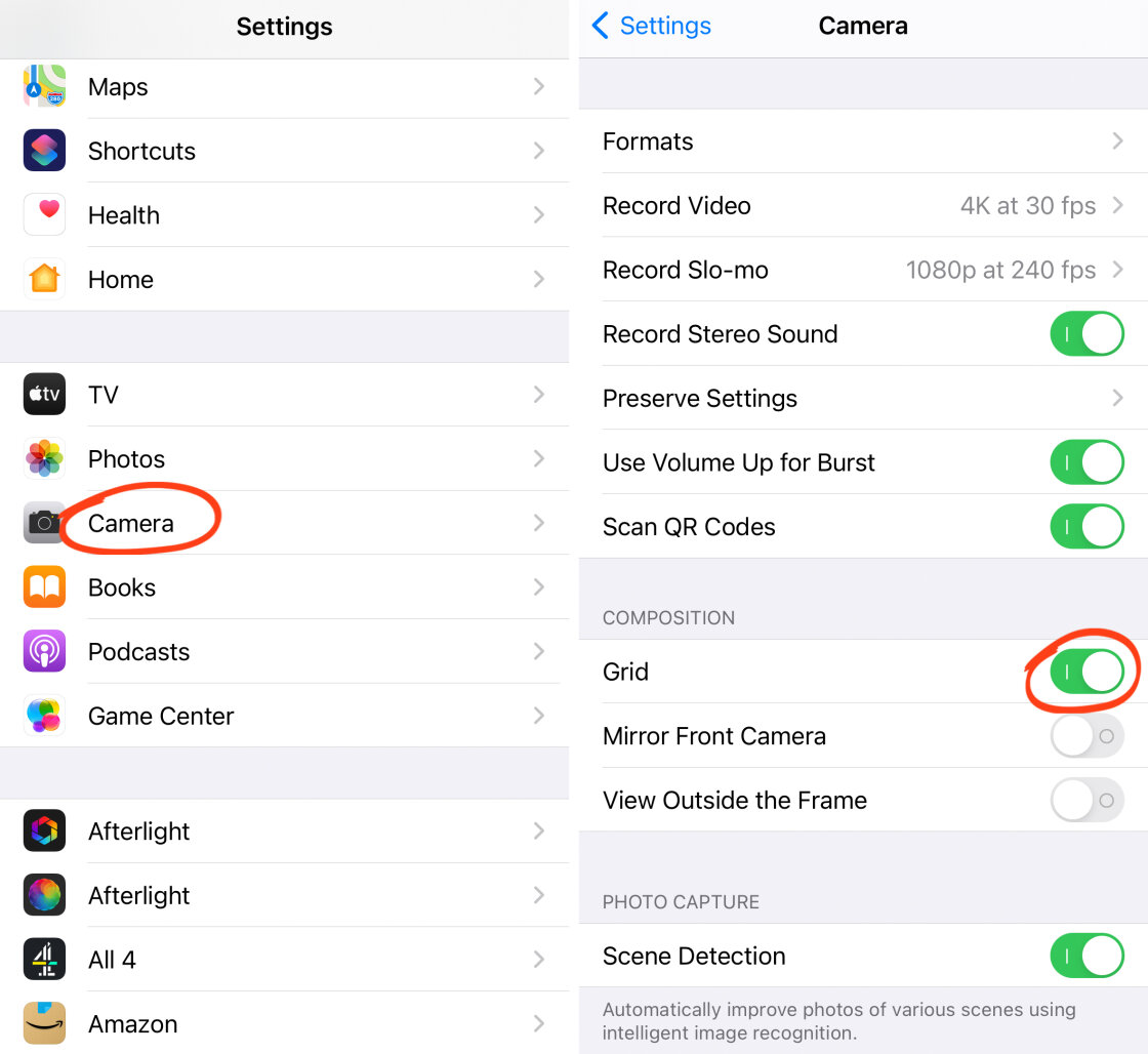
Use the grid in the Camera app to align the subject where two gridlines meet.
If you don’t see the grid on your screen, open the Settings app and tap Camera. Then switch on the Grid option.
For symmetrical architecture photos, you might prefer to position the subject centrally.
Although placing them slightly off-center can create a more interesting image. It throws off the symmetry slightly which can actually enhance the composition.
When you’re photographing strangers walking through the scene, you obviously can’t dictate their position.
So you need to be ready to shoot as soon as the person enters the frame. Then take lots of photos as they move through the scene.
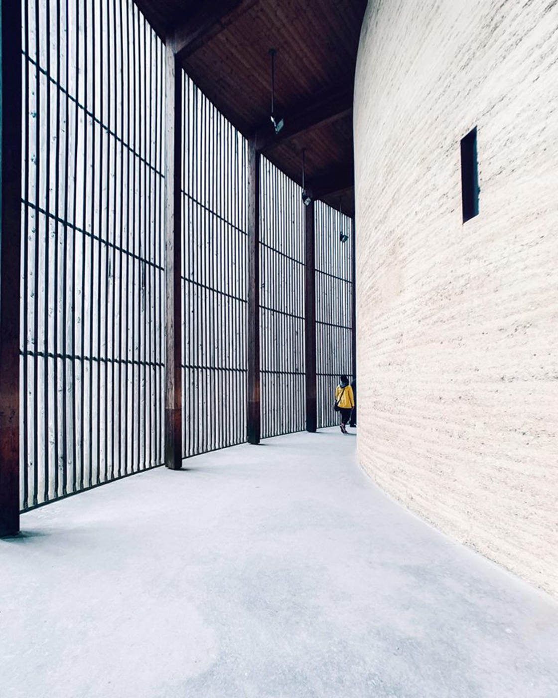
Start by composing your photo without the person in the shot.
Once you’re happy with the composition, tap to set focus. Then swipe up or down to adjust exposure if necessary.
Now, wait for a person to enter.
Start taking photos as soon as someone appears. And keep taking pictures while they move through the frame.
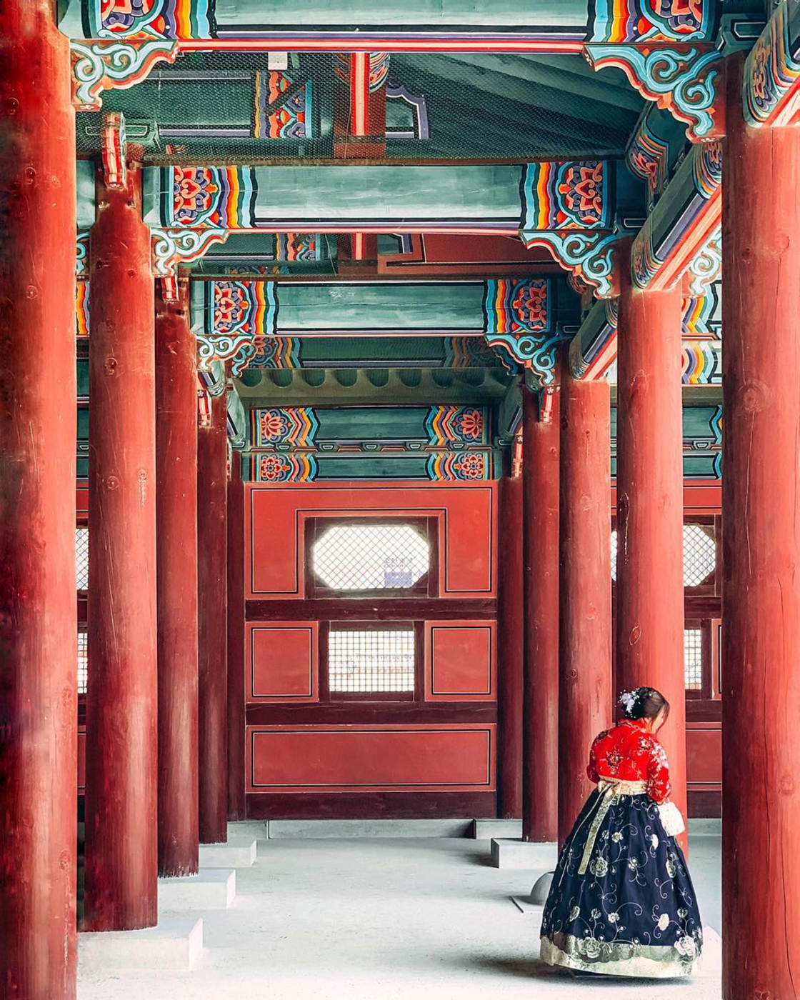
Afterwards, you can choose the best image where the person is in the perfect position.
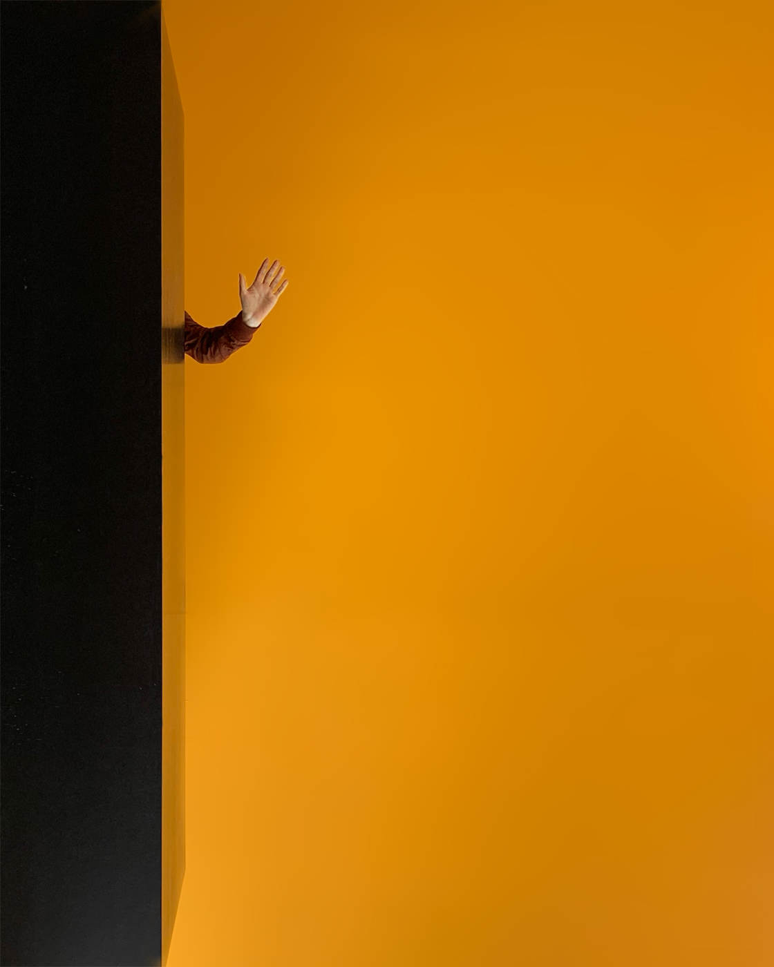
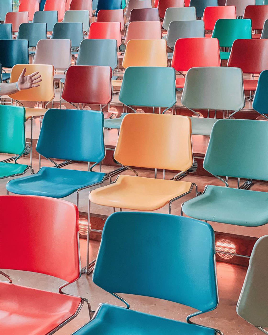
If you want to get more playful, try including just a person’s arm or leg in your composition.
Have the person hide behind a wall or some other architectural feature. Then ask them to hold out a limb.
This is a great way to add an element of humor or intrigue to your iPhone architecture photography.
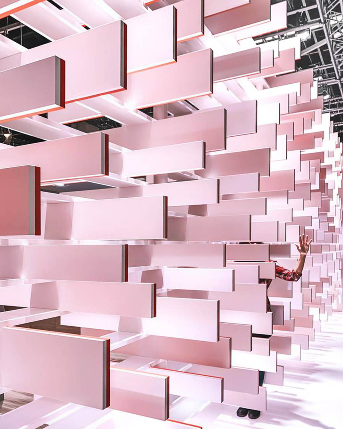
Including a person will make your architecture photography more compelling.
Of course, it can be more challenging to include a single person in your photo – especially when you’re shooting in busy cities.
But with a little patience, you’ll be able to capture spectacular architecture photos with a wonderful human element.
9. Get Creative With Your Shooting Perspective
The danger with photography is that your compositions can look too ordinary.
So how do you ensure your architecture photos look interesting and unique?
One of the easiest ways is to get creative with your shooting perspective.
Don’t just photograph a building from the most obvious angle.
Explore lots of different perspectives until you find something that works.
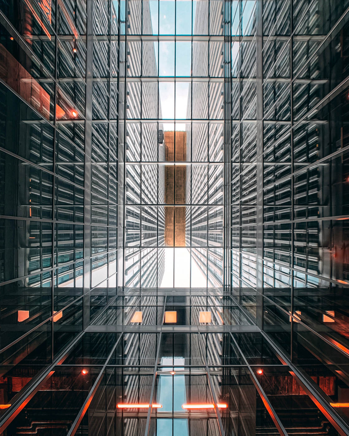
Shoot from a low angle for an incredible look-up building shot.
And explore high points of view for a totally new perspective.
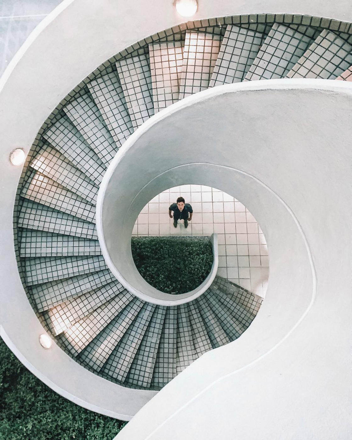
Try shooting down from a bridge or from the top of a spiral staircase.
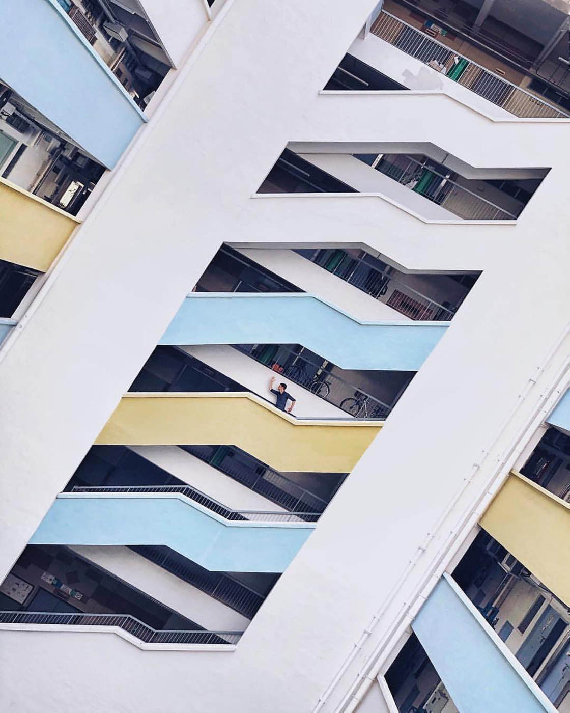
You could even tilt your iPhone at an angle to capture a slanted view of the building.
This works particularly well when there are lines in the composition. Tilting the camera changes the angle of the lines. So vertical lines will now run diagonally through the image.
Experiment with shooting from different distances too.
Try including an entire building in a wide-angle shot. If you can’t fit everything in, use an add-on wide-angle lens such as the Moment wide lens or Hitcase wide angle lens for iPhone.
Then get closer to crop out certain elements. Focus in on specific architectural features that catch your eye.
Finally, here’s a fun way to get really creative with your iPhone architecture photography:
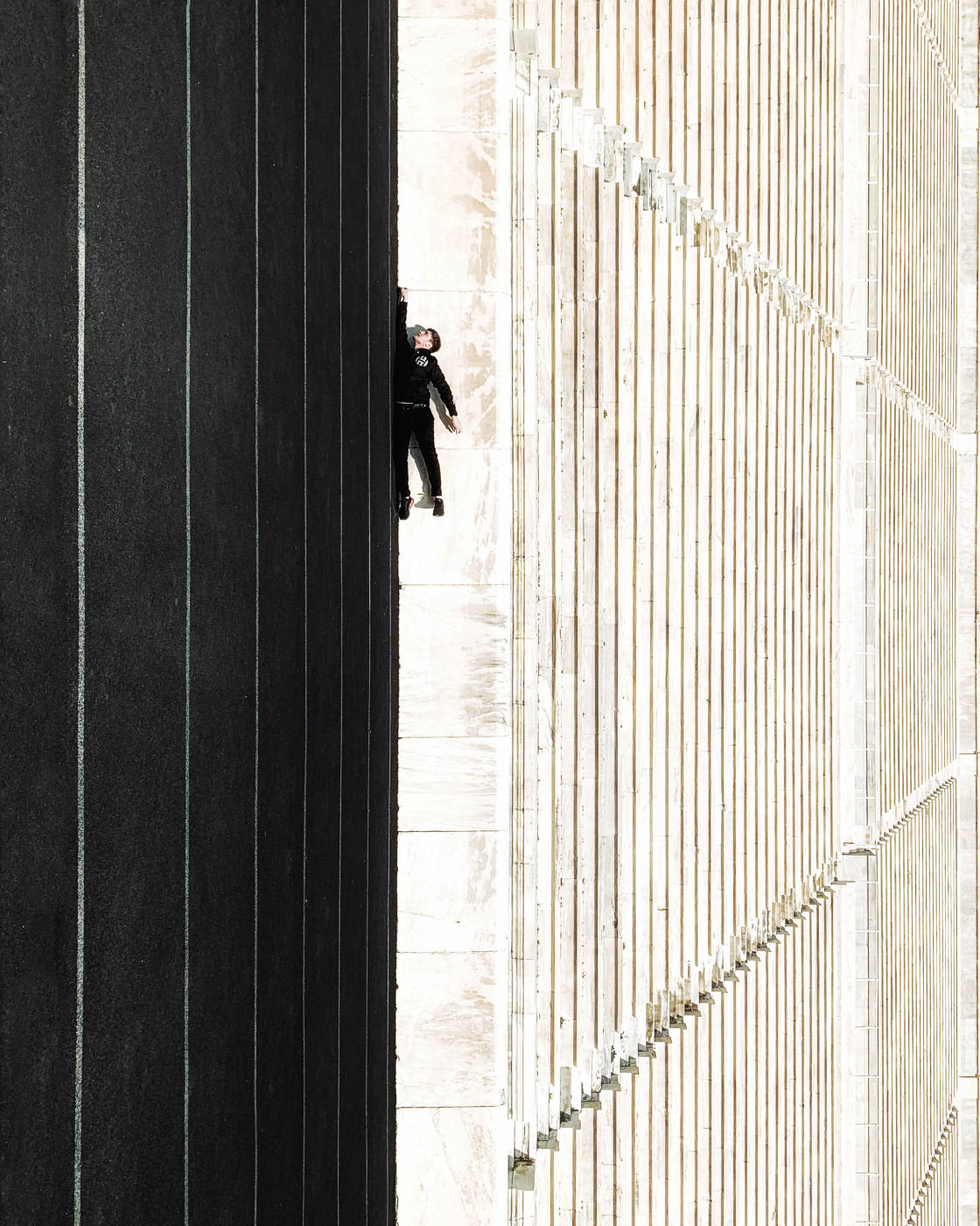
Flip or rotate your image to create a playful perspective twist.
The photo below was rotated 90 degrees in post-processing.
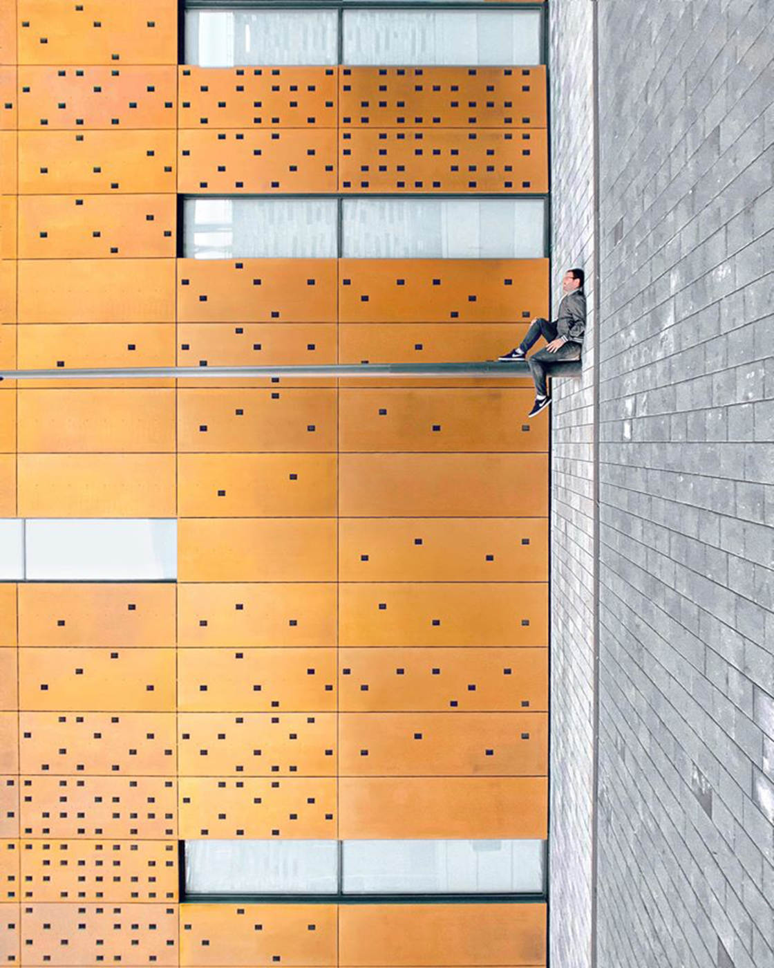
What’s most intriguing about the image is the person. He appears to be sitting upright on the pole with his back leaning against the “wall.”
But in reality, he was lying on the ground with his legs up against the pole.
This play on perspective tends to confuse or irritate the viewer. In photography, this is a good thing because it makes the image more thought-provoking.
You can see that something’s not quite right. But it takes a while to figure out what’s going on.
You might even need to rotate your phone or tilt your head to fully understand the image.
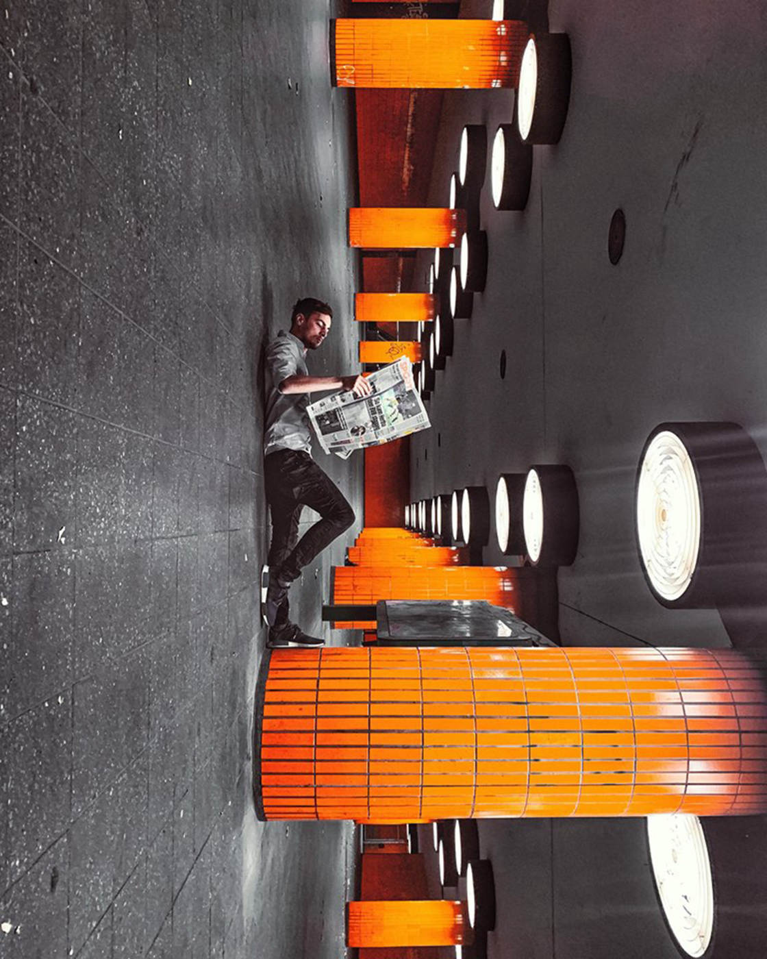
Of course, this type of composition takes more planning.
You have to visualize what the scene would look like if you rotated it 90 or 180 degrees. And you have to work out how to pose the subject.
You also need to find a person who’s willing to pose for you. Or you need to set up your phone on a tripod and pose in the photo yourself.
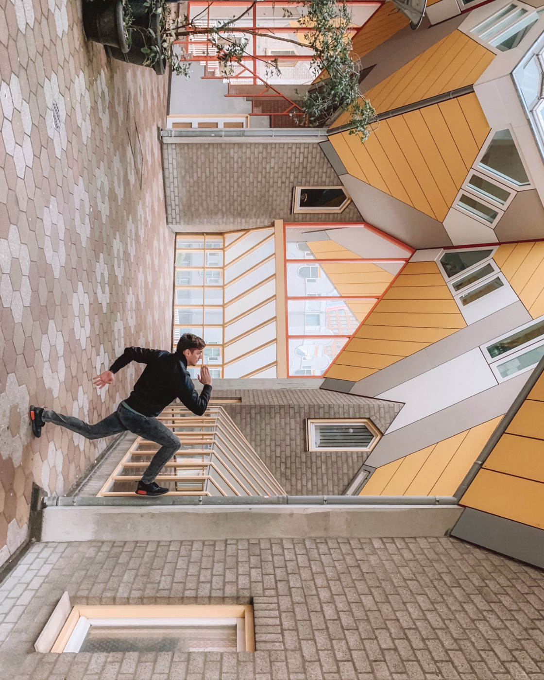
But perspective twists are an amazing way to create unique architecture photography that really captivates that viewer.
And it’s also great fun to create these kinds of images!
10. Correct Perspective In Editing For Perfect Architecture Photography
Have you ever taken a photo of a tall building and been disappointed with the results?
Does the building appear to converge towards the top?
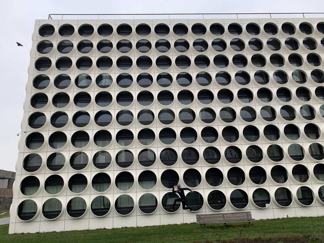
Don’t worry – you didn’t do anything wrong! This is just what happens when you shoot with your iPhone tilted up to get everything in the frame.
Luckily, there’s an easy way to fix perspective problems in post-processing.
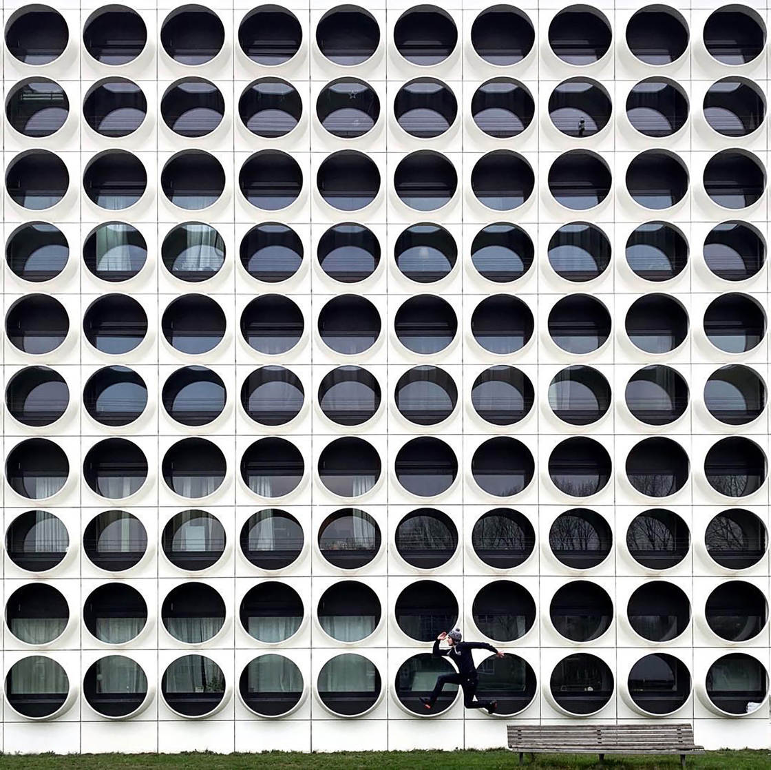
With a simple photo editing app, you can easily straighten up the building.
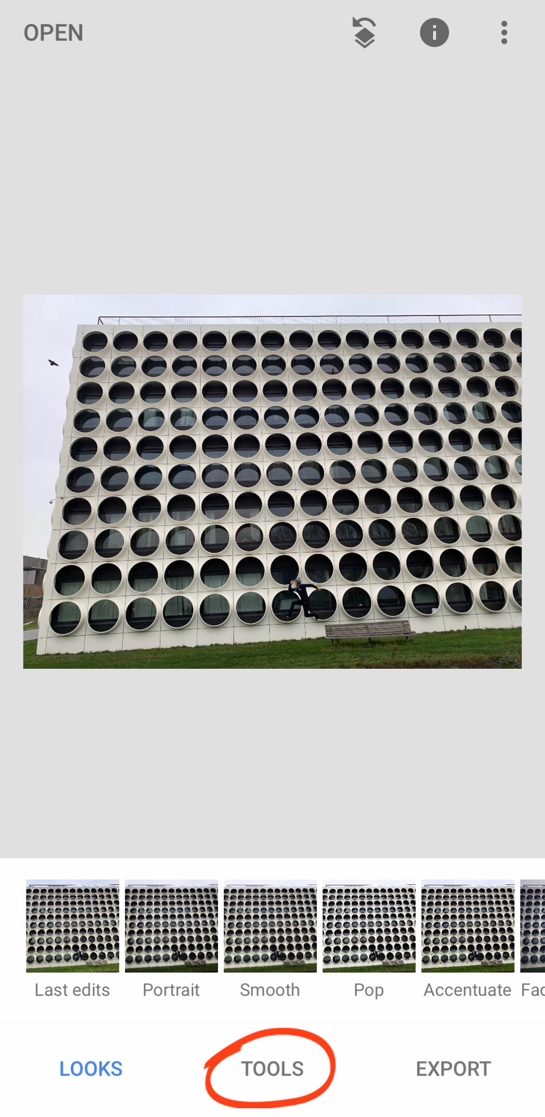
Many editing apps have a perspective correction tool. In this tutorial, you’ll learn how to correct perspective using the free Snapseed app.
Open your image in Snapseed. Then tap Tools at the bottom of the screen.
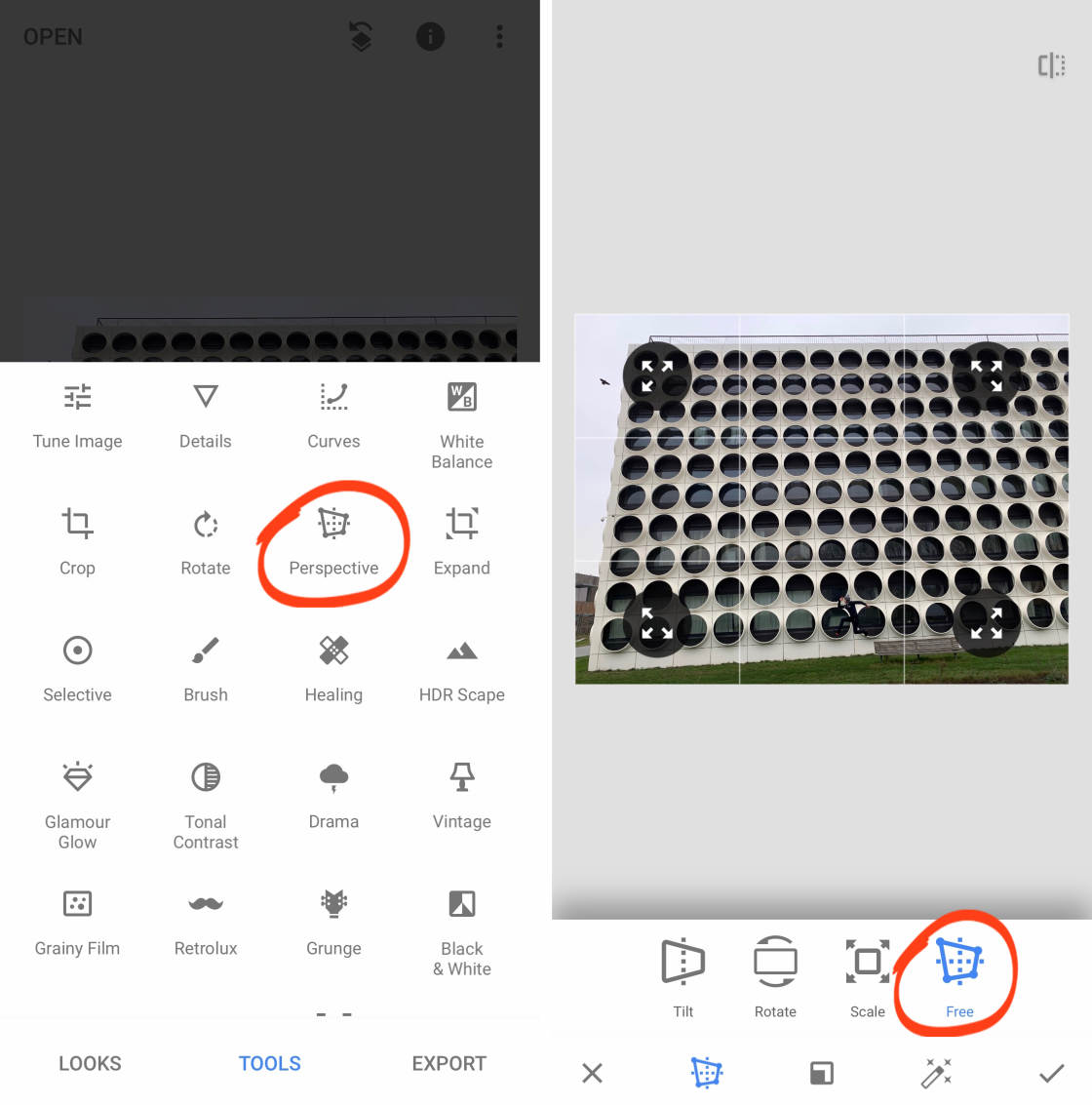
Tap on Perspective, then select the Free tool.
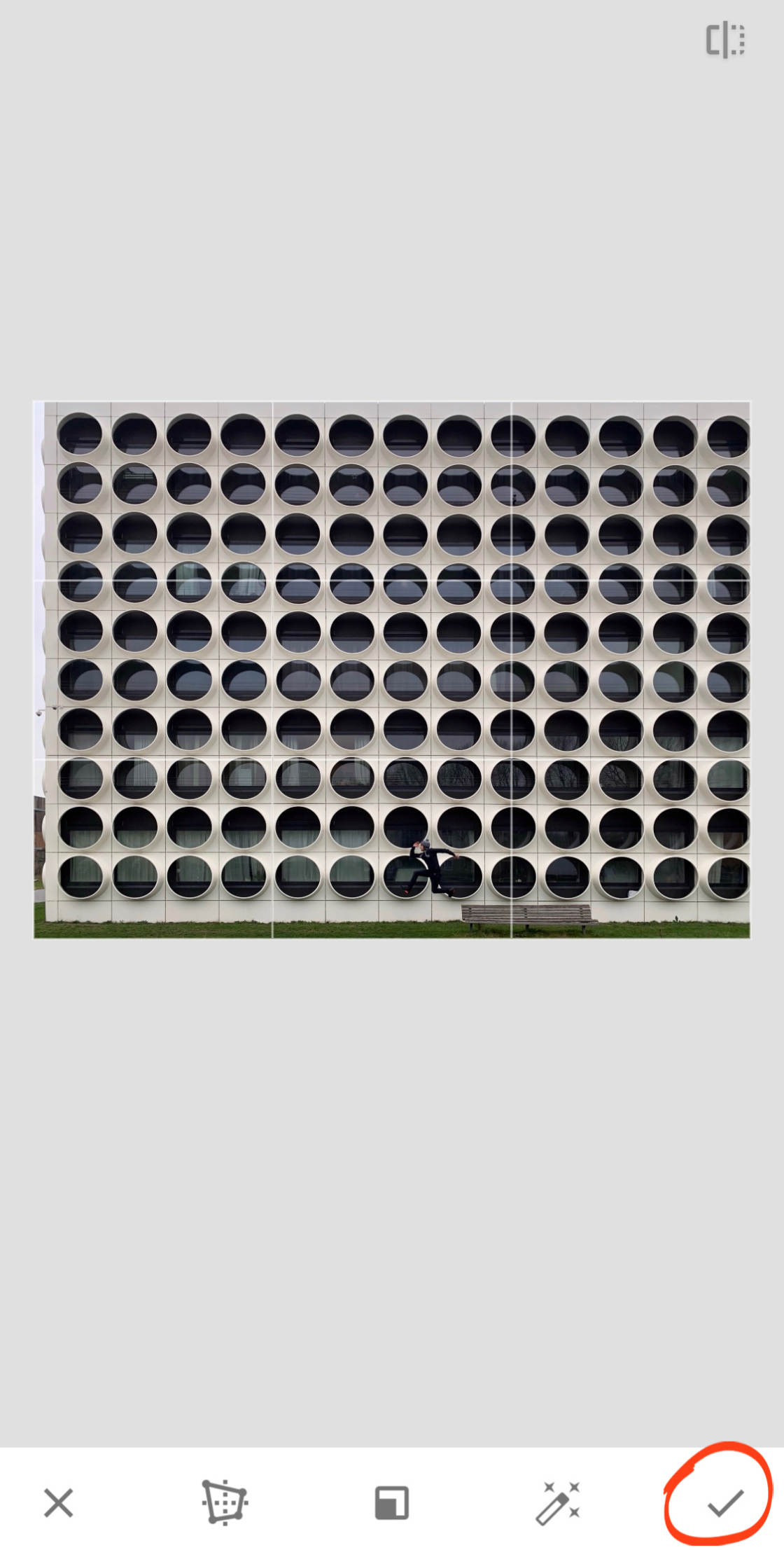
Drag the corners of the image to stretch out the building at the top.
Use the gridlines to help you get the building perfectly straight. Tap the checkmark when you’re done.
At this point, you might want to crop the image. If so, go to Tools, then Crop.

Select an aspect ratio from the options at the bottom of the screen, e.g. Square, 4:3, etc. Then drag the corner handles to crop your photo.
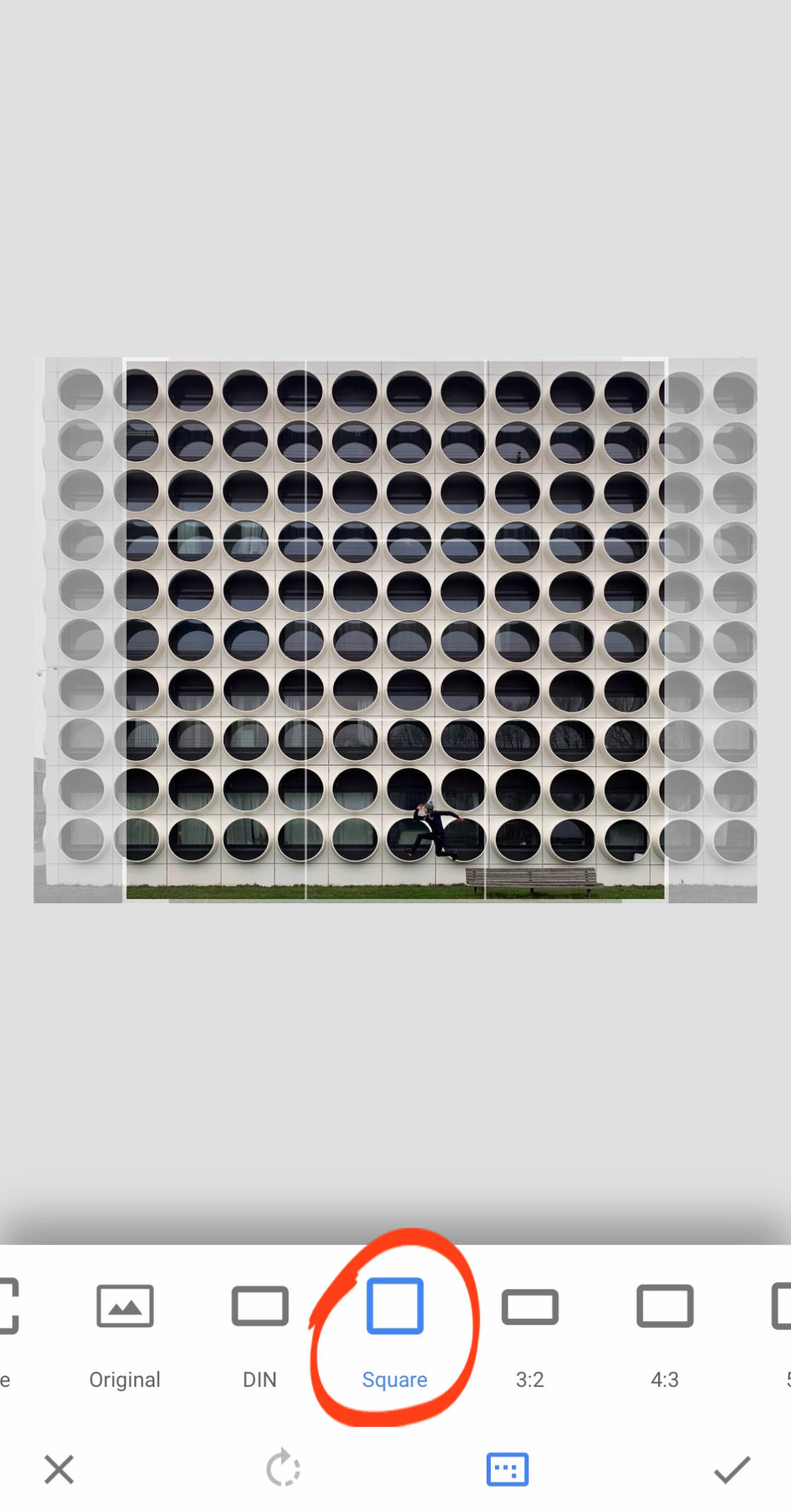
Tap the checkmark to complete the crop.
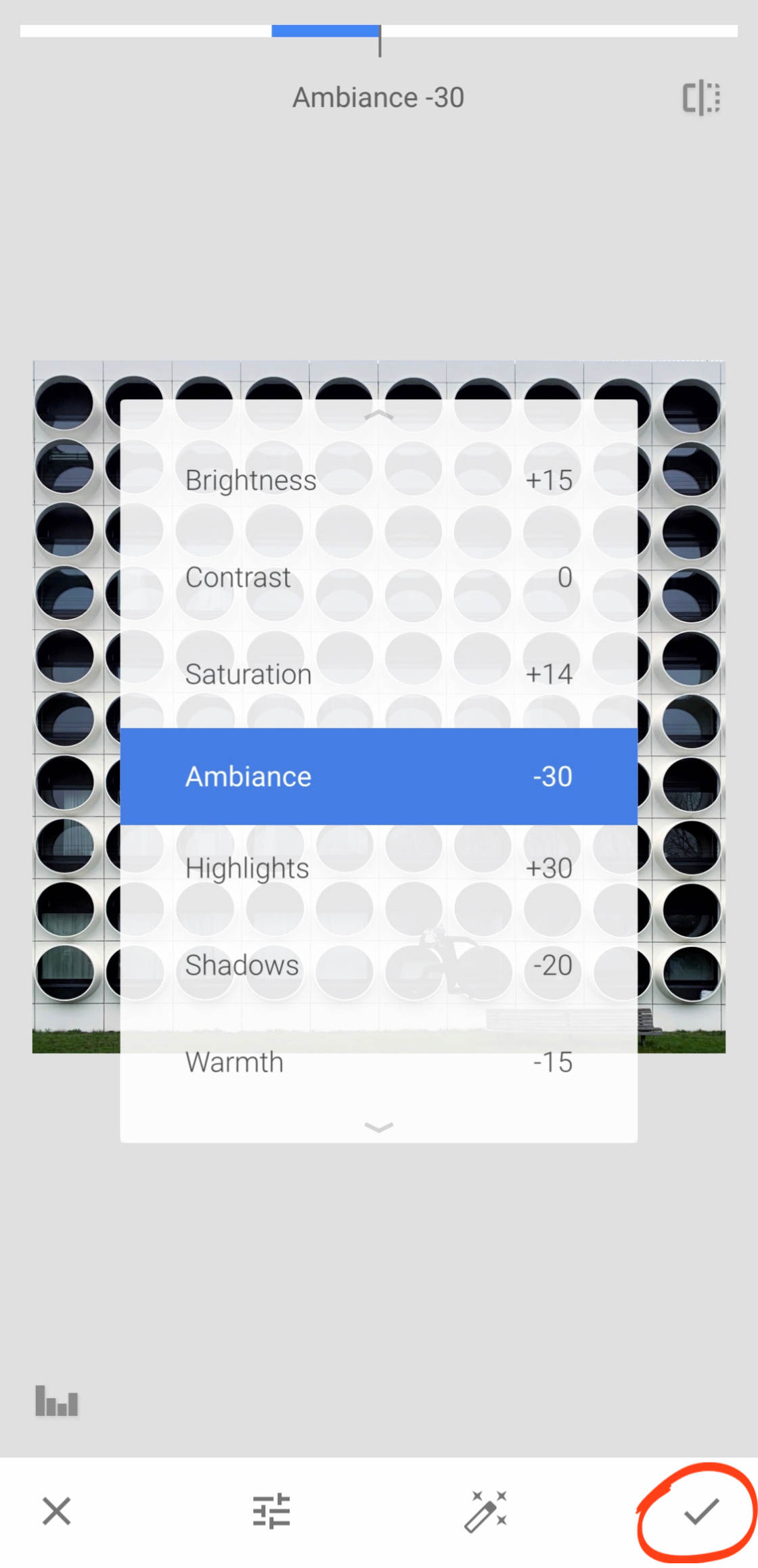
While we’re here, let’s quickly show you how to improve the color and lighting in your photos.
Tap Tools, then Tune Image.

Swipe up or down, and select the tool you want to use. Then swipe left or right to adjust the setting.
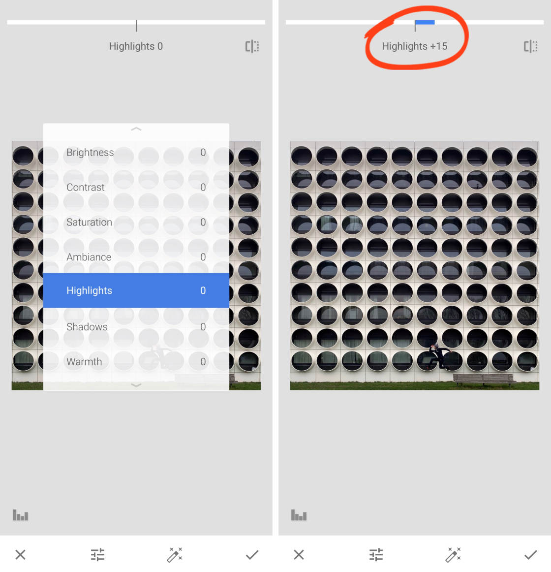
Play around with the different exposure and color settings until you’re happy with the image. Then tap the checkmark when you’re done.
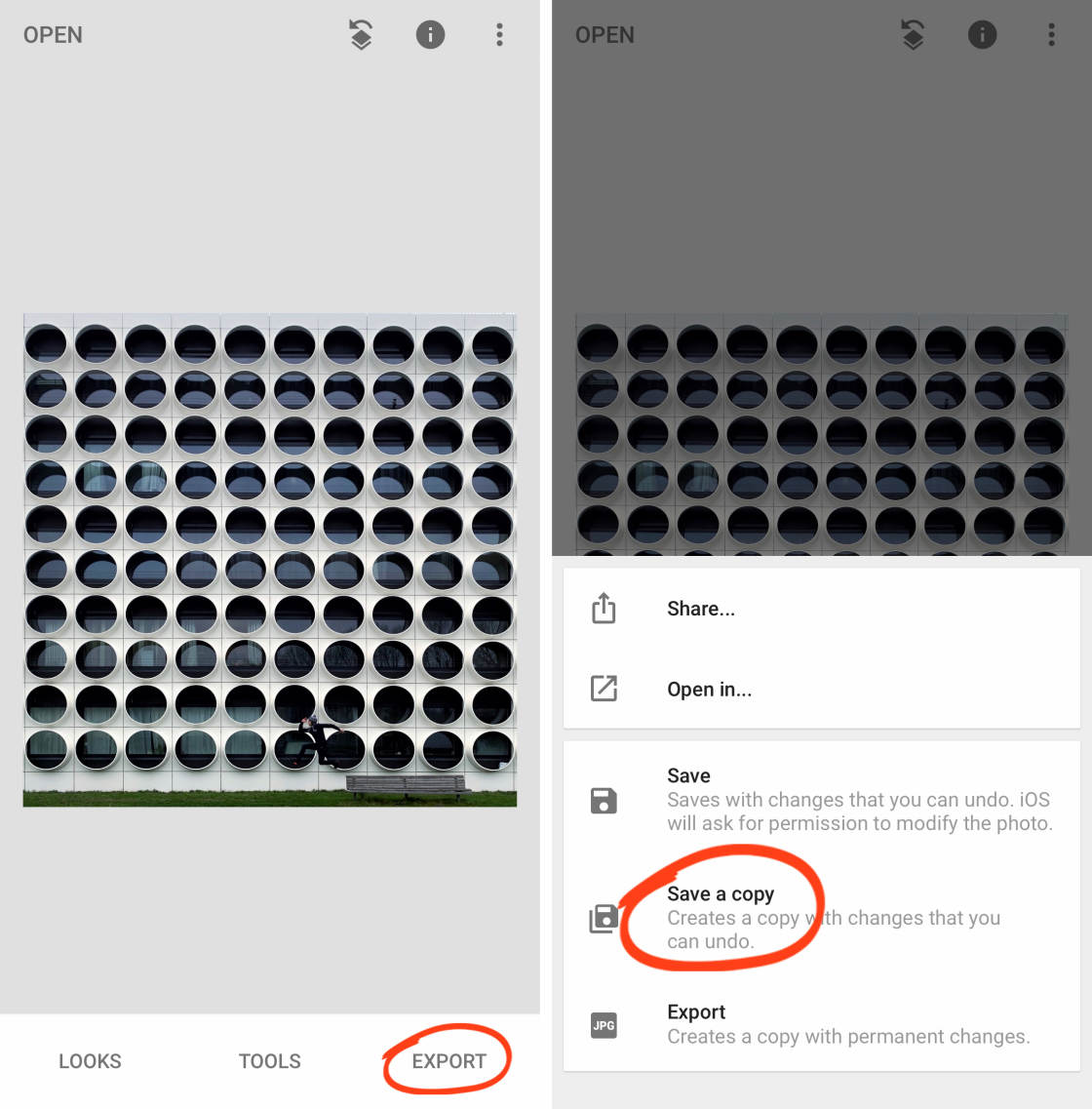
Save your edit by tapping Export, then Save A Copy.
Of course, Snapseed has many other editing tools for enhancing your image. So go ahead and use them if you wish.
And if you prefer to use a different photo editing app, that’s absolutely fine. I usually use a combination of Adobe Lightroom and Snapseed to edit my architecture photos.
If you’re new to iPhone photo editing, Snapseed is a great place to start.
But whichever app you choose, the ability to correct perspective is an absolute must.
Perspective correction lets you turn an average picture of a building into a stunning architecture photo!
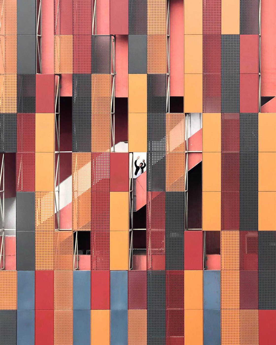
You can see more examples of my iPhone architecture photography on Instagram @mart.lindner


Leave a Reply
You must be logged in to post a comment.