Flowers are wonderful iPhone photography subjects because they’re simple to shoot and always look beautiful when you photograph them. And you don’t even have to wait for nice weather – you can purchase a bunch of flowers at any time of the year. There are many creative ways to shoot and edit flowers, and one of my favorite techniques is to create a flower portrait. Much like a portrait of a person, a flower portrait captures the mood and essence of the flower, highlighting its color and petal shape. In this tutorial, you’ll learn how to create a unique and beautiful flower portrait using apps on your iPhone to add blur, paint and texture effects.
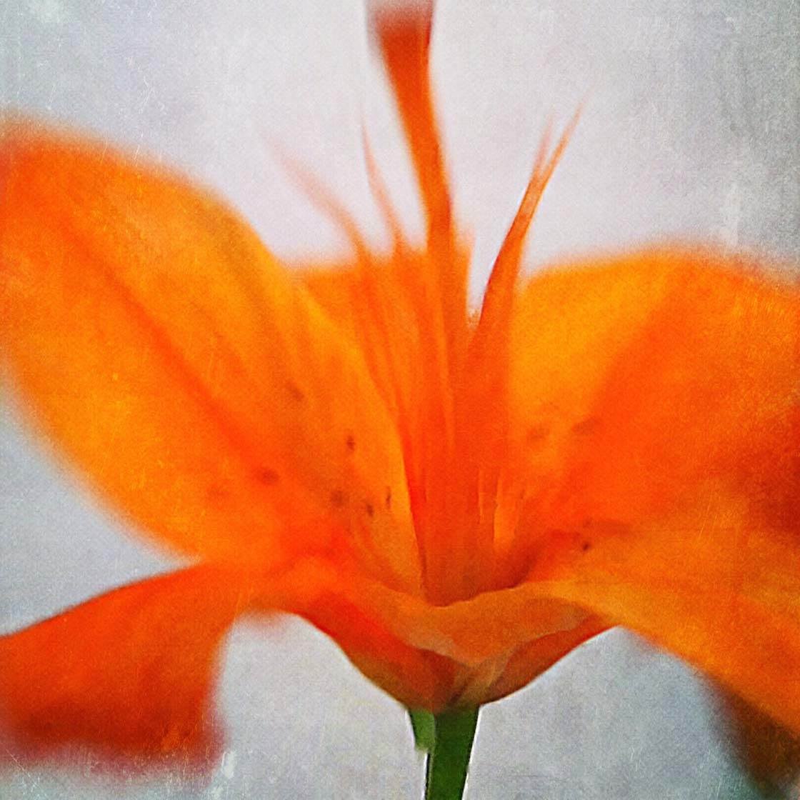
Choose A Single Flower
For this project we’ll use a single flower. Since we’re creating a flower portrait, it allows one flower to shine. Plus, a blur effect on a group or bunch of flowers creates too much abstraction.
When choosing flowers for this project, it’s best to find those that are open and star-shaped, with petals radiating out to all sides, like sunflowers. The blur effect will be applied to emphasize the direction in which the flower petals extend.
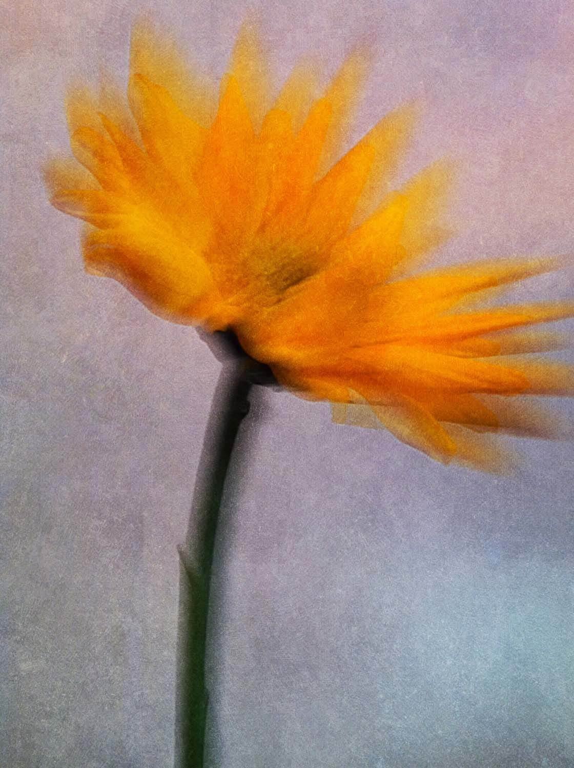
How To Photograph The Flower
Put the flower in a narrow vase or bottle so that it stands up straight. It’s up to you whether you wish the photograph to include the vase or bottle. Sometimes, it’s a nice addition to the photo, but try several shots to determine which you prefer.
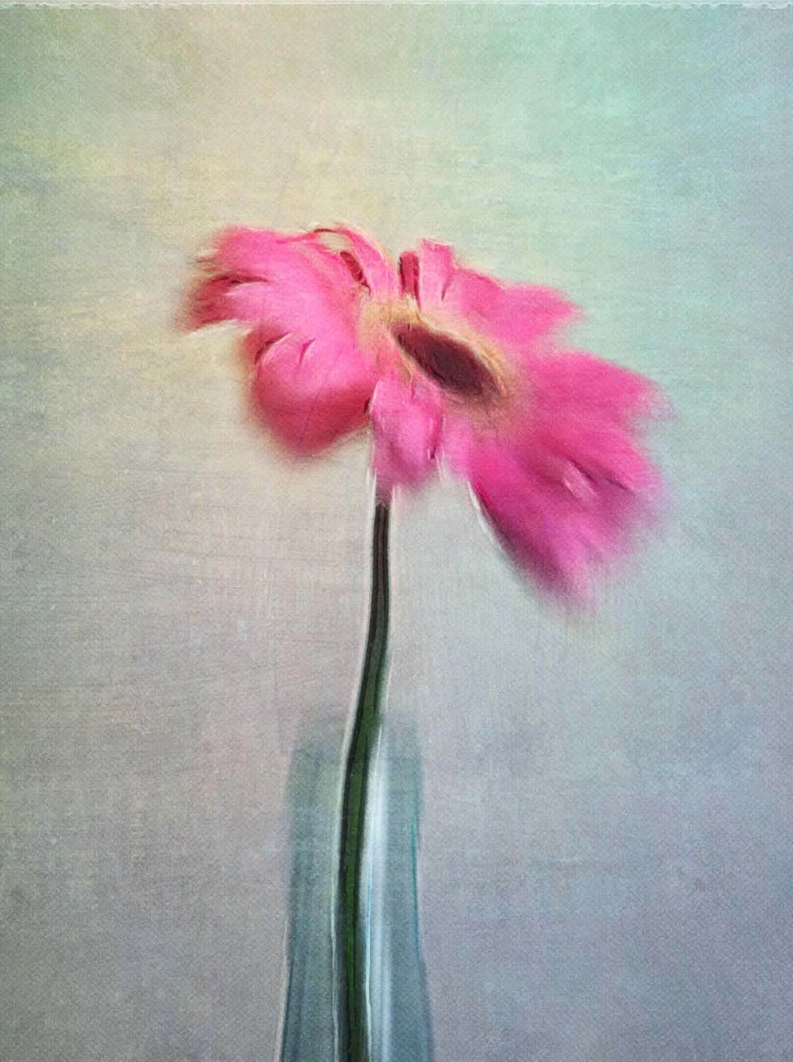
Find a solid background to shoot against. However, avoid a bright white background because it will be difficult to notice any texture when it’s applied during the editing process.
An off-white or beige background usually works well, but you could also use a colorful background that contrasts with the color of the flower.
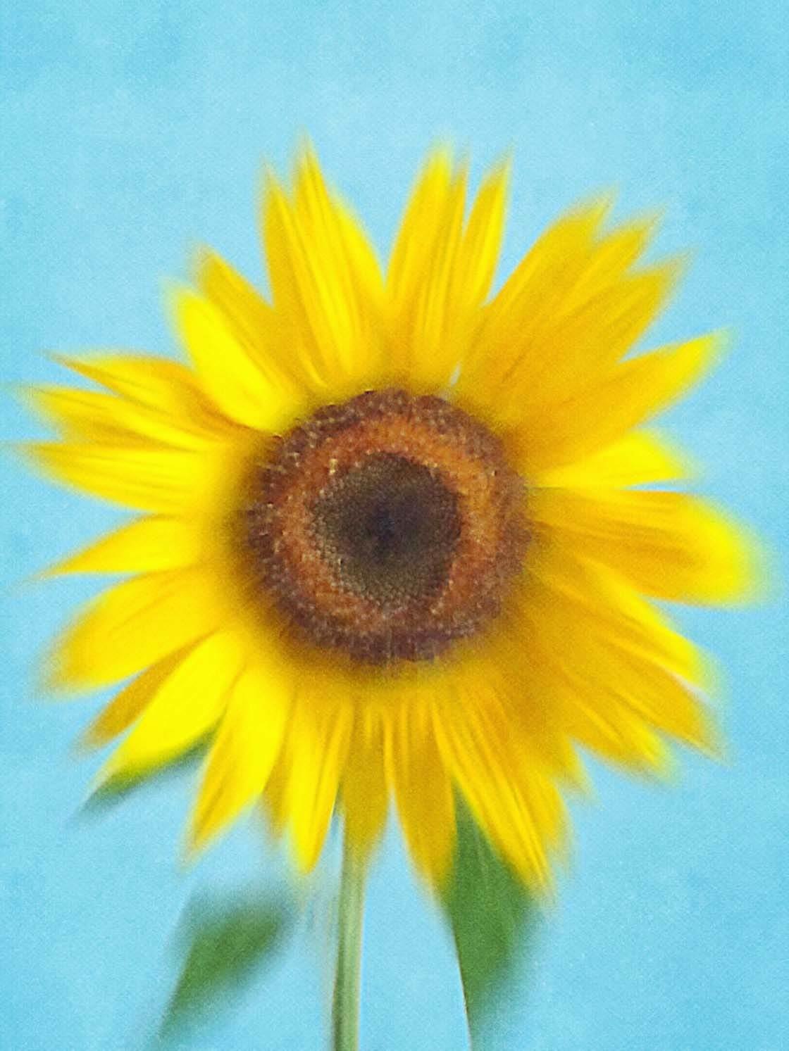
Take several shots, turning the flower to different angles each time. You never know which shot will look best when the blur effect is applied. Many times, a side view creates a unique perspective.
When you photograph, allow space around the top and sides of the flower. This is called negative space and it’s the area around the subject that’s devoid of any subject matter. The negative space will help to frame the flower and make it stand out.
Here’s the photo we’ll be using for this tutorial. If you want to use this flower for your edit, you can download it here.
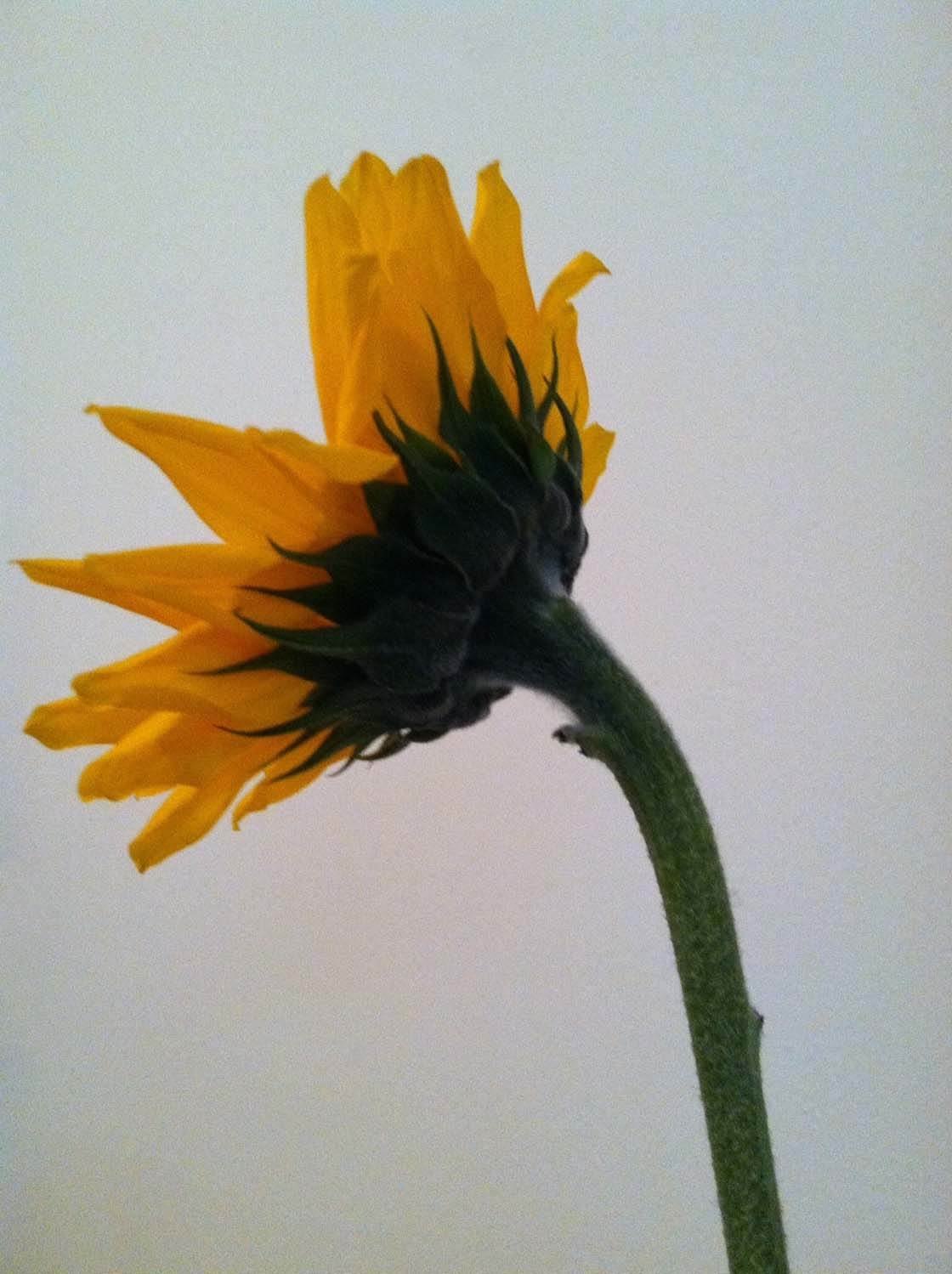
Alternatively, you could photograph your own flower and use that during this editing process. Once you’ve got your flower photo, you’re ready to start…
Step 1: Blur The Flower In iColorama S
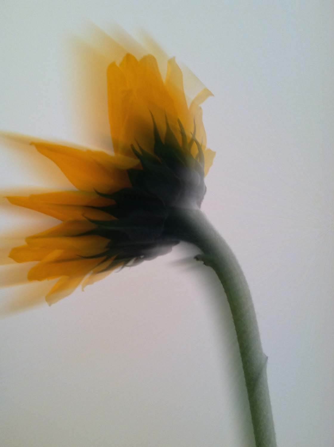
The first editing step is to add a blur effect. Blur adds a beautiful abstract quality to the photo. It creates a sense of motion and makes the flower look windswept.
To create the blur effect, we’ll be using the iColorama S app. This is a complete photo editing app, offering basic to advanced editing tools and tons of different effects.
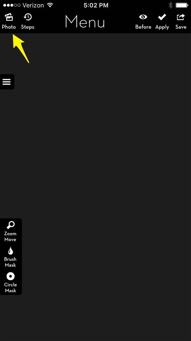
Once you open the app, select the Photo icon in the top left corner to import your flower photo for editing:
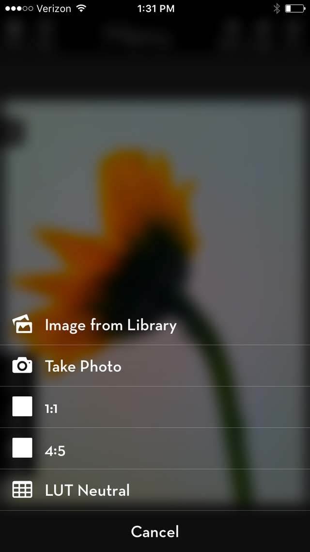
Next, select Image From Library to select the photo:
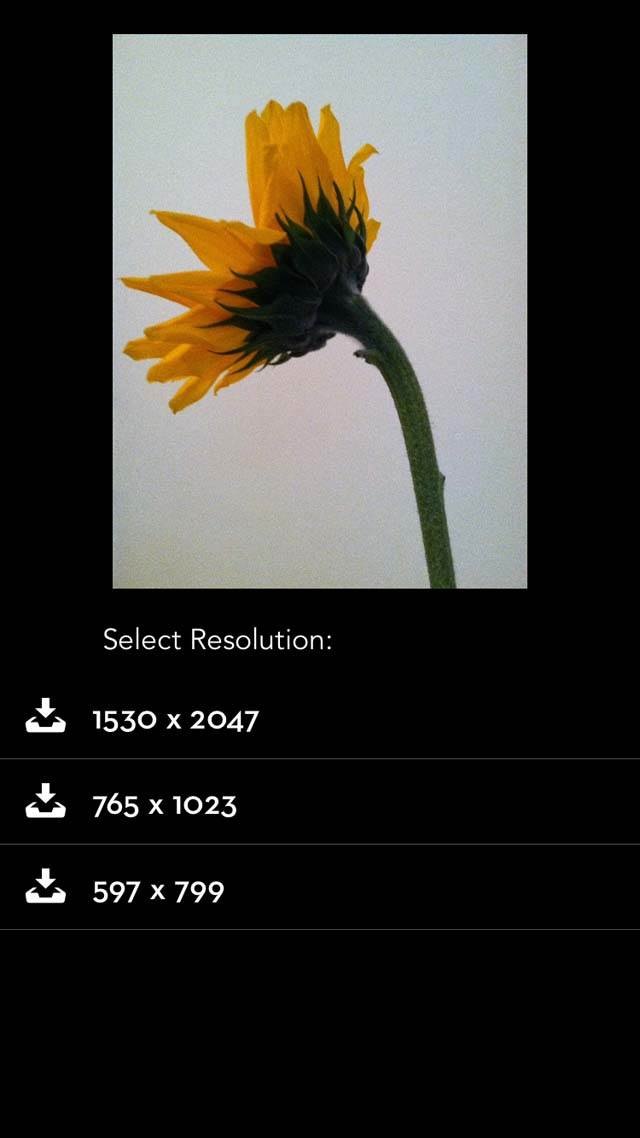
On the next screen, you’ll be able to select the final resolution for your image. I would recommend always choosing the highest resolution for the largest and best quality image:
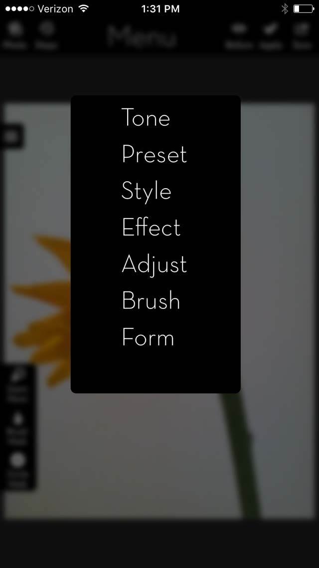
Select Menu from the main screen. When the drop-down box appears, select Effect:
In the Effect menu, scroll across to select Blur:
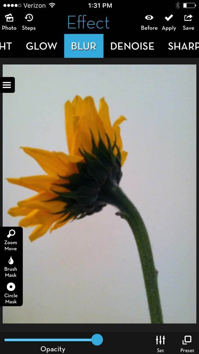
You’ll notice a Preset icon in the bottom right corner. When you tap it, a menu pops up that allows you to see all of the different types of blur effects available.
For this tutorial, we’re only going to use one of the blur effects – number 3/189:
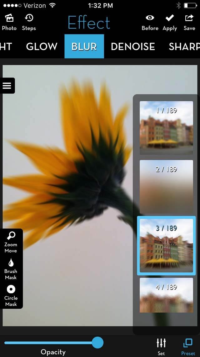
This effect is a radial or zoom blur, which means the blur radiates from a center point. By adjusting different aspects of this preset, you can affect the direction of the blur.
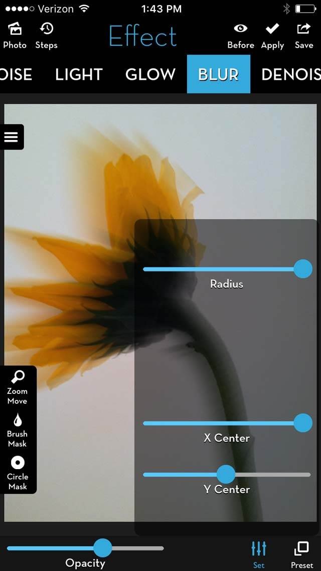
To the left of the Preset icon is a Set icon which allows you to adjust the radius, as well as the horizontal and vertical direction of the blur. The Radius slider determines the radius or expansion of the blur:
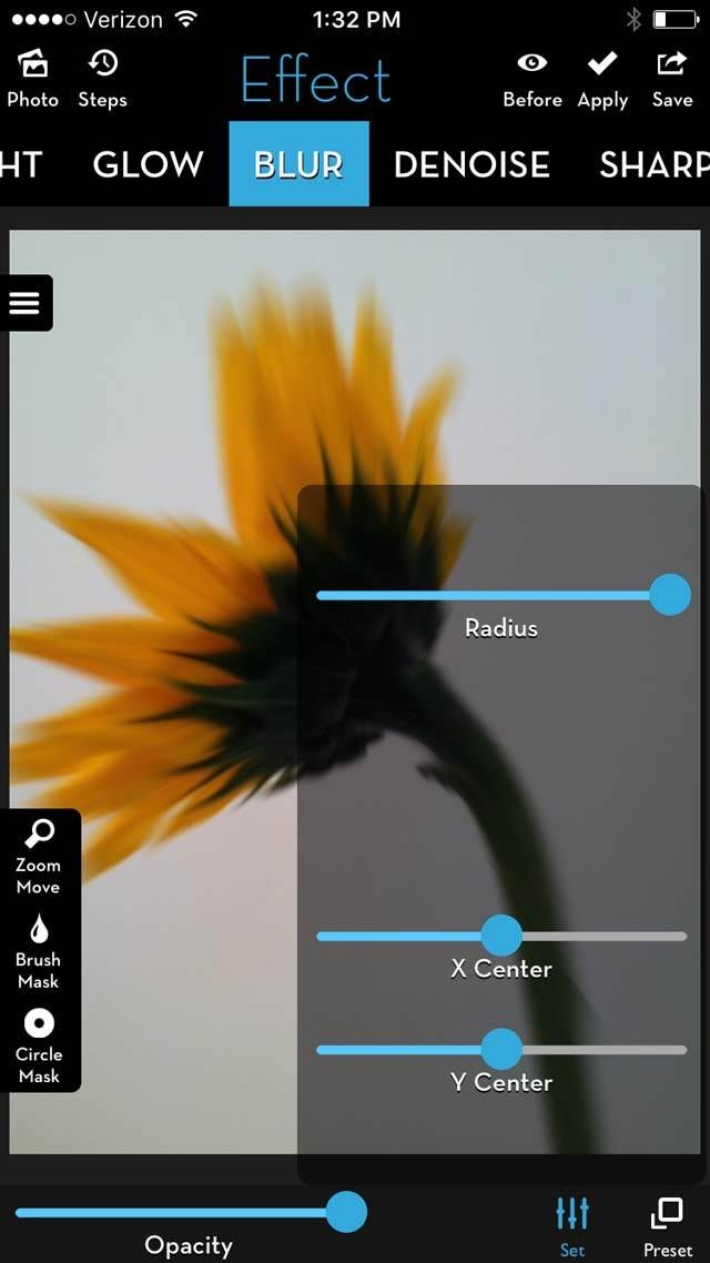
The X Center slider adjusts the horizontal direction of the blur. When it’s set to 0.00, the blur radiates farthest to the right. When it’s set to 1.00, the blur radiates farthest to the left:
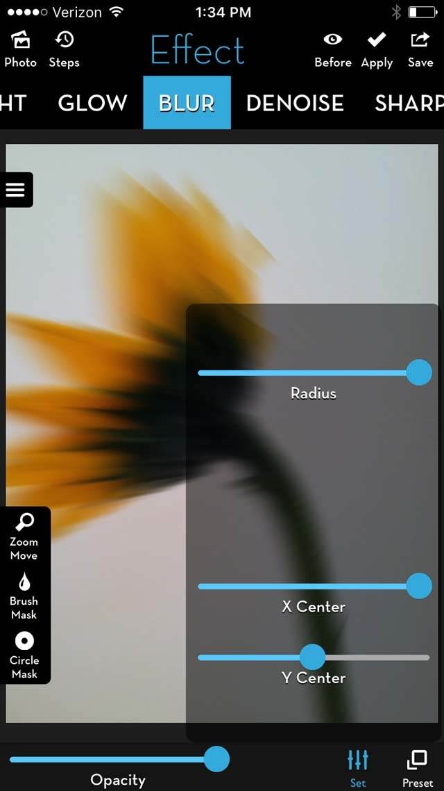
The Y Center slider adjusts the vertical direction of the blur. When it’s set to 0.00, the blur radiates farthest to the top. When it’s set to 1.00, the blur radiates farthest to the bottom:
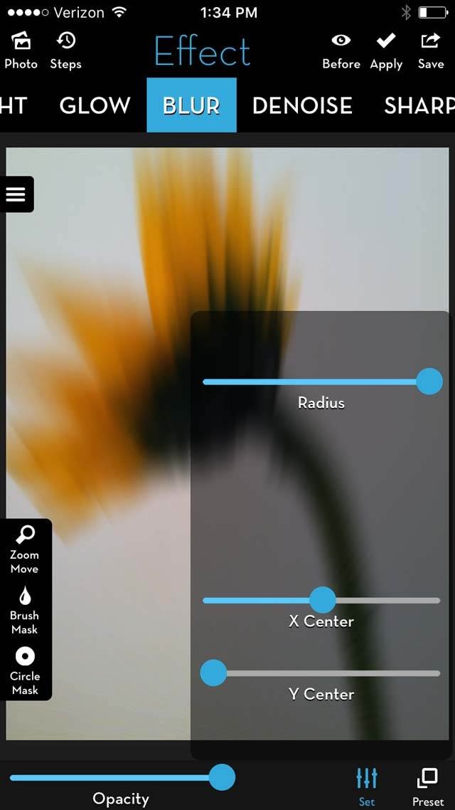
Since this flower’s petals were already radiating toward the upper left of the frame, moving the X Center to 1.00 helped to accentuate this pattern.
The Opacity slider controls the amount of blur overall. If you want more detail in your photo, lower it. Since I wanted a little more detail, the Opacity was lowered to 70%.
Experiment with the radius and opacity until you find the blur effect you desire. My goal is always to accentuate the natural direction of the flower petals while still keeping enough detail so that you know it’s a flower:
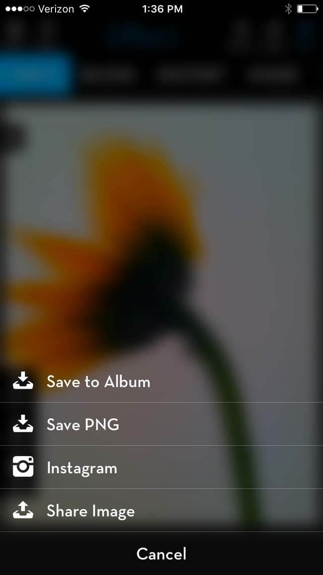
Now, we’re ready to save the image. Tap the Save icon in the upper right corner and select Save to Album:
This is how the image should appear:
Step 2: Apply A Paint Effect In Brushstroke (Optional)
The next step is to add a painting filter, but this is optional. This step makes the flower look like it’s been painted instead of photographed.
The paint and texture effects blend seamlessly together, but you may find that you like the photo without this effect.
To paint the photo, we’ll be using the Brushstroke app. Brushstroke converts your photo into a painting with just one tap. It offers more than 50 different paint and painting styles including watercolor, acrylic, oil, and lead pencil.
When the app opens, tap the left icon to select the image you just blurred in the previous step:
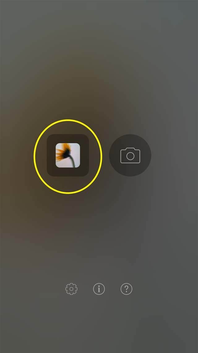
On the next screen, make sure your photo is showing in the photo window, then tap the right arrow at the top right of the screen:
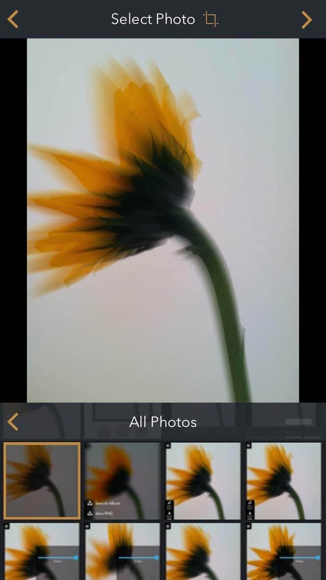
The app will then “paint” your photo. You’ll see a variety of paint filters such as Oil, Washed, Medium, and Natural. Scroll across until you reach the Simple filters. Select S1 from this section:
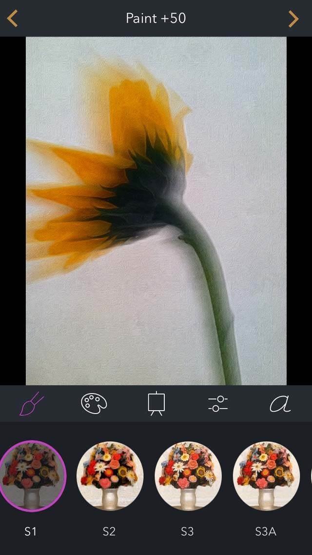
At the top of the screen, you’ll see the intensity of paint applied. Paint +50 is the default setting. But if you need to adjust this, swipe your finger right to increase it, or left to decrease.
You can change other aspects as well. To change the color palette, select the Palette icon. Next to that is the Canvas icon which changes the texture of the canvas.
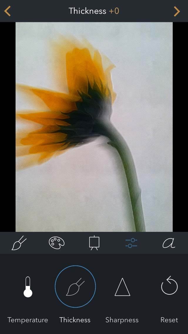
The fourth setting is for Basic Adjustments like sharpness, contrast, and brightness. If you don’t like the texture of the paint, you can adjust the thickness.
I prefer the paint strokes to be less noticeable, so select Thickness and then swipe the screen left until you reach +0:
To save the image, tap the right arrow in the upper right corner. On the next screen, tap Save to save the image to your photo library:
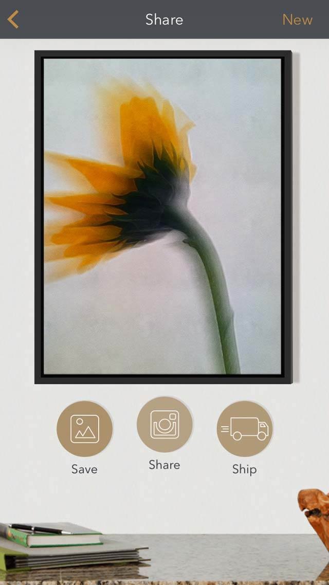
This is what your edit should look like at this stage:

Step 3: Add Texture In Mextures
Now, we’re ready to add some texture in the Mextures app. This step adds dimension to the flower portrait, and also gives you the opportunity to change the background color.
We’re using the Mextures app to add texture to the entire photo. Mextures has more than 100 gritty, grainy, dusty, vintage and grunge textures.
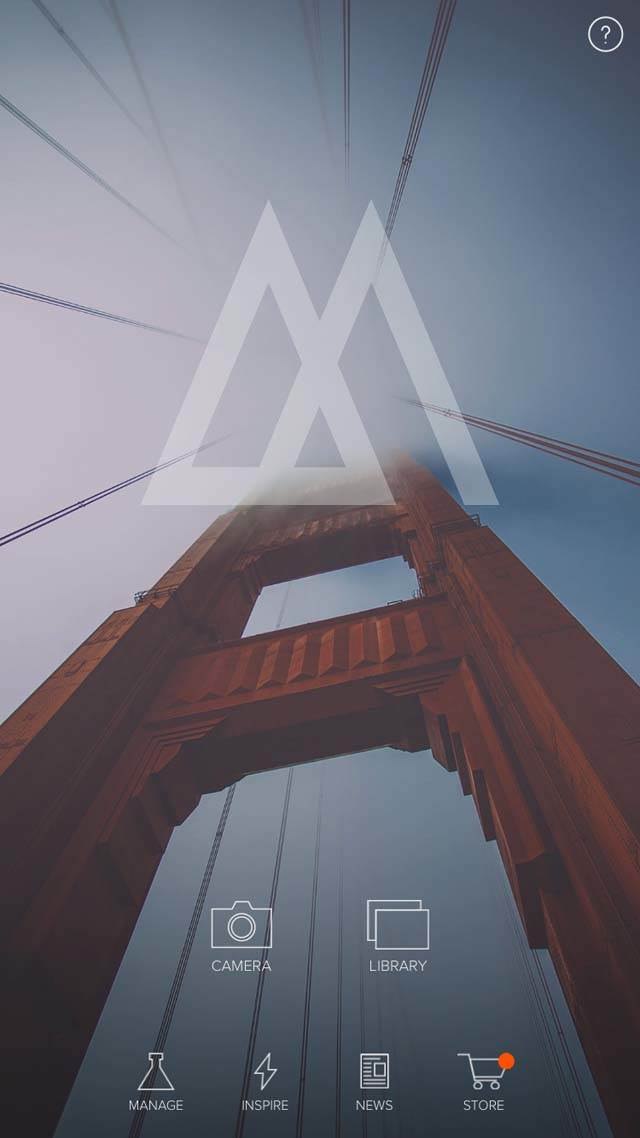
To open your photo in the app, select Library from the home screen:
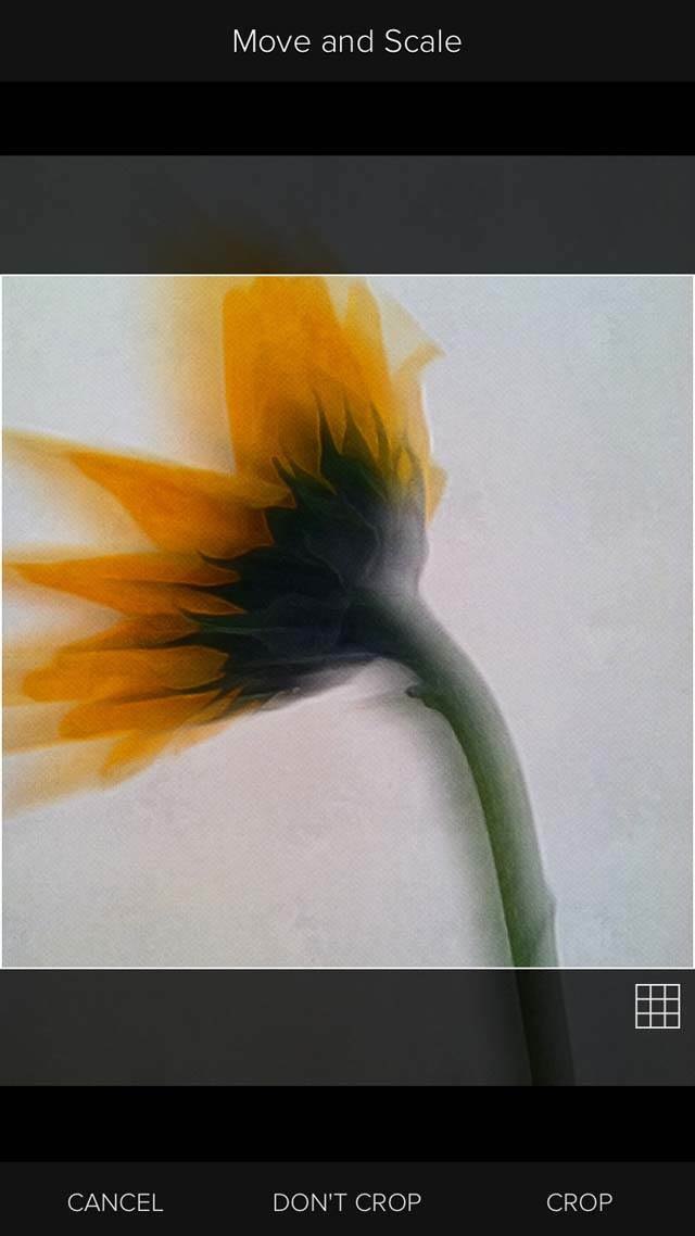
Select the photo that you just painted in the previous step. Next, you’ll have an option to move and scale your photo. You can also choose to Crop it here as well. For this project, we’re choosing Don’t Crop:
On the next screen, you’ll see many different categories, such as Emulsion, Grunge, and Vintage Gradients:
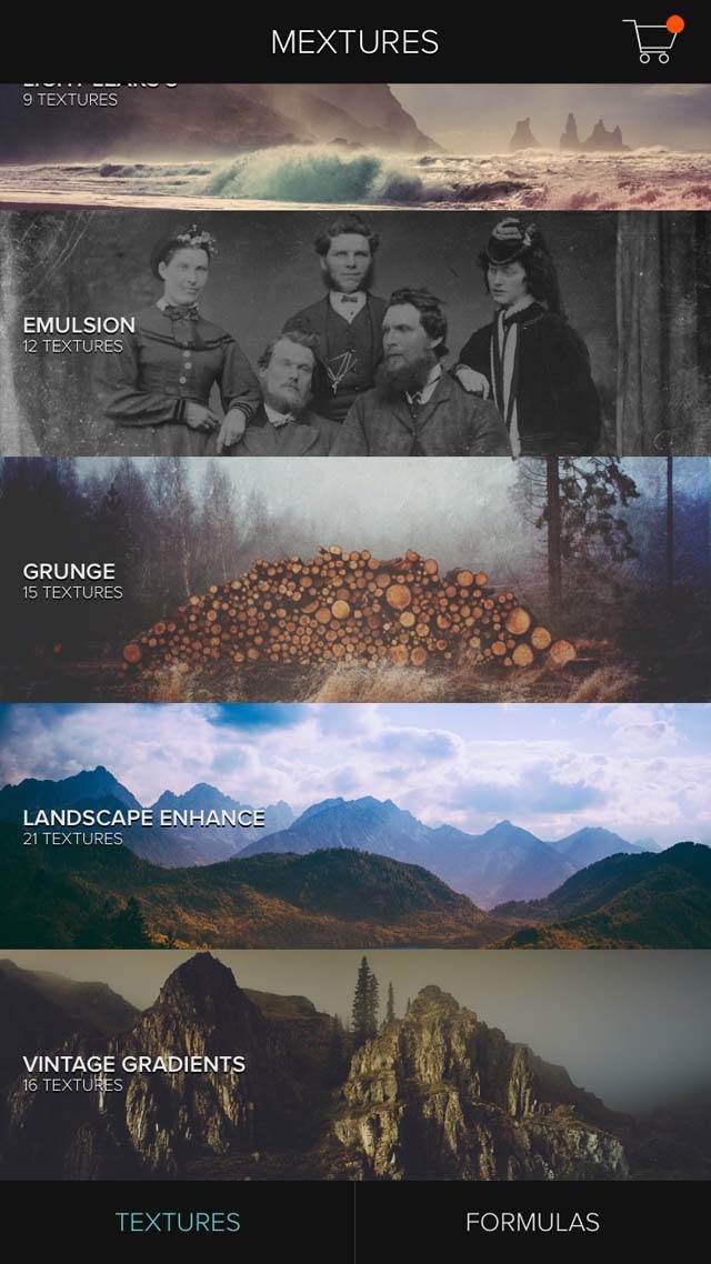
Select the Grunge category and you’ll see several grunge textures to choose from. Each adds a different combination of texture and color to your photo.
Using the slider on the right, you can adjust the intensity of each texture. For this photo, the Mulberry grunge filter was added at 60% opacity:
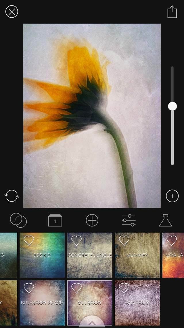
Once you’ve selected your texture, tap the Save icon in the upper right corner, then tap Save to Photo Library:
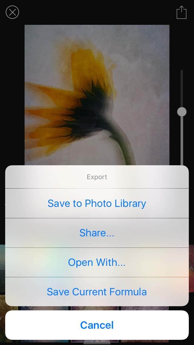
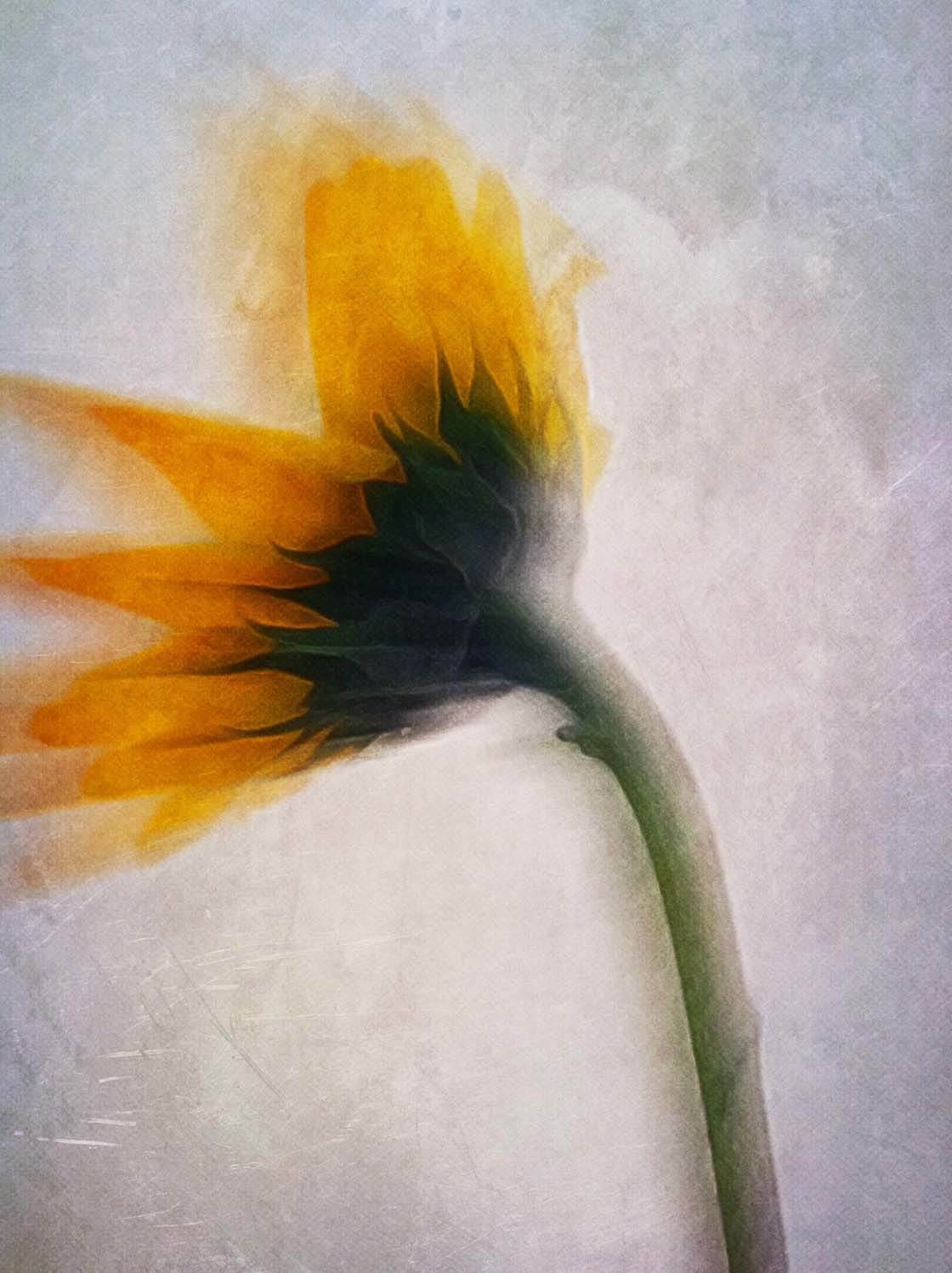
This is what your final photo should look like:

Conclusion
These three simple steps (blur, paint, and texture) create a “recipe” you can use to create this type of floral portrait on any flower photo that you take.
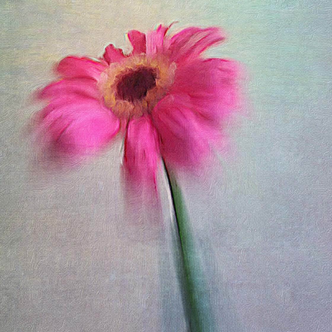
Of course, you can experiment with different filters and effects in each app to achieve a wide variety of effects that will make your flower photos truly unique.

Great tutorial. I will be giving this a try for sure. I think I’ll experiment with Mextures vs. Stackables for the “texture” piece.
Thanks so much Chris. Experimenting with different apps is a great idea. They will each change the recipe to create a uniquely different final image!
Great tutorial…thank you for sharing.
You’re welcome Mary! Hope you will experiment with it!
Thanks ~ Best Wishes