Photo composition is the key to creating powerful iPhone photos. There are many compositional rules that help you arrange the elements in a scene in the most visually pleasing way, but sometimes breaking the rules can lead to even greater results! So how do you know when to follow the rules and when to break them? In this tutorial you’ll learn how to use and break three common rules of composition to create stunning and compelling iPhone photos.
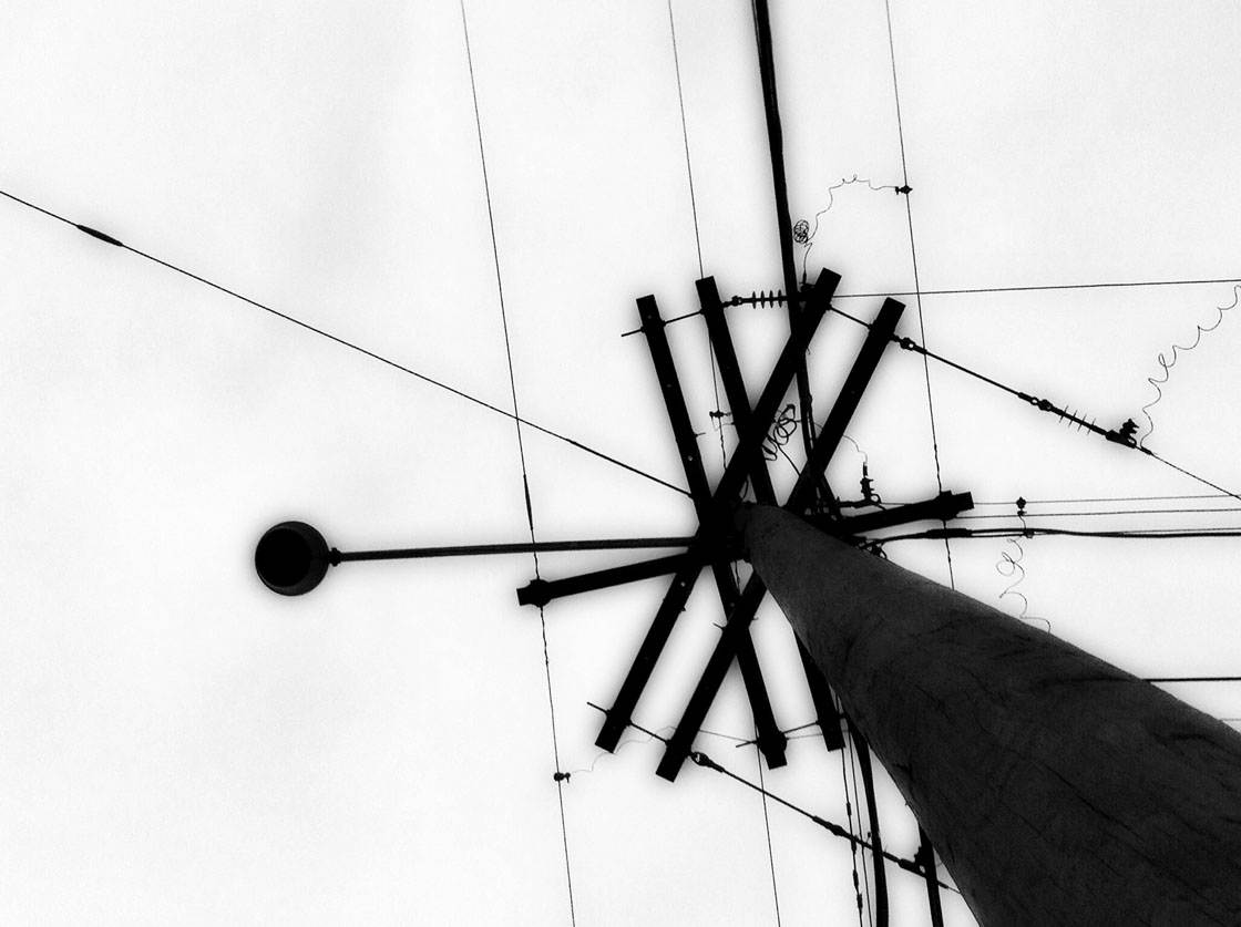 The three composition rules that we’re going to explore are:
- Simplicity
- Rule of thirds
- Negative space
Before you can break a rule of composition effectively, you first need to know how to use the rule. Once you know how to apply the rule in your photography, you can break it with intent for creative purpose.
So for each rule of composition we’ll first look at how to use the rule and when it works well. And then you’ll learn how to break the rule in certain situations.
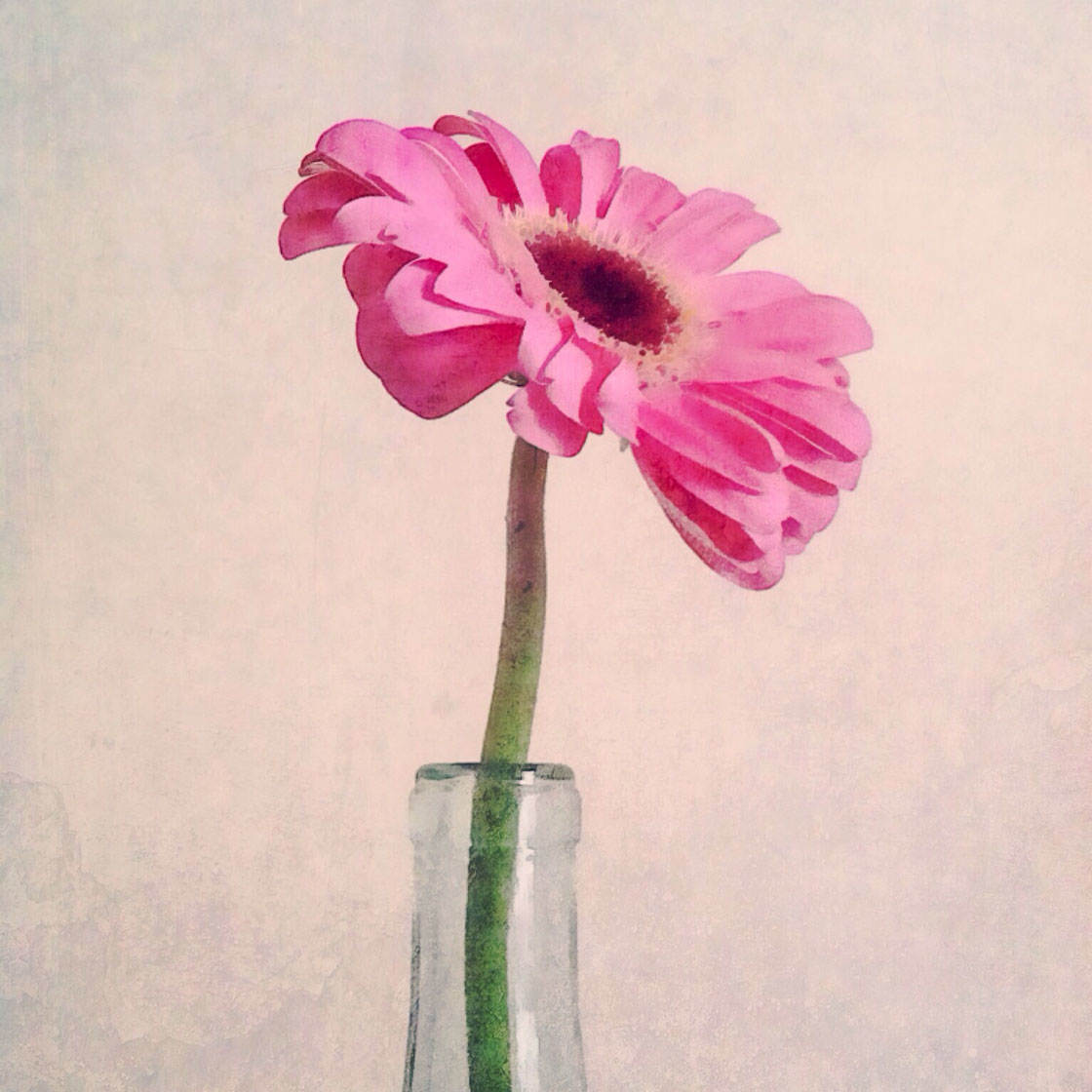
Remember that photo composition is all about getting the viewer to see what you want them to see, and in the way that you want them to see it.
So before you even look through the iPhone’s viewfinder, always take a moment to ask yourself: What is it about this subject or scene that I want to emphasize to the viewer, and what story do I want to tell?
You can then make better composition choices to help you to capture the scene in the best possible way.
Rule 1: Keep The Photo Simple
The best way to get the viewer to see what you want them to see is to keep your photo simple. This means identifying your focal point, and then eliminating clutter or background distractions that might take attention away from your focal point or subject.

Sometimes, when you find a great scene, you’ll want to photograph everything in it. When you look at the scene with your own eyes, everything looks interesting and worthy of capturing in your photo.

But when you simplify the scene, like I did in the photo below by moving closer to hats, the viewer knows exactly where to look. Keeping your photo as simple as possible adds impact and helps to focus the story on a particular aspect of the scene.

Without a point of interest, the photo won’t hold the viewer’s attention. Once you find your focal point, you’ll know what elements need to be diminished or eliminated from the scene.
In the photo below, there are several elements: a bouquet of flowers, several bouquets behind it, and several crates on a table. The scene is too crowded and we don’t know where to focus our attention.
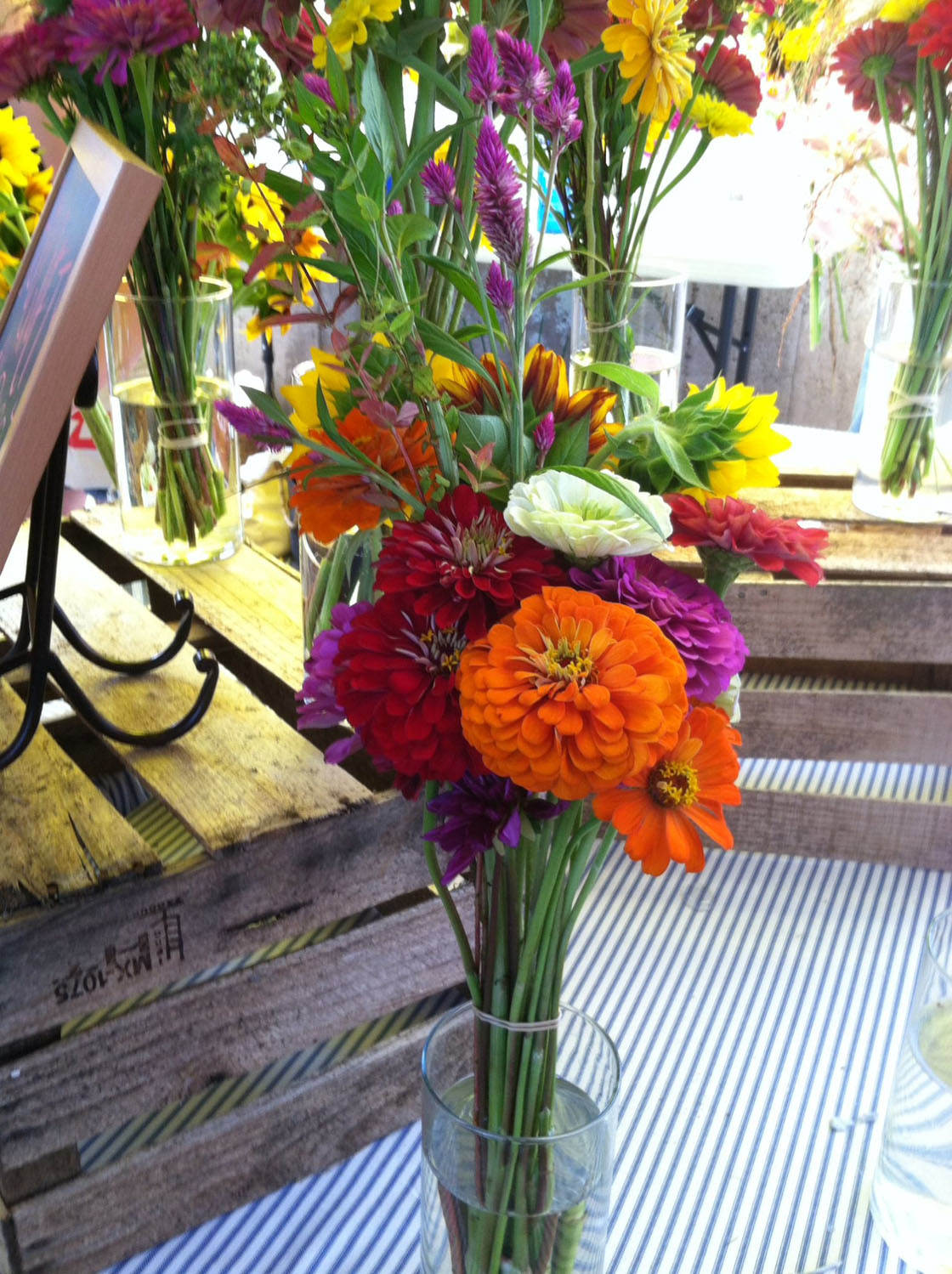
By focusing on just one flower in the bouquet, we create much more impact in our image. The orange flower is now our subject and the surrounding flowers frame it.

When To Break The Rule Of Simplicity
As with any rule, it’s important to know when to break it. Sometimes, the details of the background are just as important as the subject when they provide context for the photo.

The background or surrounding elements may help to tell the story of the photo. Without them, the subject might lose its purpose.
Sometimes, a busy scene can actually be more powerful than a simple one. The trick is to identify whether the surroundings are going to help you tell a story or not.

Below is a photo I took of a bench in a nature park. At first glance it might seem that I left in too much of the surrounding trees and foliage, taking attention away from the bench.

But remember that photo composition is about getting the viewer to see what you want them to see.
In this case, I wanted the viewer to see how this old bench had become completely integrated with its surroundings and was now another part of the forest.
If I’d moved in closer to the bench to eliminate the surrounding forest, I wouldn’t have been able to tell this story through my photo.
So whenever you’re taking a photo, take a moment to consider whether the scene would look better if it was simplified to remove all distractions, or whether you might be able to tell a more compelling story by including more of the surrounding elements.
Rule 2: Use The Rule Of Thirds
One of the most well known principles of photo composition is the rule of thirds. The rule of thirds relates to where you place the subject or focal point within the frame.
This principle tells us that instead of always placing your subject in the center of the frame, you can create a more natural balance by placing it off center.
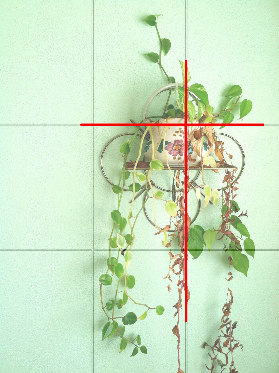
But first, you may be wondering why would we use the rule of thirds in the first place? After all, it’s natural to think that placing your focal point dead center will make the most engaging photo.
But center placement is static. When your subject is equal distance from all sides, your photo can appear too balanced and predictable, making it less compelling to the viewer.
The rule of thirds is based on the theory that a slight imbalance creates a more dynamic photo that feels more natural and engages the viewer. So how do we go about applying the rule of thirds?
Imagine dividing your photo frame into three sections horizontally and vertically so that you have nine areas and four intersecting points.
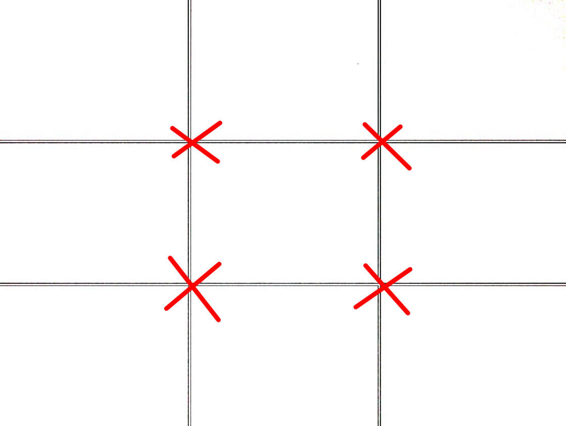
Actually, you don’t have to imagine this because you have a grid setting right in the camera app on your iPhone. Just go to Settings > Photos & Camera > Grid.
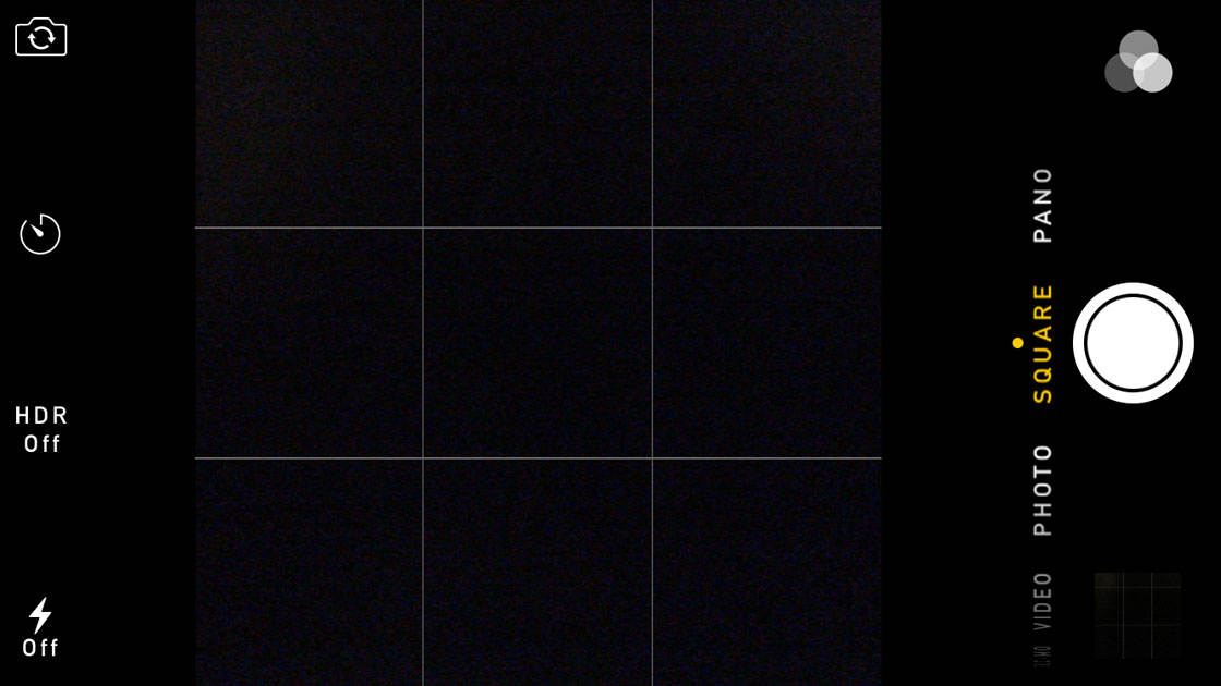
When you turn on this grid in the Settings, and then open the camera app, you’ll see a grid that can be used to help you compose your photo according to the rule of thirds.
Simply position your main subject or focal point, such as the eye in the portrait below, on one of the intersections where the gridlines meet.
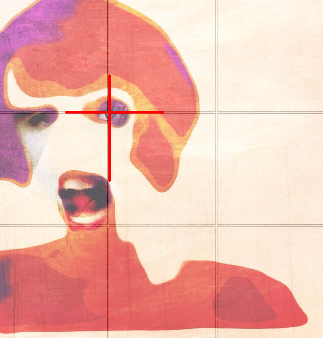
When To Break The Rule Of Thirds
While the grid is a great tool to use when composing your iPhone photos, remember that it’s only there as a guideline.
You don’t need to use the grid too precisely. Over time you’ll start to use the rule of thirds naturally without the need for the grid.
Sometimes placing your subject or focal point just slightly off-center or very near the edge of the photo might make more sense for the particular scene that you’re photographing.
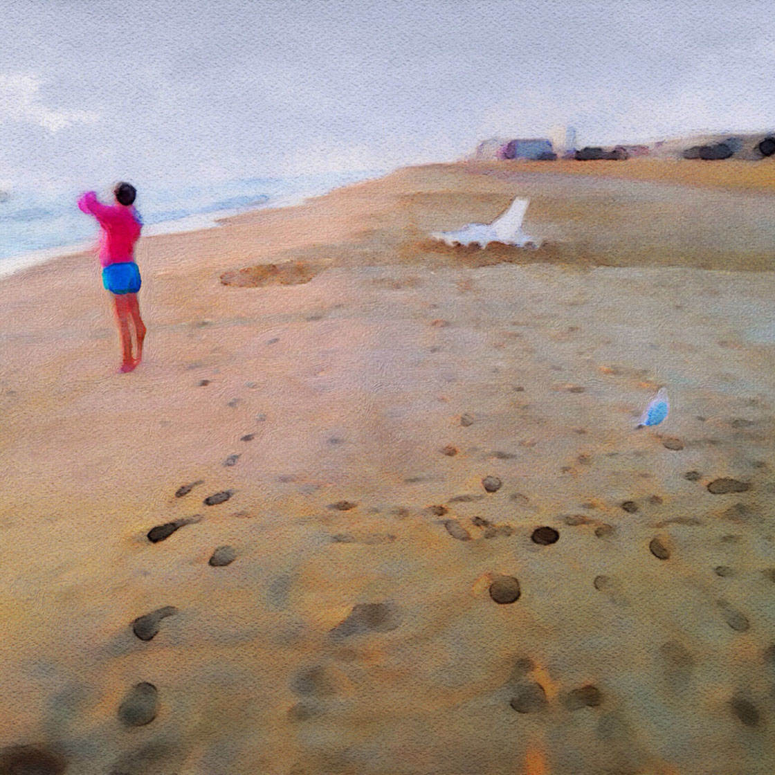
Placing your main subject near the edge of the frame can be a great way of creating tension in a photo, especially if it’s a person looking or walking out of the frame.
It can add an extra element of mystery or drama, either because you don’t know what they’re looking or because they’re about to walk out of the photo.
So what about placing your main subject directly in the center of the frame? The rule of thirds would indicate that this wouldn’t look good, however, in certain situations it can actually have a very powerful impact.

Consider central subject placement when you wish to make a strong, bold statement. Remember that central composition is relatively static as it draws your eye straight to the center of the frame, but you can use this to your advantage.
This is a good placement option when you want to convey a sense of structure and stability.
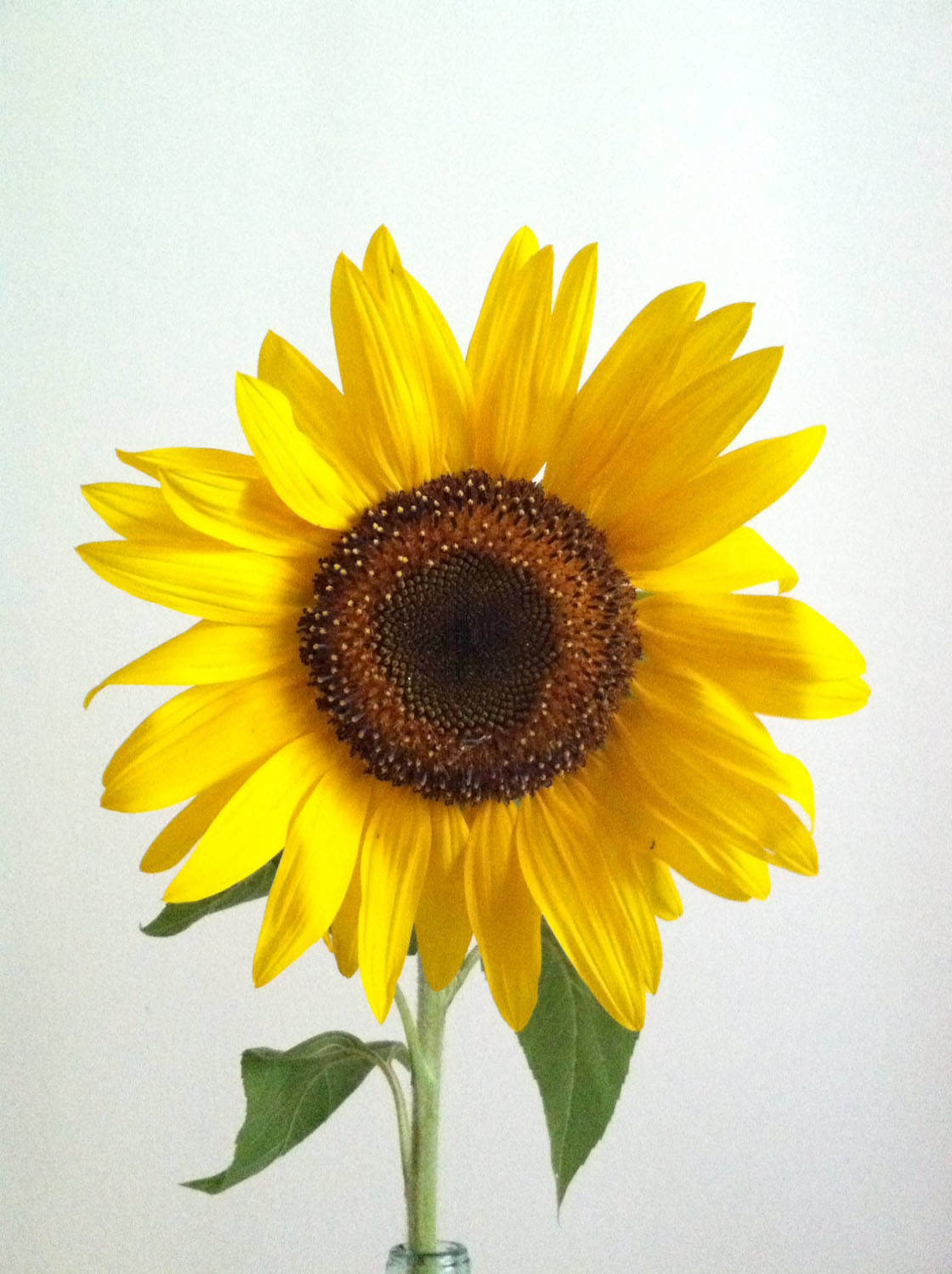
There are also some subjects that may photograph better with a center placement, for example portraits of people as well as flower portraits.

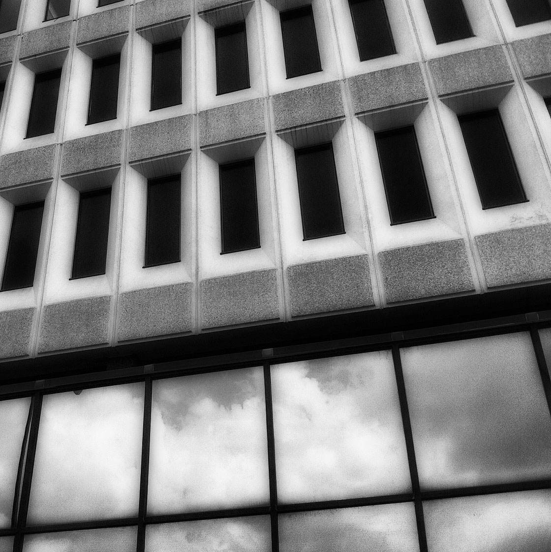
If you want to create symmetry in your photo, central composition is essential. This is especially useful when photographing buildings and architecture which often have symmetry built into their design.
Knowing when to use or break the rule of thirds will become easier with practice. A good technique is to take lots of photos of the same subject with it positioned in different areas of the frame.
You should then analyze these images to get an idea of how the overall balance of the composition is affected, and whether the different subject placements change the visual impact and story of the photo.
Rule 3. Incorporate Negative Space
Another important aspect of photo composition is negative space. This refers to the empty space that surrounds your subject.

If we look at the subject as positive space, then negative space would be everything else. Negative space is the area that’s largely devoid of any subject matter – it appears empty.

For instance, it may be a blank wall or floor, or it could be a large expanse of sky.
The area doesn’t necessarily have to be completely blank, but there shouldn’t be anything distinctive in this area that takes attention away from the subject.

Negative space emphasizes your subject and brings attention to it. After all, there’s nothing else in the shot competing for attention with your subject. The viewer’s eye isn’t confused or distracted.

Negative space also works well for creating a certain mood or atmosphere in your photos, often creating a sense of calm.
Using negative space can add an emotional tone to the photo, helping the viewer to FEEL something rather than just SEE something.

Another reason to include negative space is that it allows space for movement in a scene. This works well for moving objects such as cars or people walking through a space.
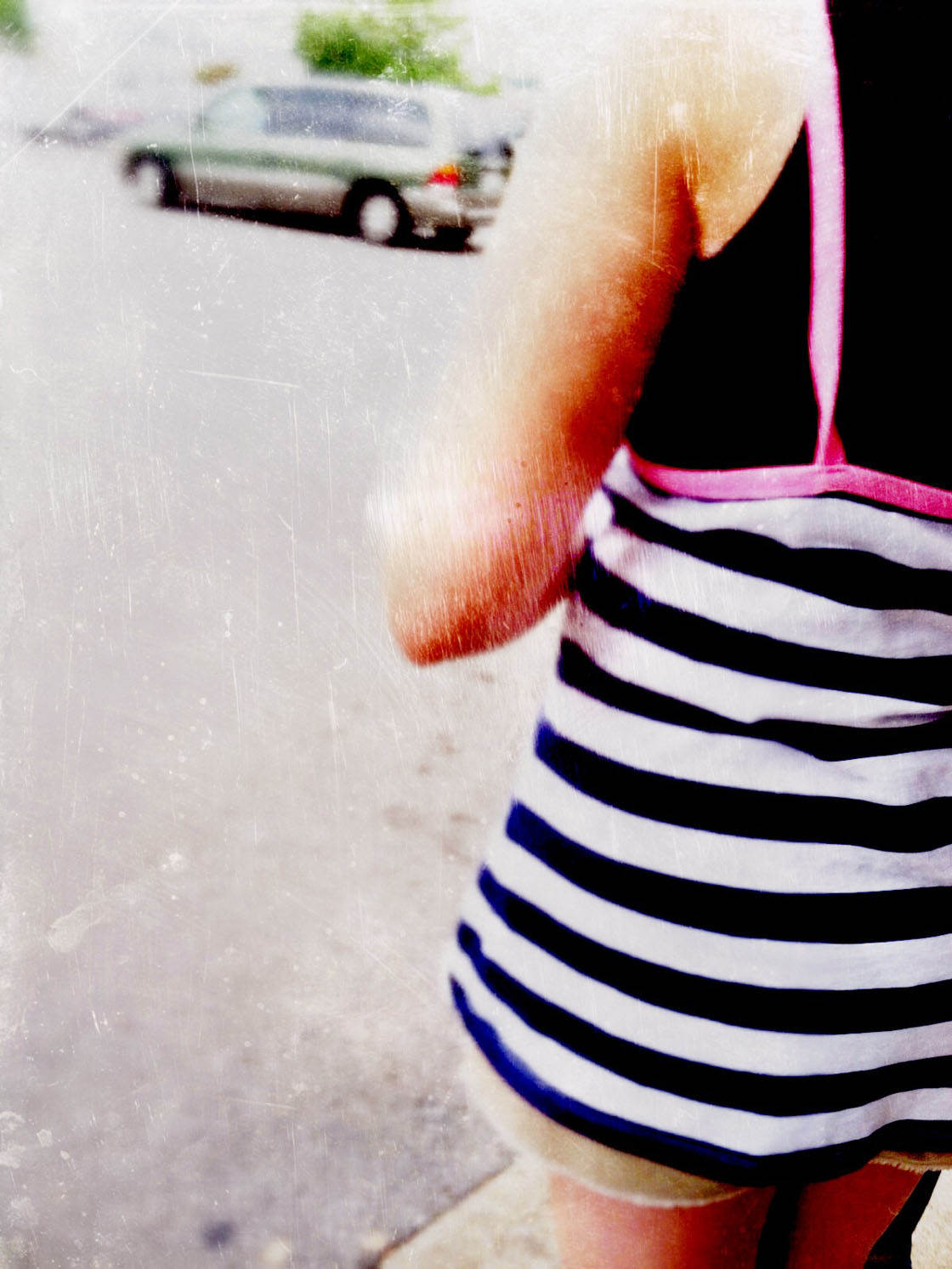
It also works well if you have a portrait of someone who is gazing towards one side of the frame. Leaving space for them to look into helps you to follow their gaze.
When To Break The Rule Of Negative Space
Sometimes, it makes more sense to fill up the entire frame with detail and leave little to no negative or empty space.
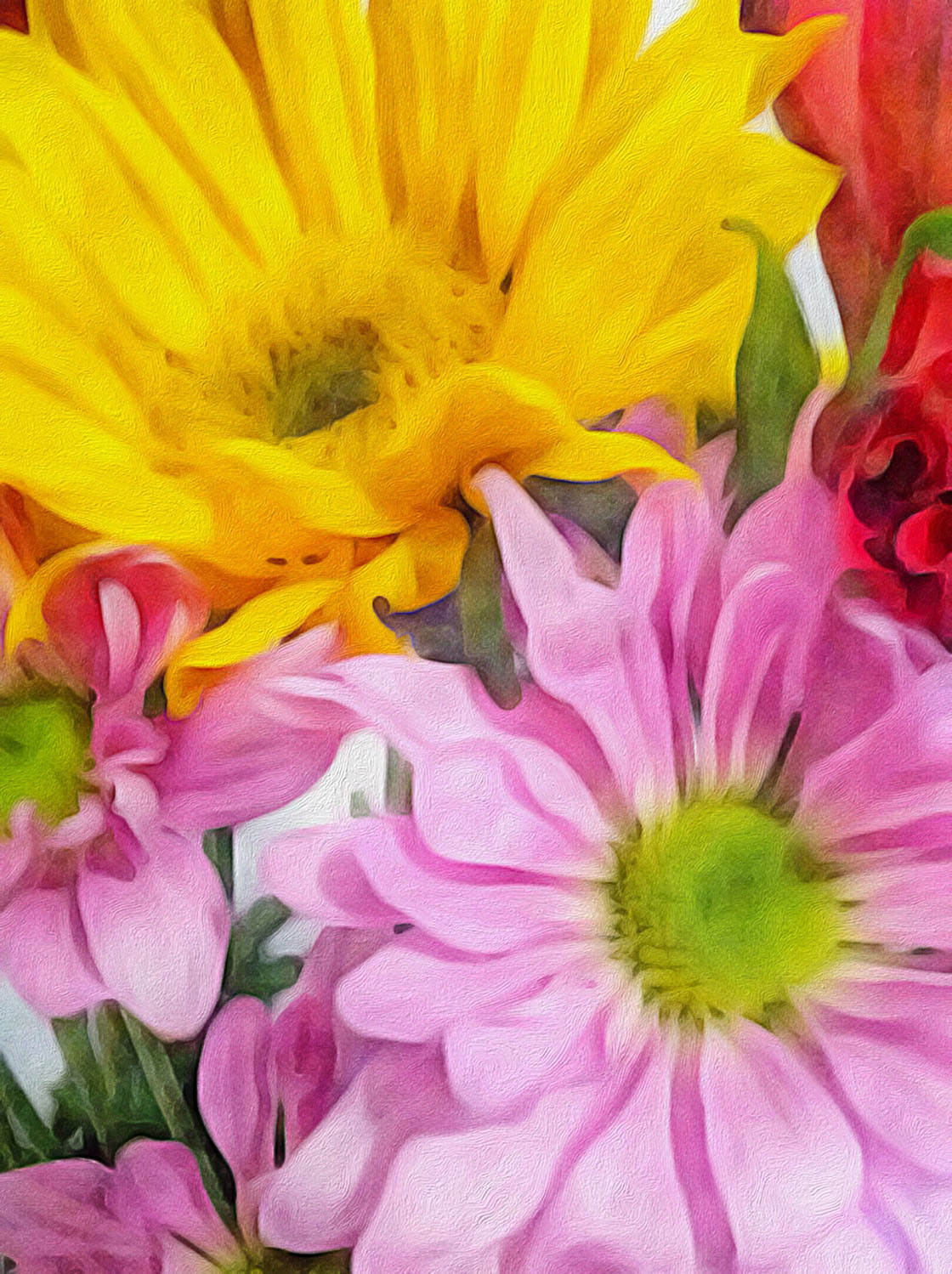
Filling the frame with close-up subjects such as these flowers is a great way of capturing their texture, color and fine detail.
If you spot a subject with an interesting or repetitive pattern, such as the building in the photo below, filling the frame with the pattern will result in a mesmerizing abstract image.
Below is another photo that works well without any negative space. The busy detail in this vendor’s booth adds context to the photo.

All of the elements included in this composition are necessary to tell the story. The busy scene adds a sense of energy and vibrancy to the photo.
A photo that has the entire frame filled with detail creates a very different mood to one that includes a lot of negative space.
Both techniques can result in visually powerful photos, but for different reasons. If you want to create a photo with a calm, serene or even melancholy atmosphere, negative space is the best option.
But for a high-impact and vibrant photo that’s full of energy, filling the entire frame with detail is a great choice.

Conclusion
As you can see from the photos in this tutorial, knowing when to break the rules of photo composition is as important as knowing when to use them.
Every time you look at a scene through your iPhone camera’s viewfinder, you’ll need to make a creative decision about how you compose the photo.
Think about the rules of composition, and then think about whether breaking them might have more impact.

As the photographer, you’re in charge of composing the shot. Take your time to try out different compositions until you capture the scene in a way that tells the story you want to convey.
And remember, there’s no right or wrong. With a bit of practice you’ll soon find that you’re using your photographic instincts to decide whether to apply or break a particular rule of composition.


I love some of the paper and texture backgrounds you use in these examples. Can you lead me to what you have used? I use Faded or Mextures currently. The sewing table photo and the pink zinnea in green bottle are the two I am particularly interested in. Thank you so much. And thank you for all the wonderful articles you write ( and I read).