How do you create stunning black and white edits on iPhone? Beautiful black and white editing may seem like a difficult, technical process. But it doesn’t have to be. In this tutorial, you’ll discover a sequence of steps for editing that anyone can follow. So if you want to create your own jaw-dropping black and white edits, read on…
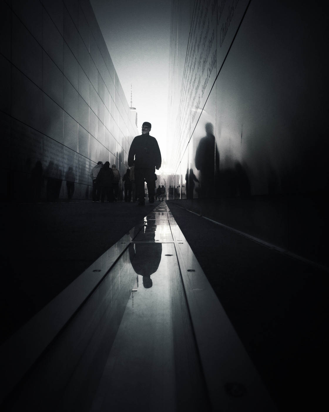
How To Do Stunning Black And White Editing
Today, I’m going to show you how I edit my own color images–and turn them into beautiful black and white pictures. I’ll take you through my editing process, step by step, using one of my photos as an example.
You’re about to learn the editing process that I use to create black and white photography like this:
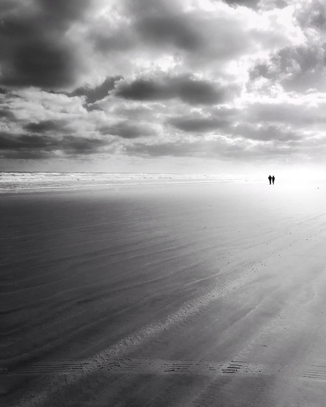
And this:
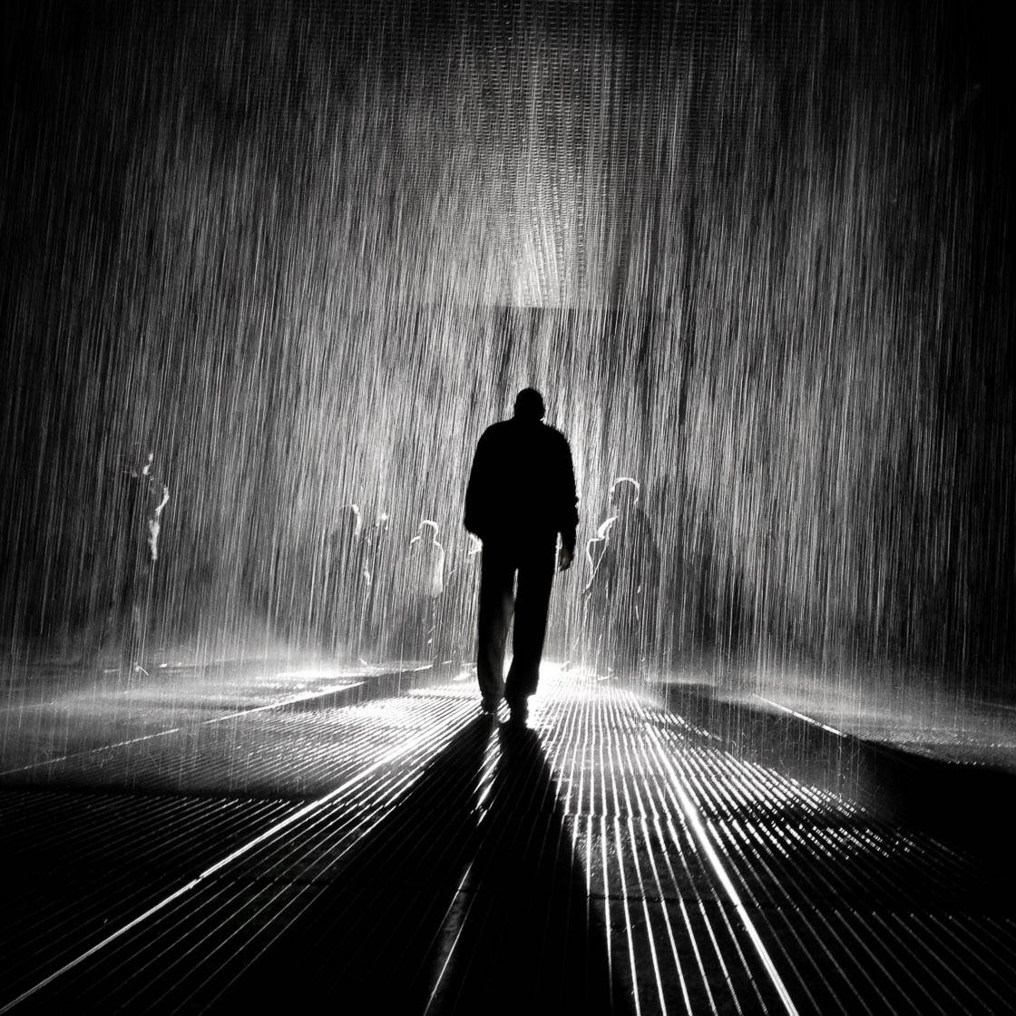
So I invite you to follow along!
I’d like to note: I generally do my black and white editing in Snapseed. It’s not a black and white app. It’s a free, all-around photo editing app.
But it might be the best black and white photo editor out there. It’s that powerful.
However, if you’re looking for a dedicated best black and white photo app, check out Blackie. It allows you to take stunning images in black and white.
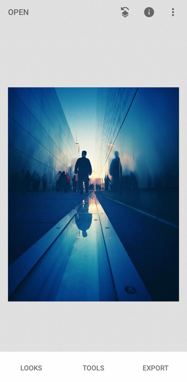
Here’s the original photo for today’s edit:
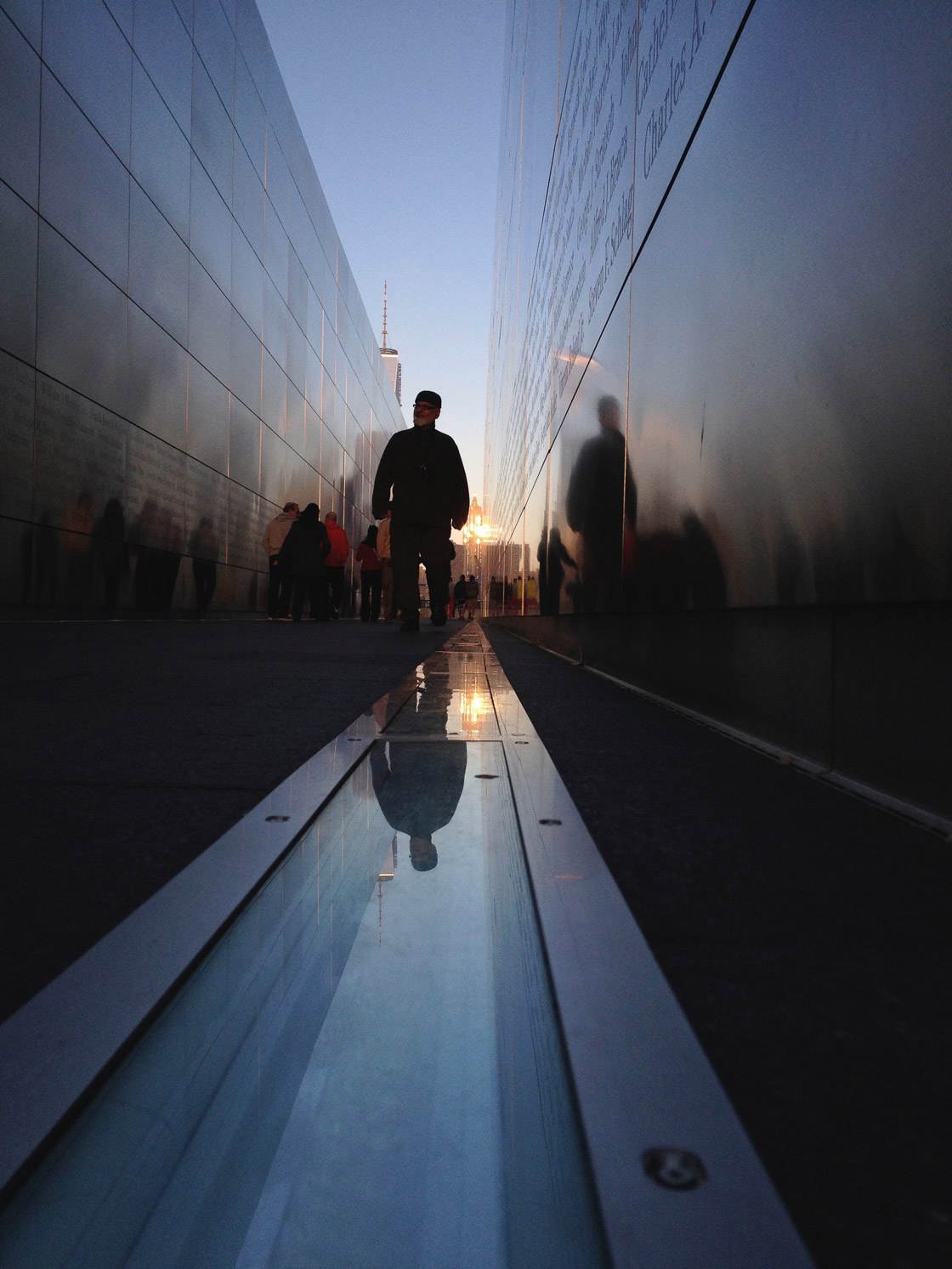
To access this image full-size, click here. You can use this to follow along on your own!
The Story Behind The Color Image
I took the image above at an architectural memorial in Liberty State Park, New Jersey. The memorial commemorates all New Jersey residents who died in the 9/11 attacks.
One evening, I stood between the walls of the memorial. I looked out toward lower Manhattan–where the World Trade Center towers once stood.
Previously, the Twin Towers had dominated the skyline.
But now the skyline is empty.
Hence the name of the memorial: Empty Sky.
I took this Empty Sky image just after sunset. The sky was blue and bright.
Now let me show you how to edit it.
Step 1: Open The Image In Snapseed To Begin The Edit
Snapseed is a fantastic tool for black and white editing. Best of all, it’s free!
Before beginning, make sure that the image is in your photo library.
Then tap on the Snapseed icon on your Home screen to start the app.
Select Open in the top left corner. Then tap Open from Device.
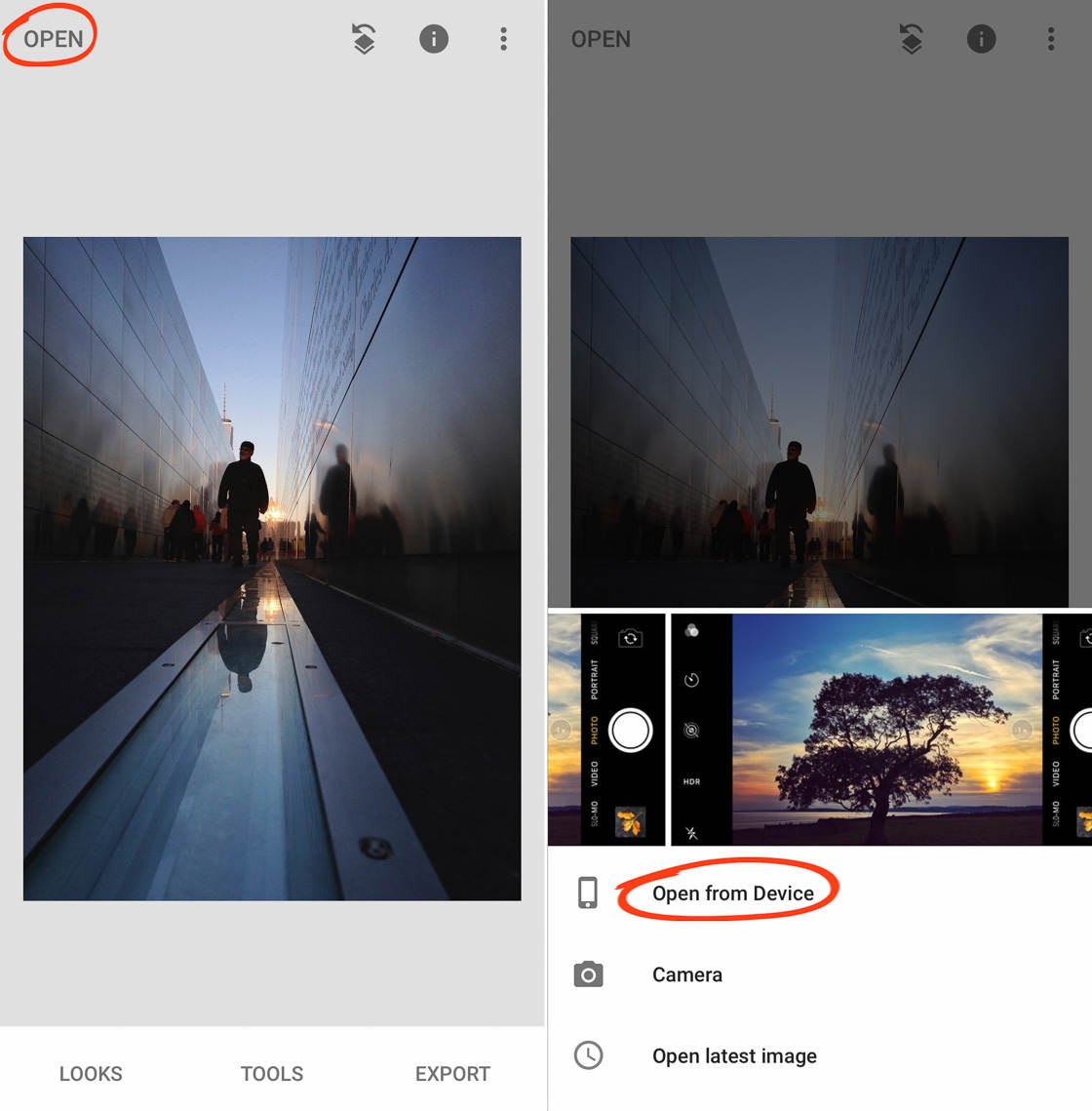
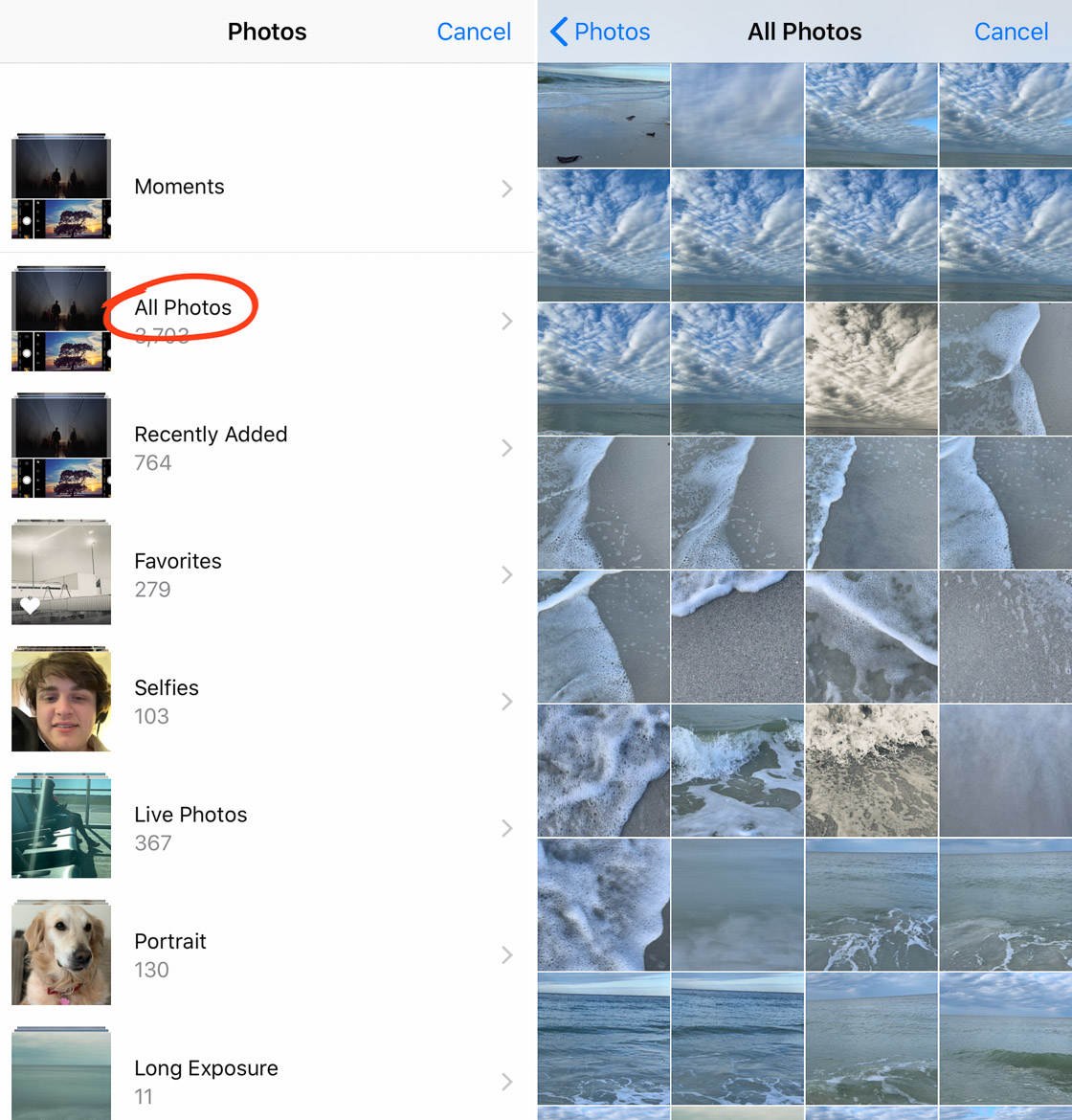
Finally, tap All Photos, and scroll until you find the original image you’re looking for.
Tap on it, and it will open in Snapseed.
Step 2: Straighten Your Image For More Professional Black And White Photography
When you edit your image, begin by looking it over.
Ask yourself: Are the horizontal lines straight? Are the vertical lines straight?
If not, you can make adjustments to correct them.
This image has no obvious horizon line, but it felt slightly off-level to me.
So I began by opening the Perspective tool in Snapseed.
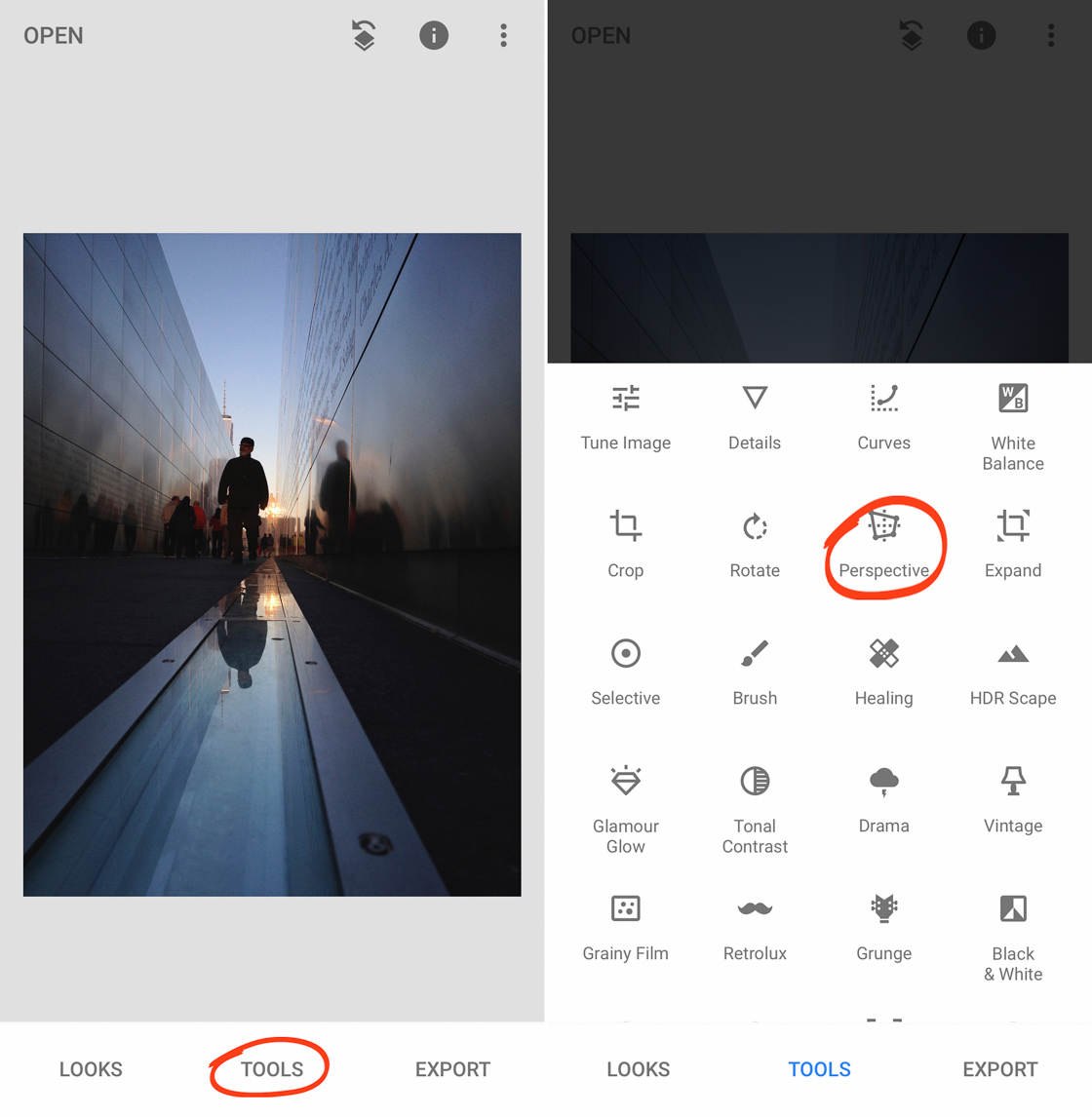
To do this, tap on Tools. Tap on Perspective.
I then selected the Rotate option.
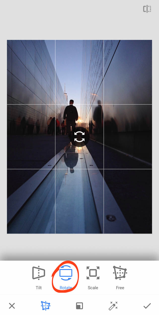
By simply swiping your finger left or right, you can adjust the angle of the image. As the image rotates, the Rotate tool fills in any pixels around the edges.
I used the tool to rotate the image counter-clockwise just a touch–a couple of degrees at most. Finally, I tapped the checkmark to save the edit.
Step 3: Crop Your Image For The Desired Display
Next, I cropped the image.
The point at which you crop your images isn’t particularly important–you can crop your photos at the beginning or the end of the edit.
In this example, I wanted to decide on my final composition early in my editing process.
So I opened the Crop tool.
You can access this tool by tapping Tools, then Crop.
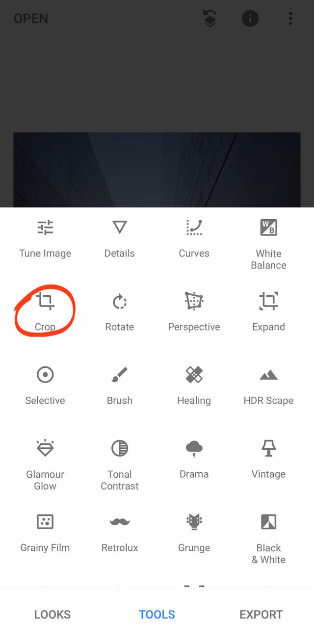
In general, I like to use a 4:5 aspect ratio. This is because I upload my images to Instagram, and 4:5 images will display the most pixels possible on Instagram (i.e., 4:5 images display largest!).
I tapped the 5:4 crop option, and composed the image within the crop borders.
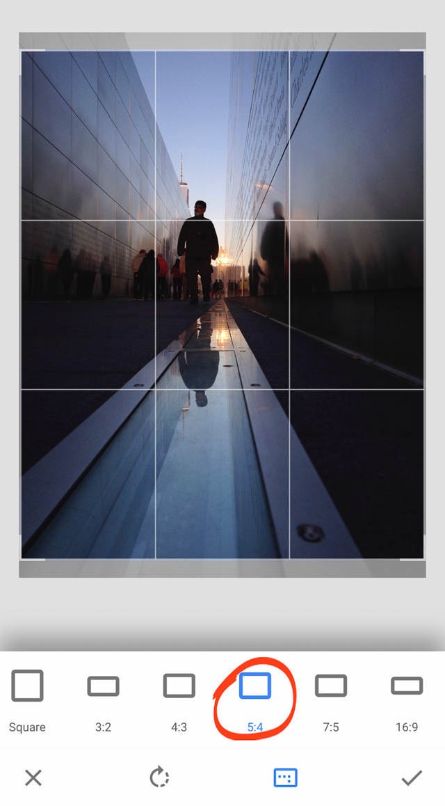
I ended up placing the image in the center of the Crop tool, like so:
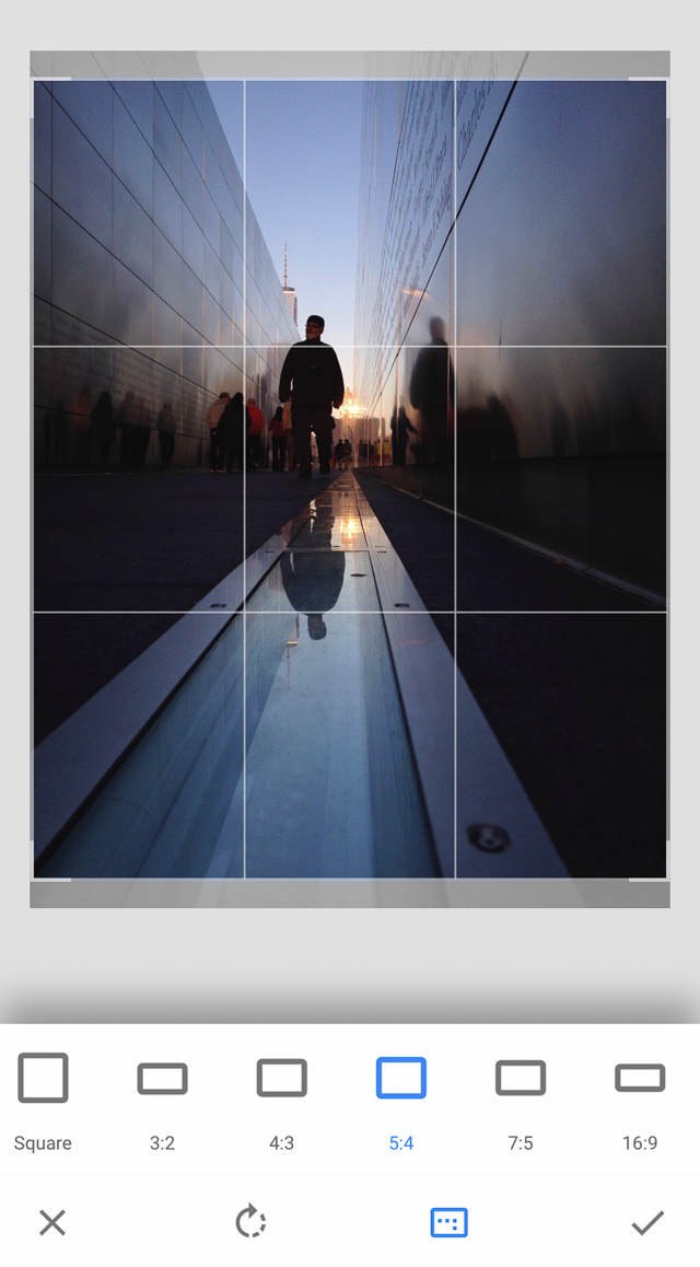 Then I tapped the checkmark to save the edit.
Step 4: Use The Vintage Tool For Richer Tones
One of the most important aspects of a black and white image is the richness of its tones.
But how do you achieve rich tones?
Here’s a tip: Start by editing your image in color. Deepen and darken its shadows.
This ultimately results in a black and white image with richer blacks.
To deepen this image’s shadows, I turned to the Vintage tool.
The Vintage tool affects images in several ways.
Here’s the most important one: it darkens the edges of the frame, creating deeper shadow areas (a vignette).
To access the Vintage tool, tap Tools and then Vintage.
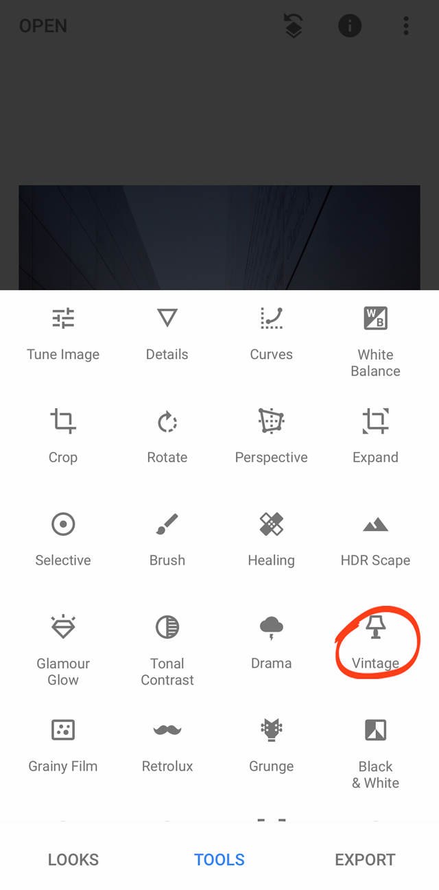
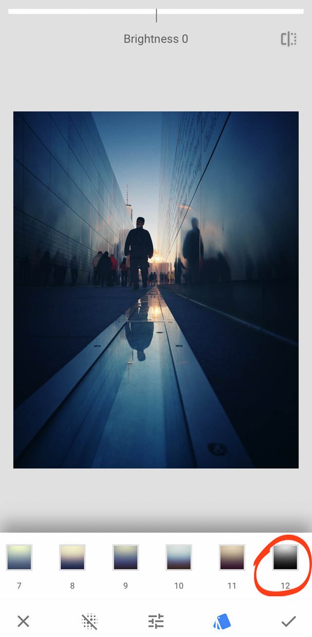
You’ll see a series of Vintage filters. For this image, I used Filter 12, because it creates very deep blacks.
Tap on 12 to apply the filter.
Then you can adjust the settings of the filter by tapping the Adjustments menu at the bottom of the screen.
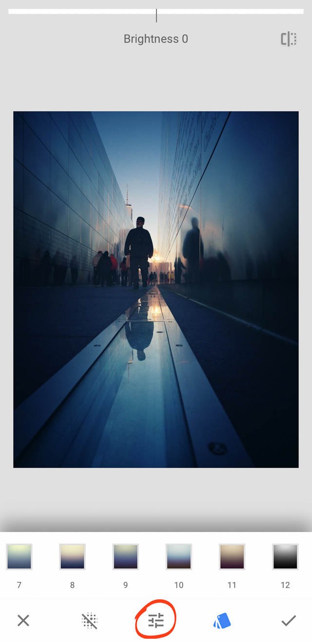
For this image, I increased the brightness by 10-15. I also increased the saturation by 5-10, and dialed up the style strength to about 50.
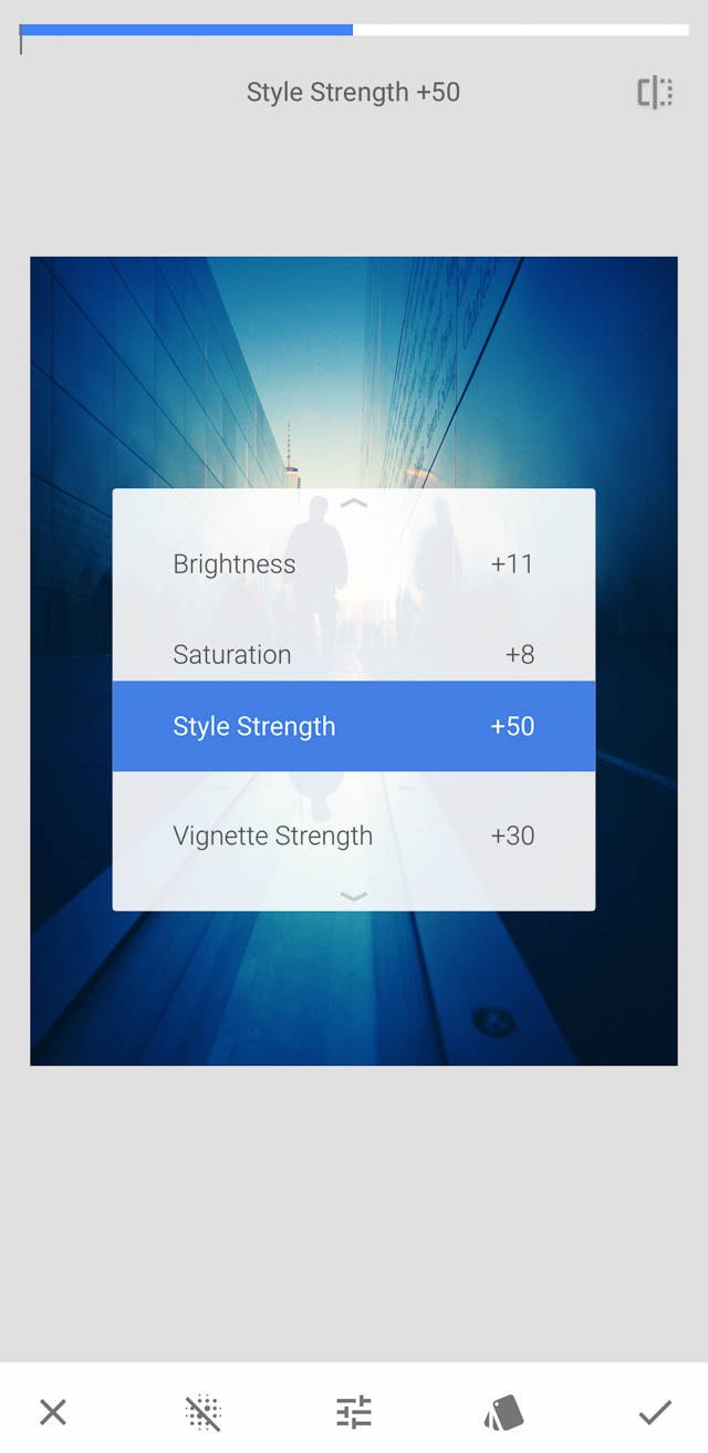
The purpose of these edits was to create a richer, deeper, more dramatic image. The changes are more obvious in color–but these effects can also be seen in black and white (as you’ll realize in a moment).
Step 5: Use The Vignette Tool To Deepen Your Shadow Areas Further
I had already created deep blacks with the Vintage tool. But I wanted to see if I could deepen them further, especially in the foreground.
I used the Vignette tool to do this.
Tap Tools, then Vignette.
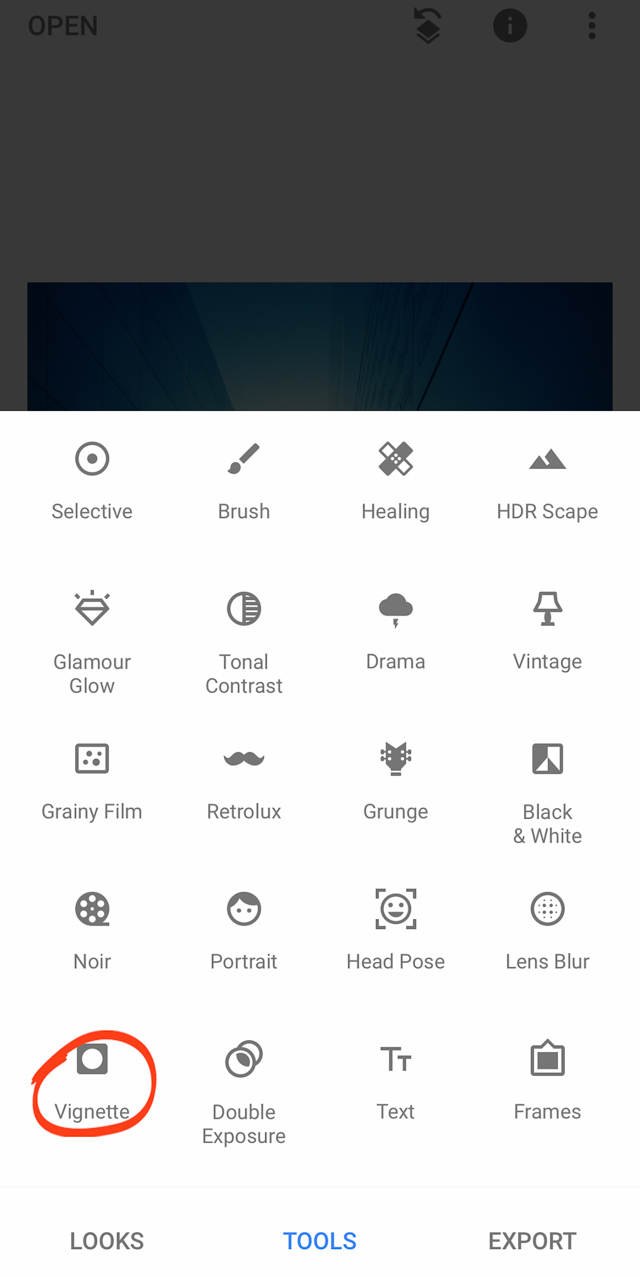
Now, the Vignette tool creates a dark circle–a vignette–around the edges of your image.
The Snapseed Vignette tool allows for some customization of the vignette. You can move the position of the vignette by tapping and dragging your finger around the screen.
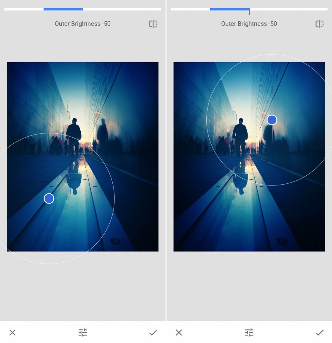
You can also pinch to decrease and increase the size of the vignette.
For this image, I wanted to increase the shadows in the foreground of the image.
So I placed the vignette in the sky just above the standing figure. This darkened the foreground significantly.
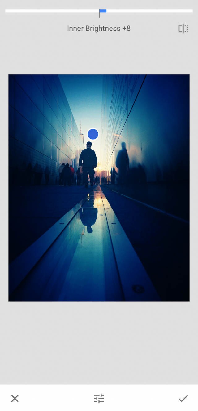
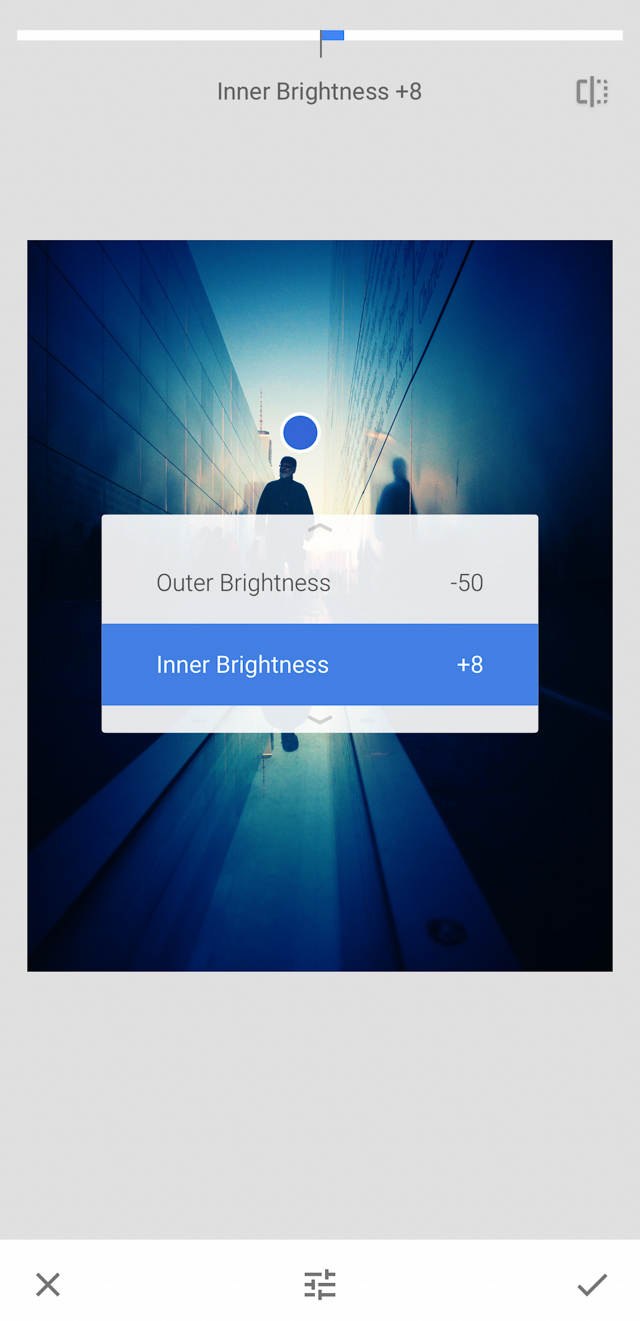
I also wanted to convey a sense of quiet hopefulness in the image. So I tapped the Adjustments menu to access the Vignette tools.
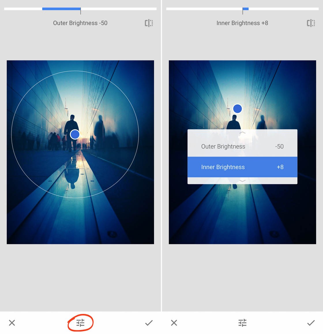
Then I raised the Inner Brightness by a slight amount (5-10). This created a slightly brighter sky above the standing figure.
Step 6: Use The Selective Tool To Remove Distractions
If you’ve been following along, you should now have a richer, deeper image (but one that’s still in color!).
At this point, I like to do some selective editing.
In particular, I noticed that the figures huddled near the wall were slightly distracting.
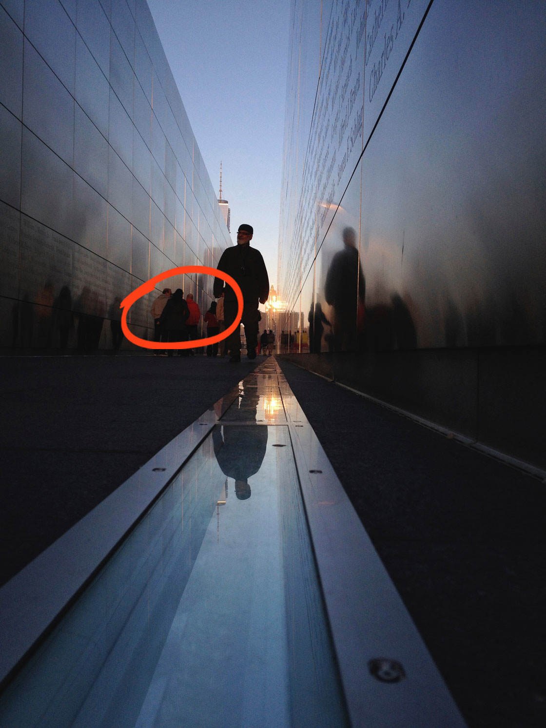
Do you see how the figure in the red coat draws the eye? Even once converted to black and white, I knew the strong red tone might be a distraction.
My first goal was to desaturate the red coat.
Tap Tools, then Selective. Tap on the red coat to add a selective point.
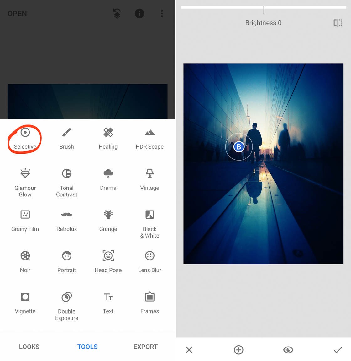
Selective points allow you to edit the space just under and around the point–leaving everything else untouched.
Now, pinch to make the selected area extremely small.
Then swipe up to select the Saturation option. Finally, swipe left to desaturate the red coat.
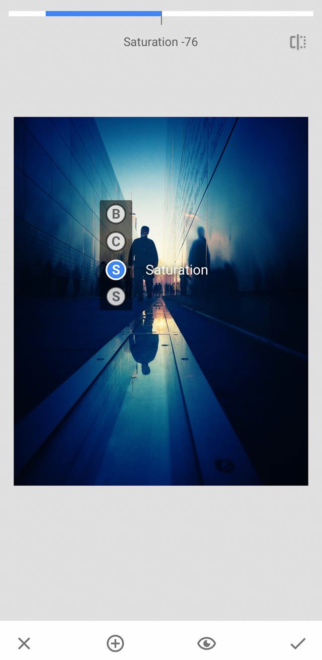
I set saturation to about -75, which was the point where the red coat became a more neutral color.
Then I selectively added contrast (about 25-30). This served to heighten the presence of the figure, helping it stand out a little more.
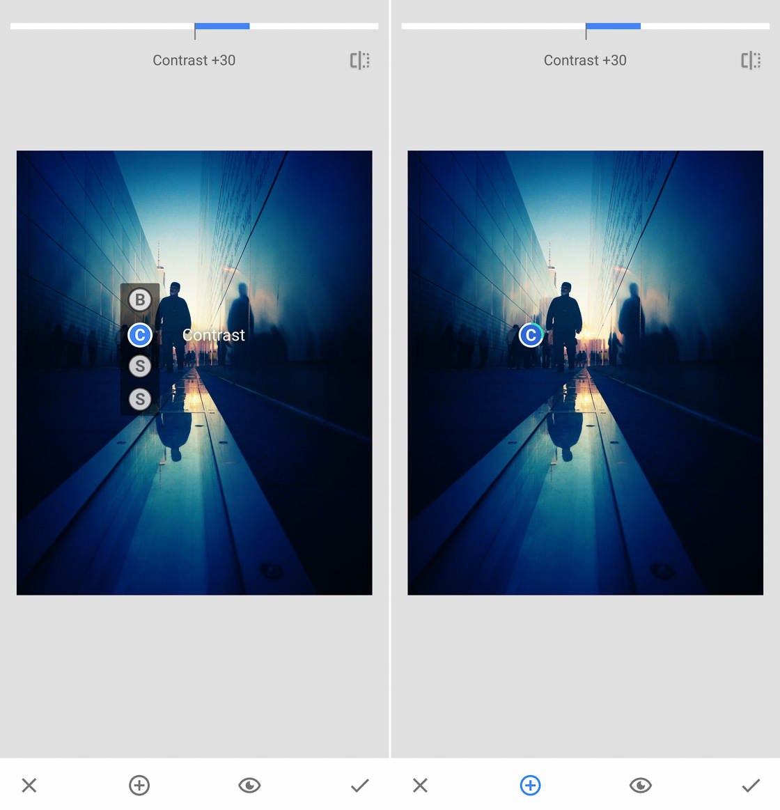
You see, I liked the addition of the figure–I just didn’t like how the red coat distracted from the image’s focus. So I used my first selective point to remove the red coat while making the figure more noticeable.
My second goal was to bring together all the background figures as a unified group. They were all wearing different colored clothes, and I wanted to make sure this didn’t make them into noticeably separate people.
So I tapped the Plus (+) icon at the bottom of the screen to create a second selective point, and I added it to the image.
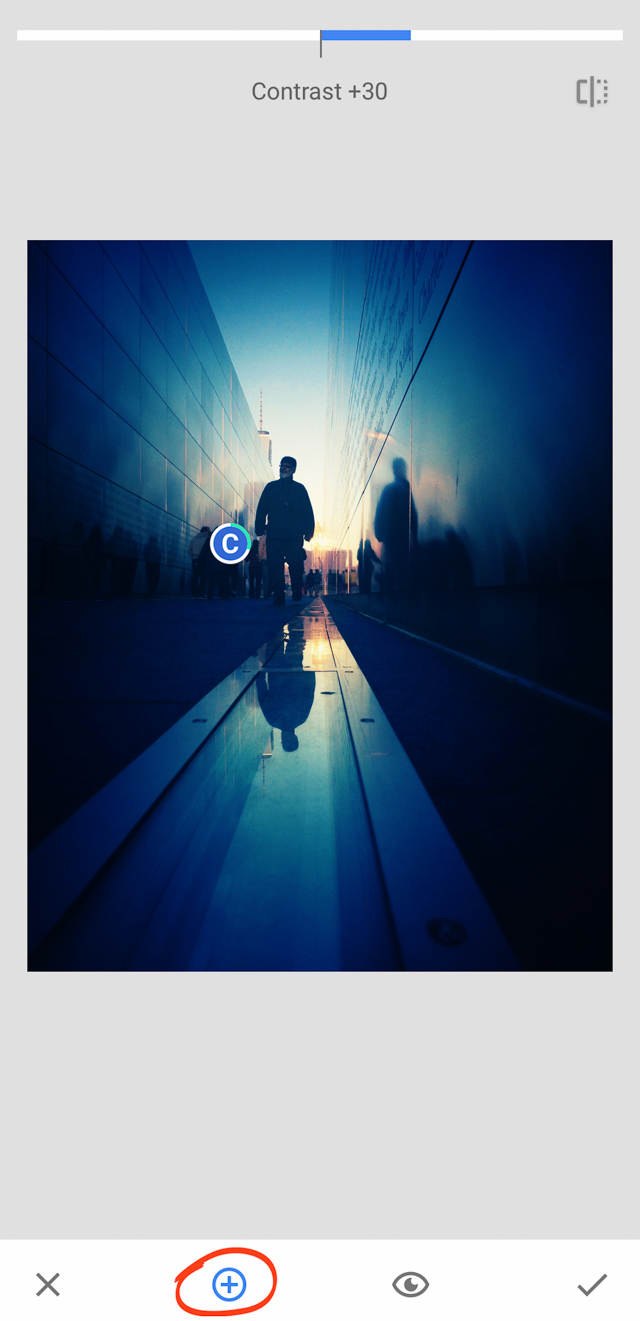
I placed the selective point on the figure with the tan coat, and pinched to make it small.
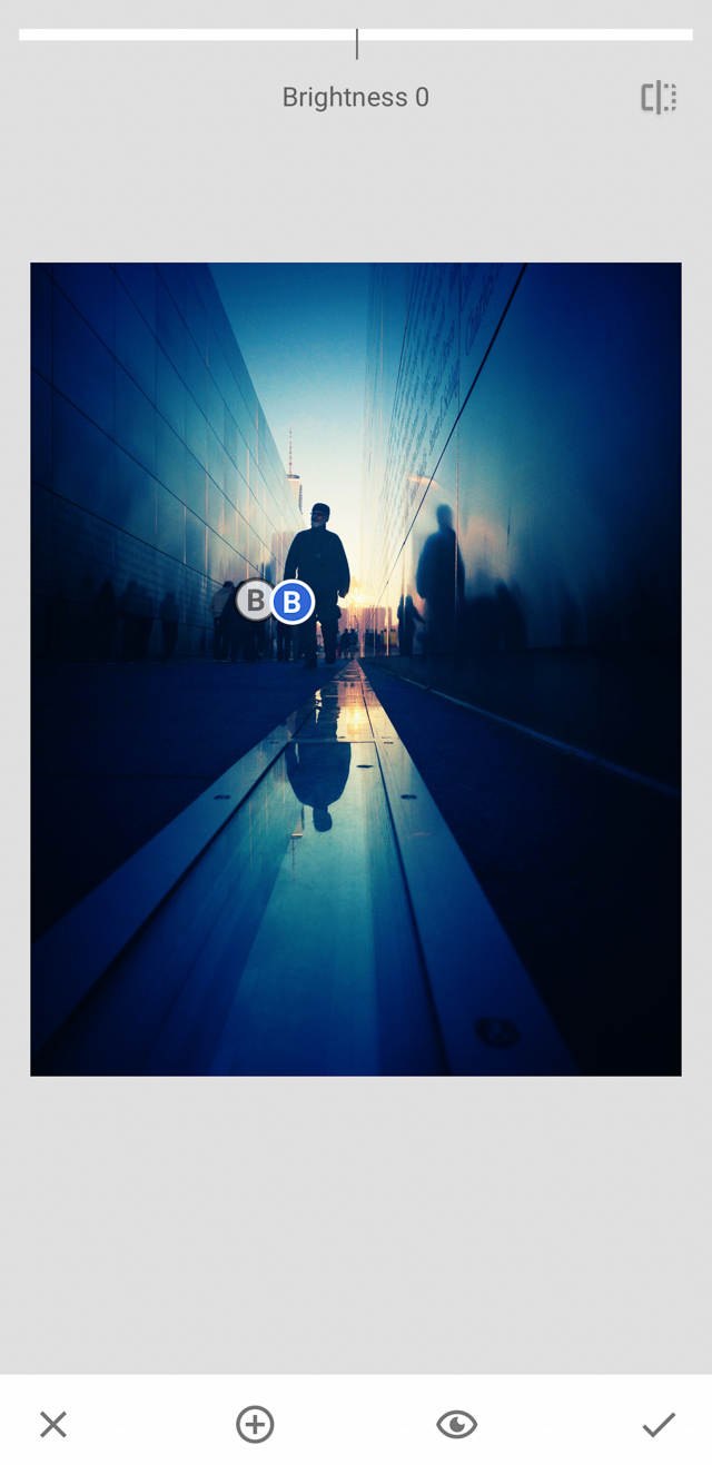
I used this selective point to decrease the contrast by about 50 and decrease the brightness by about 70.
These adjustments increased the unity of the group by drawing the different figures into one single huddle.
Then I added a third selective point. I placed this point just to the left of the figures on the wall. I increased the brightness to 25-30 and the contrast to about 33.
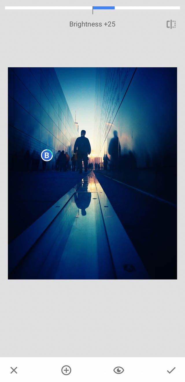
I did this for two reasons. First, I wanted to heighten the contrast between the wall and the figures. I knew that this would further increase the unity of the group.
Second, I wanted to make the names etched into the memorial’s wall more noticeable.
I placed a fourth selective point just below the reflection of the main figure’s head (at the bottom of the image). This point was medium-sized–about the width of the glass.
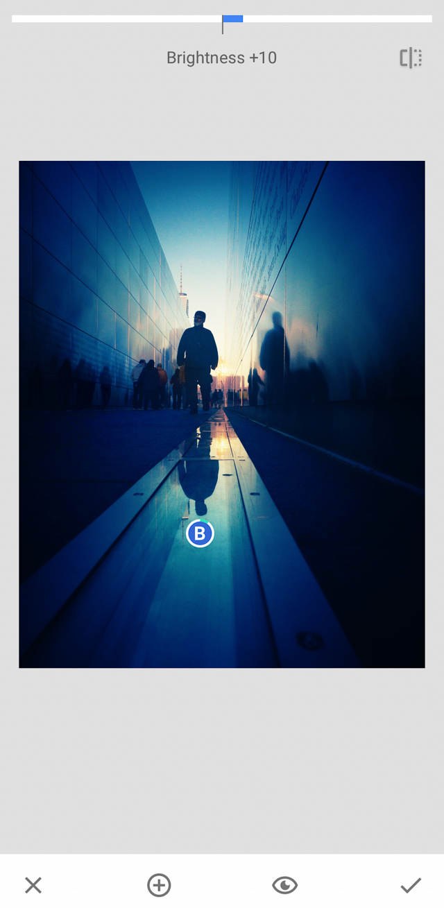
I set the brightness to 10 and the contrast to 20. This made the reflection pop a bit more.
I placed my fifth (and final) selective point at the bottom of the image, in the center.
I adjusted the diameter of this point to a medium size.
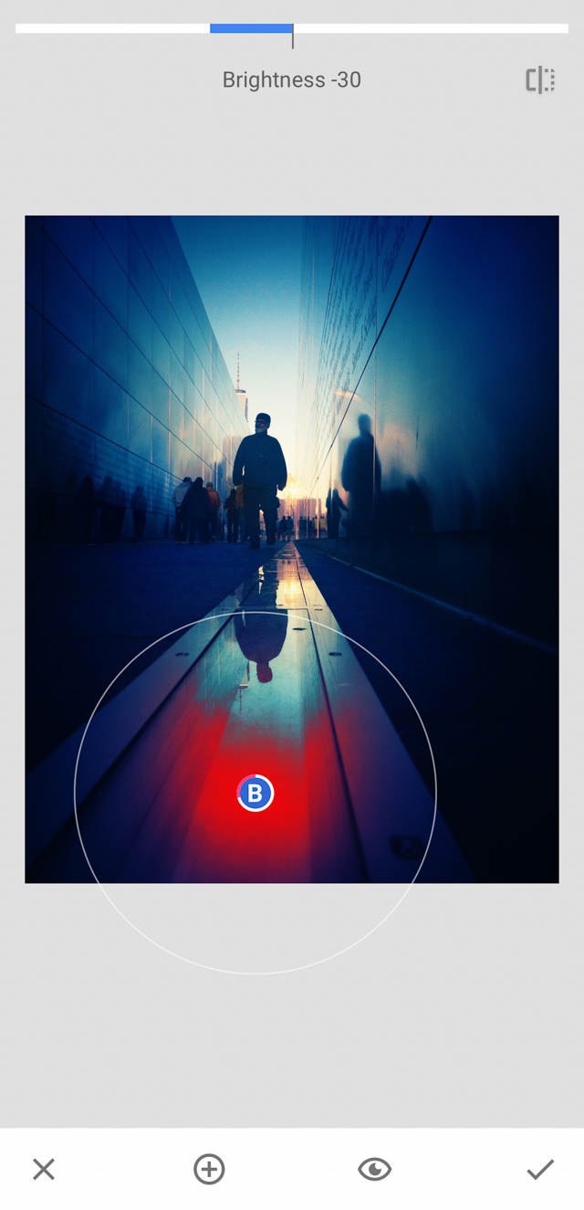
I dropped the saturation by 25-30. I decreased the brightness by about 30 and increased the contrast about 50. This helped emphasize the figure’s reflection and to deepen the darker foreground tones.
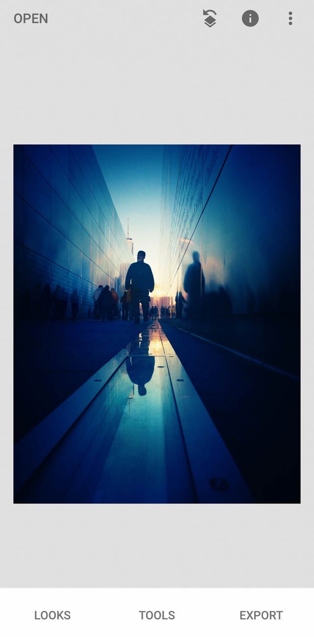
Step 7: Use The Brush Tool To Enhance The Tiny Details
The Brush tool is fantastic for making slight enhancements.
How do you access the Brush tool?
Tap Tools, then Brush.
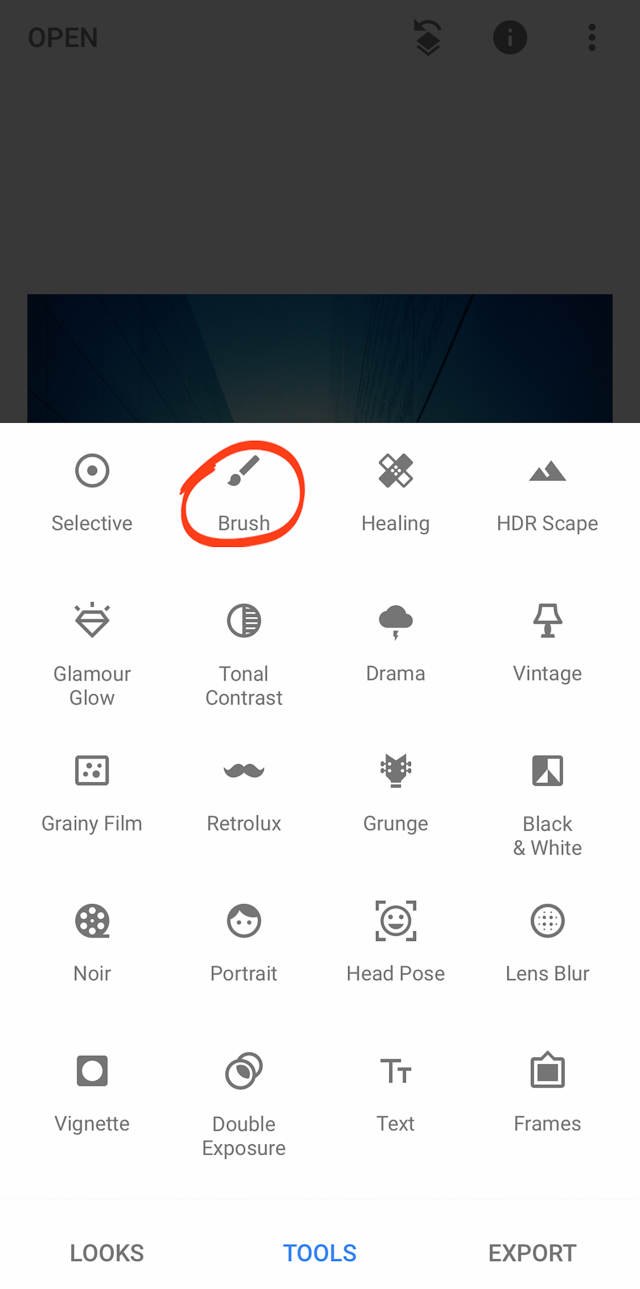
I used the Brush tool to enhance several parts of this image.
Make sure that Dodge & Burn is selected and set to +5. To change the value, simply tap the arrows.
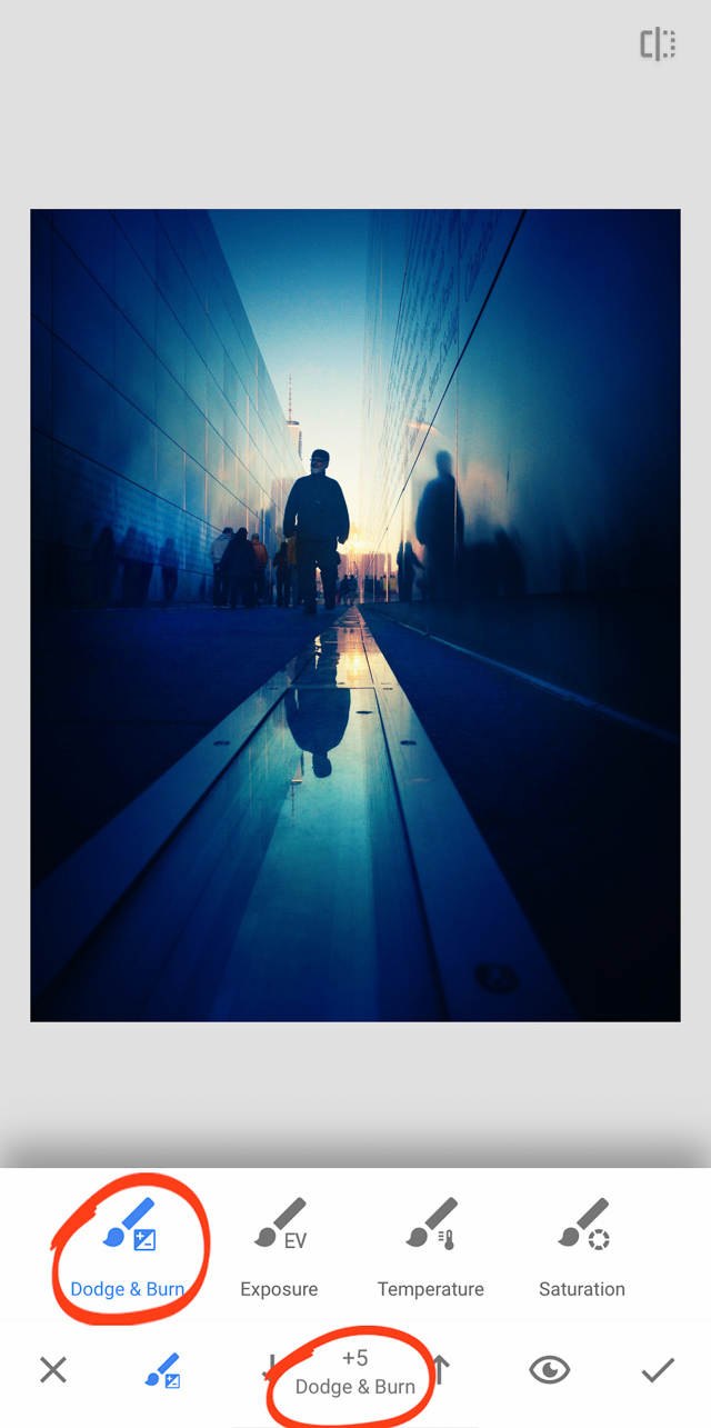
Now you can “paint” on the image with a finger, and the image will be slightly lightened.
For this image, I wanted to enhance the line on the right of the image. I wanted to give it more presence–make it into more of a leading line. I painted over it with my finger.
I also wanted to enhance the reflection of the figures on the left wall. So I painted a bit of light there, as well.
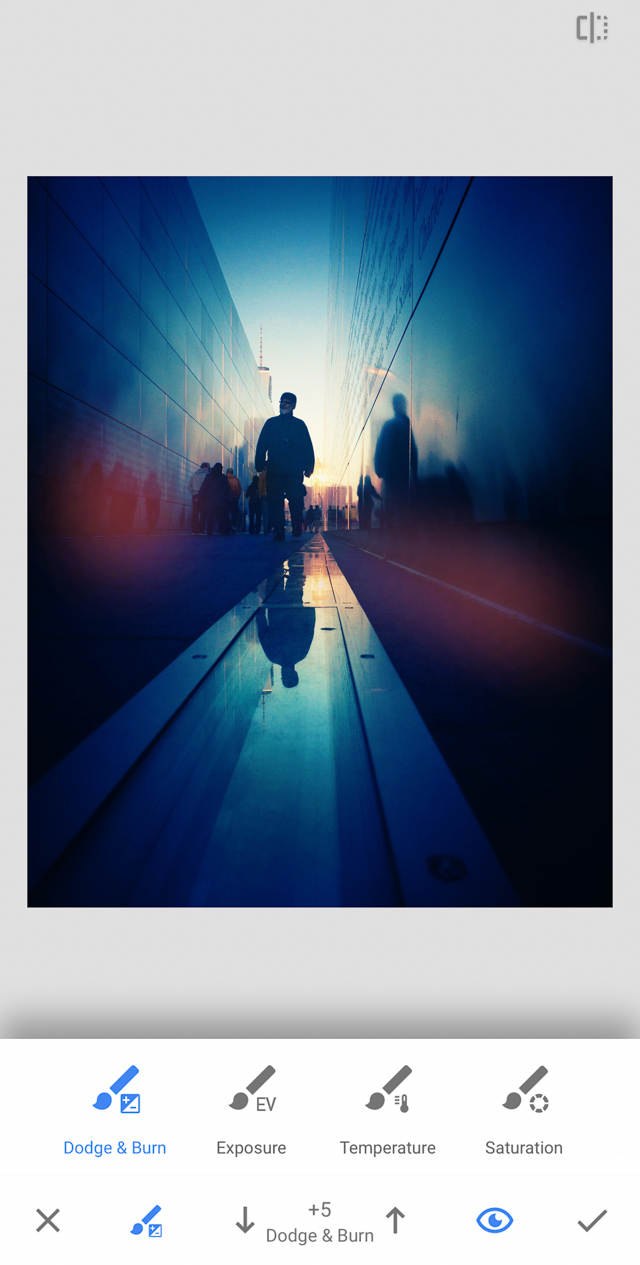
In general, the Brush tool is wonderful for making these subtle changes. For this image, those are the only adjustments I made. But you can use the Brush tool to make slight changes to much of your image, if you desire.
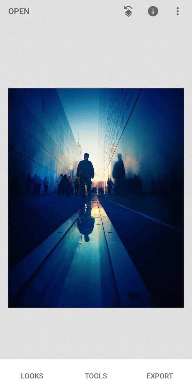
Step 8: Desaturate To Convert The Image To Black And White
Up until this point, you should have been editing the image in color. That’s what I did.
It was only at the end that I converted the image to black and white.
Why did I make the conversion?
I felt that the black and white image evoked a more somber tone, which fit the memorial.
Plus, I was planning on posting the photograph on 9/11–to memorialize the tragedy.
There are multiple ways to convert to black and white in Snapseed. But this one is my favorite–as it allows you to create richer tones.
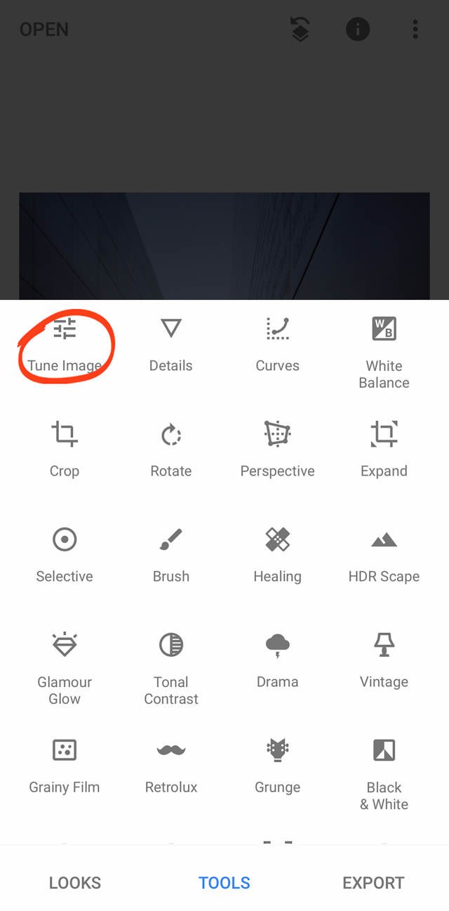
Tap Tools, then Tune Image.
Tap to access the Adjustments menu.
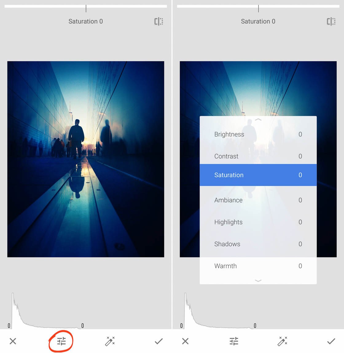
Scroll down to the saturation, and then drop it to about -90.
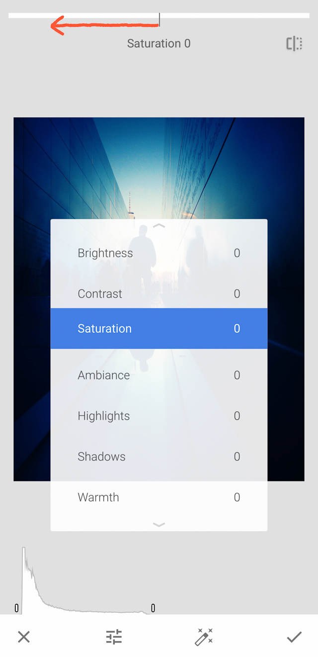
Why didn’t I desaturate the image completely?
Because if you leave a bit of color in your black and white images, they’ll have a slightly richer tone.
I often do this with my black and white photos. And that’s what I did with this shot.
To complete the edit, I increased the brightness and highlights by 10-15 each. This made the brighter parts of the image pop out even more.
And I dropped ambiance by 35-40, in order to add additional contrast without sacrificing subtle tones in the image.
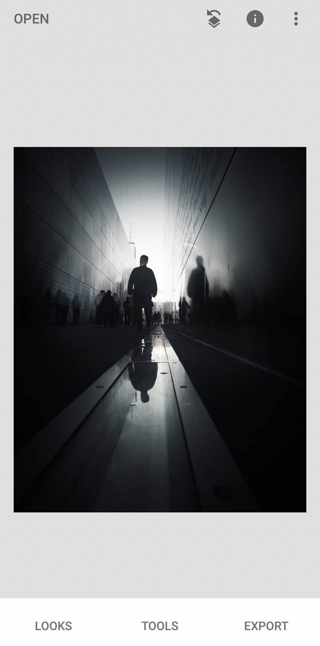
Step 9: Save A Copy Of The Image For Future Use
Here’s the final black and white editing step you should follow: Save a copy of your image to your photo library.
If you save a copy, rather than save the edits as-is, you’ll be able to access the history of the edit later. This can be useful if you want to go back and tweak the photo.
To do this, simply tap Export, then Save A Copy.
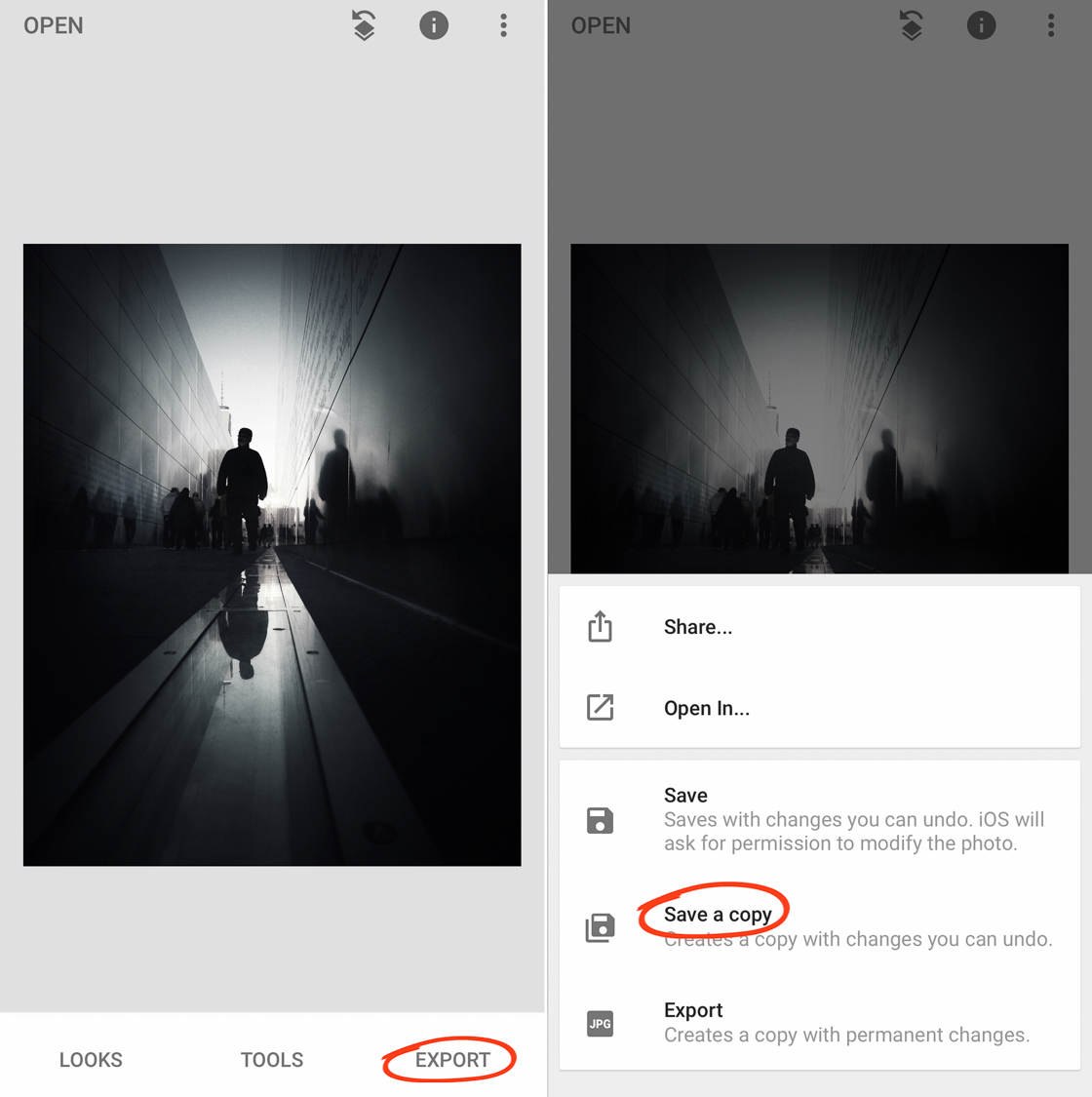
You’ll now be able to access your edited image in your photo library.
And that’s it! You’re done.
You’ve successfully created a stunning black and white edit!



Leave a Reply
You must be logged in to post a comment.